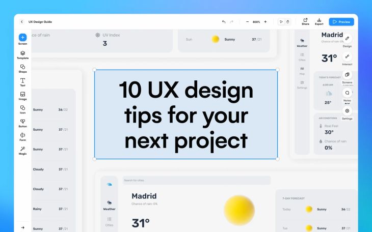
10 UX design tips for your next project
User experience design, or UX design, focuses on improving the way a user interacts with digital products. It is an essential part of every web and app design, so it’s important to understand how you can utilize it. With some help from a UX design tool, such as Uizard, you can kick-off your UX design project with a premade UI template that is already user experience optimized, or benefit from the wonders of AI features.
In this blog post we are going to run through ten UX design tips that will help to enhance user satisfaction on your website or app. However, if you’re new to UX design, and want to learn more, check out our article ‘The Uizard guide to UX design’.
10 UX design tips
Whether you’re a beginner or an expert, these UX design tips will certainly help when you start your next project. Let’s get into it.
- Navigation and flow
- Buttons and icons
- Color and contrast
- Optimize 404 and error pages
- Focus on forms
- Hyperlinks and anchor text
- Device optimization
- Typography and readability
- Use white space effectively
- Analyze your designs with AI
Navigation and flow
Consider the flow of your UX design carefully. The top of your web or app page should contain the most important component block, as this is what a user will see first. This may include important snippets of content and images. And even if they scroll no further, they will have gained a good understanding of the page already.
Navigation is equally as important, so you should add more than one way for users to get from one page to the next. Buttons, hyperlinks, and extensive headers and footers are the most common ways to integrate pathways between pages. You can benefit from wonderful premade header and footer components when using Uizard, and all you have to do is drag-and-drop them onto your design screen.
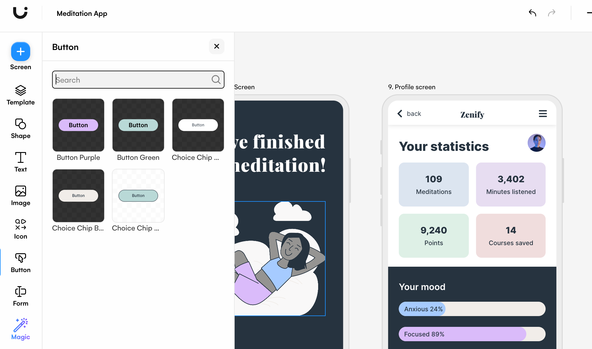
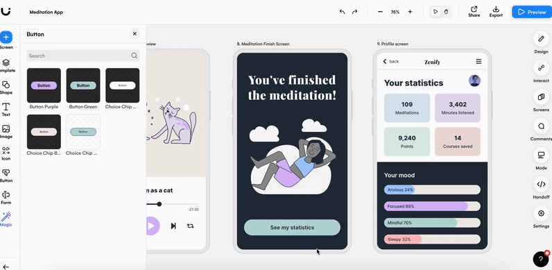
Buttons and icons
Whether you’re designing for mobile or the web, users need to be able to click on buttons and icons, and this means using appropriate sizing and spacing. This is especially important for mobile devices as users will be clicking on a touchscreen, and may accidentally click on the wrong element if there are multiple within the same proximity. Designing for a touchscreen device is easy with Uizard. With components that are already appropriately spaced, sized and ready to use on your UX design, you have one less thing to think about.
Another thing to note is that the text used on your buttons should be clear and legible, which means it has to be at a readable size. However, the button should be proportionate to the text size. In Uizard you have multiple button options with varying text sizes to pick from, so you can find the perfect addition to your design.
Color and contrast
Color can massively impact the way a user perceives your design, and even your brand. Avoid using color combinations that are over stimulating or overpowering, as you may find that users are reluctant to use your design. To ensure that your UX design is fully accessible to all users, color and contrast should be taken into consideration. A great way to improve accessibility is to check your design in greyscale to make sure that people with color blindness can still read the text and headings on your design.
If choosing colors is not your strong suit, Uizard’s color generator can help. Simply click on the element you’d like to edit, click on the ‘fill’ option and then on ‘generate’. From here you can use a prompt to gather color options for your UX design.
Optimize 404 and error pages
Error and 404 pages are a great, often missed, opportunity when it comes to UX design. Use these pages to tell users how to fix their issue, where to find more information, and offer them a way to navigate to a new page. You can also personalize error pages with humorous copy that is in-line with your branding.
Linking to your support page is another way to optimize your design for great UX. But remember, the UX of your support page should be clear, concise and organized, too, just like ours!
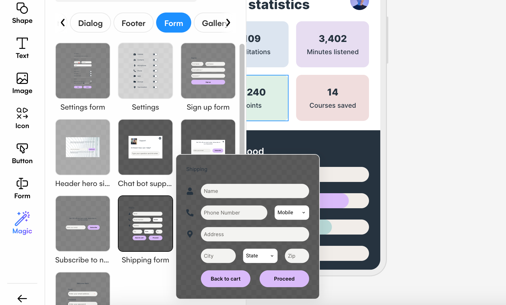
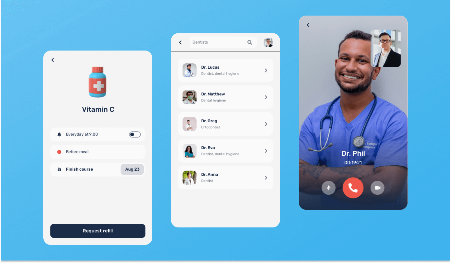
Focus on forms
Forms are another amazing way to practice user experience on both app and web designs. But there are a few UX design tips to keep in mind here. If you are using a form to gather user information, such as gender, it's important to include everyone in the options. The layout of your form is also key, and you will need to enforce proper spacing and alignment of components. Without it, users may not feel comfortable providing their details or personal information.
Using Uizard, designing a UX form component is easy. In the left control panel you will find the section ‘Form’, and from here you have the option to use an array of elements that are perfectly suited to creating a UX form component. Or, head to the UI templates section where you will find premade form components that you can drag-and-drop onto your UX design.
Hyperlinks and anchor text
Hyperlinks are a useful way to allow users to navigate from one page to another from a body of text. However, there are sites and apps that fail to make it obvious when text is actually a hyperlink. For instance, on some sites you have to physically hover over the text with your cursor before you even realize that there is a link, which is not great for UX.
Making the text a different color instead will signal from the offset that the text is a hyperlink, and this little improvement will see an increase in users clicking on your hyperlinks. The anchor text of these links are also crucial to UX. Anchor text is important for accessibility and screen readers, so make sure that it tells a user what they will find, and where they will go if they click.
Device optimization
Although this might be a clear-cut UX design tip, there are still many designs out there that are not optimized for all types of devices. You have probably browsed a website on your mobile and had to zoom out, in, or scroll to access parts of a page, and this is not great for UX. Likewise, so is designing an app that is not proportionate to the size of an iPhone screen. Always check that you have used the correct dimensions when creating a UX design.
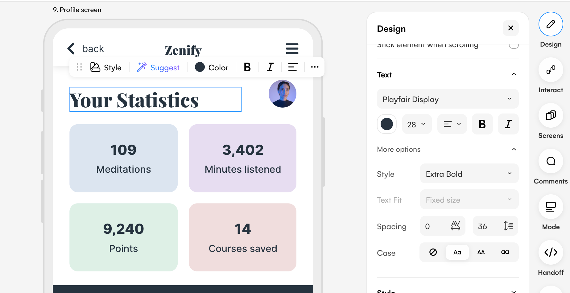
Typography and readability
With the correct typography you can easily signal which parts of your content are the most important, and draw attention to them. Although you may want to use larger text to present headings, using a different font, color or emboldening the letters can help to separate a heading from the rest of your content. It will also ensure that it is read first before anything else.
Another UX design text tip to note here is that your text needs to be readable. So this means, not too small, but also not too large, and make sure that there is appropriate spacing between lines. Using Uizard’s text controls you can easily stick to this UX design tip. All you need to do is select the text element you want to edit, and click the design option in the right panel. From here you can change the font, color, size, and spacing quickly and easily.
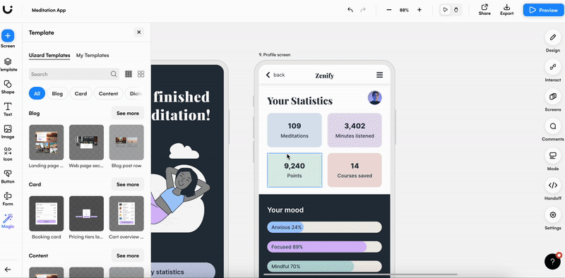
Use white space effectively
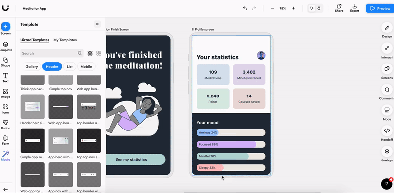
Ever noticed the amount of white or blank space used on designs? This is no accident, and white space is actually important for UX as it ensures a clutter-free design. White or blank space can be used to separate content, create blocks or sections, and it gives users the chance to digest information before scrolling further. Using a premade Uizard UI template can aid you when deciding how much space to leave between component blocks. Just pick a template that meets your needs, and edit it directly using Uizard’s drag-and-drop editor.
Analyze your designs with AI
If you’ve followed all of these tips and you’re looking for something extra, you can also analyze your UX design with Uizard’s AI design features. Signing up to Uizard offers you the ability to dissect your design screens, and to check which areas are gaining the most attention from users. With Uizard Focus Predictor, you can analyze design hotspots with an attention heatmap — the red areas signify the most used spots of your design — and you can make changes to ramp up the UX on your design.
Interested in starting your very own UX design project using these tips? Sign up to Uizard today for access to lots of templates, components and AI features. For more design related information check out our blog.