5 AI generated UI designs that will blow your mind
AI tools can improve your workflow, productivity and more. But they can also help both designers and non-designers to create amazing UI designs. So, what if you could use a few lines of text to create a UI design for an app or website? Well, with Uizard Autodesigner you can.
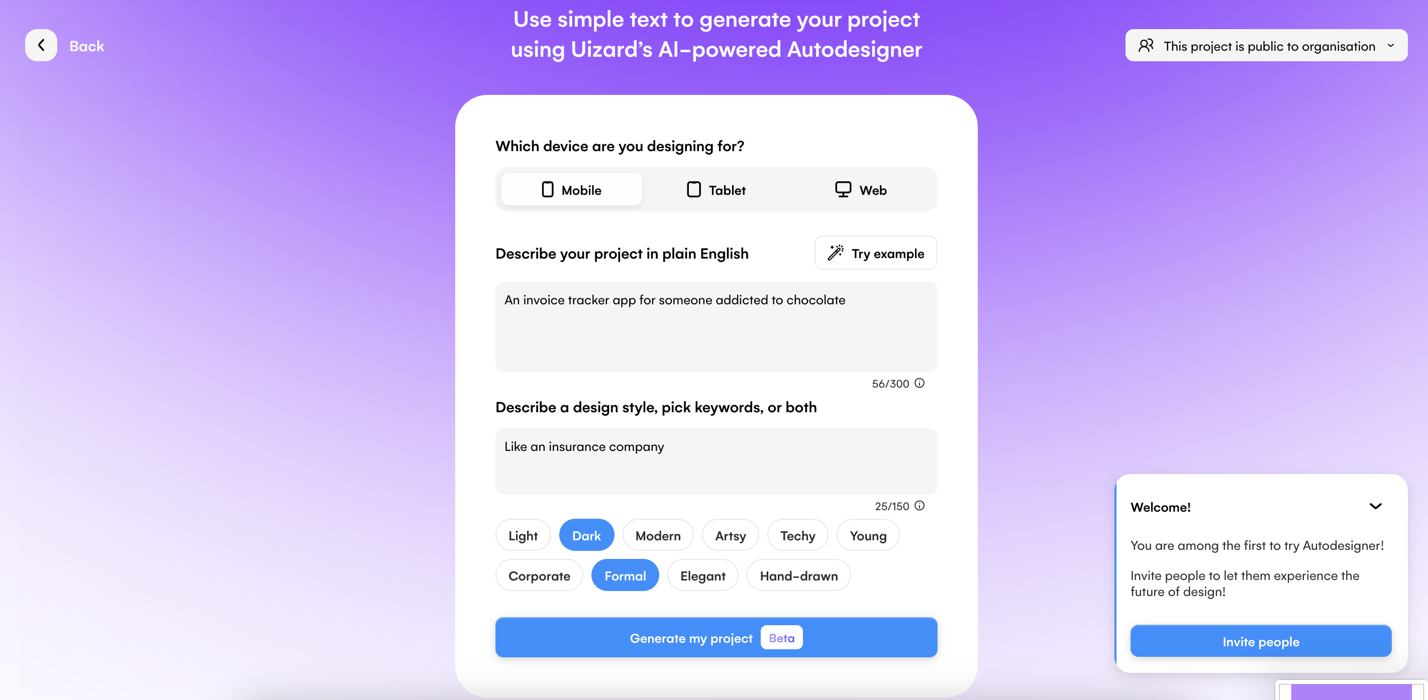
Simply select the device that you’re designing for, and describe your project. You can then describe a design style, pick a few keywords, or do both, to ensure that Autodesigner has everything needed to generate your design.
Skip to section:
What to expect from Uizard Autodesigner
5 AI generated UI design examples
2. Sci-fi movie streaming app design
3. UK hotel booking app design
4. Chocolate tracking app design
5. Charity donations web design
What to expect from Uizard Autodesigner
Every UI design generated by Autodesigner is unique, and tailored to the prompts provided. However, the steps you take before the generation process, and the results you can expect after, will share the following similarities:
Text prompts: Autodesigner will need a few things from you before it can create your UI design. You will need to input text prompts to describe both what your project is, and its design style. The more specific you are, the more specific the AI can be when generating your UI design.
Keywords to describe a design style: There are a few different keywords you can pick from to tailor your UI design even further. You can even skip the design style prompt, and just use keywords, or vice versa.
Several pre-built design screens: Each UI design will come equipped with multiple design screens featuring various components and elements. These can then easily be modified using the drag-and-drop editor, or through one of Uizard’s magic tools.
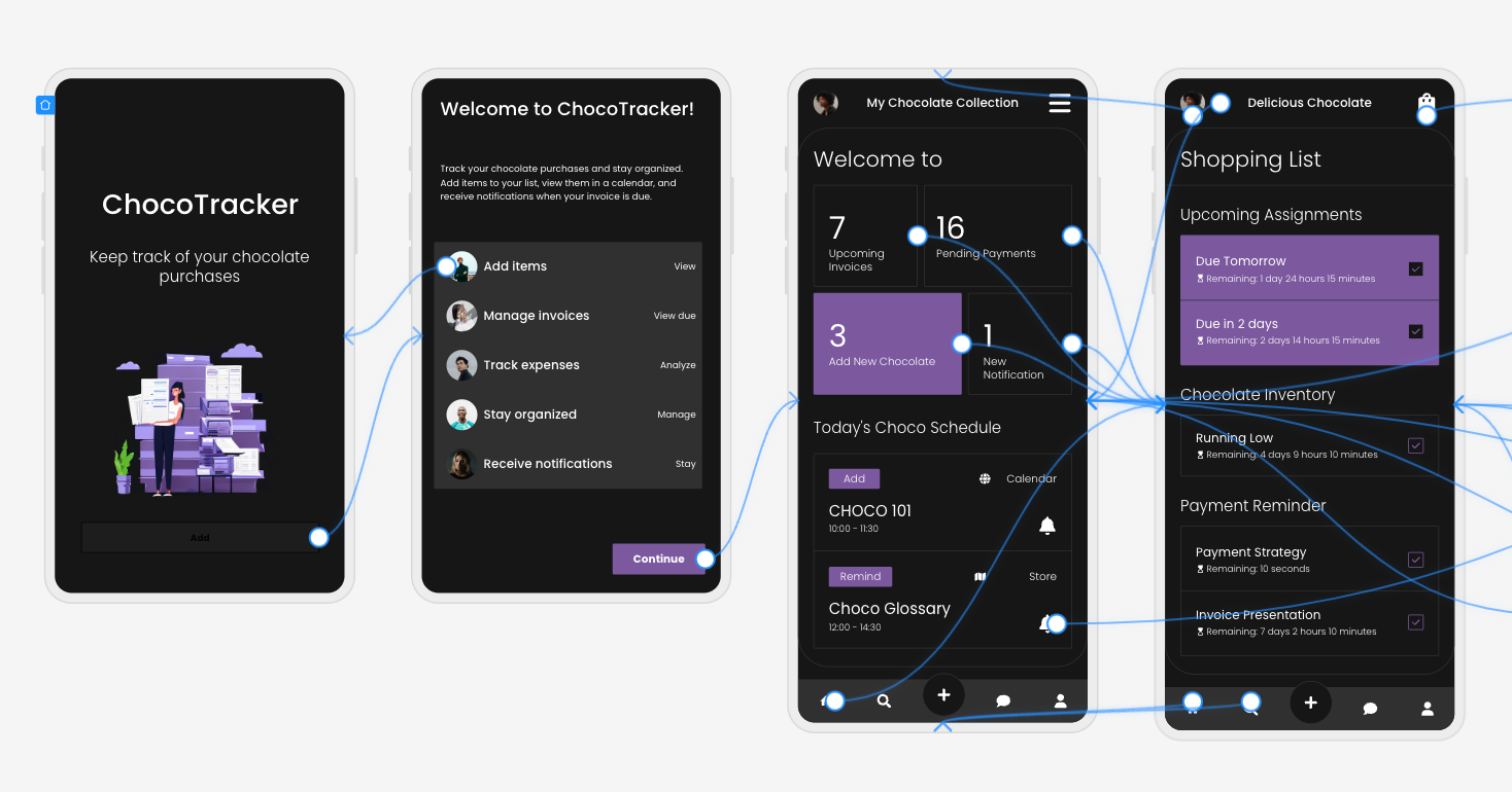
User flow mapping: Autodesigner will automatically link elements to other design screens to represent user flow. For instance, a ‘Sign up now’ button will be linked to a sign up page. This helps to show the user journey on your design.
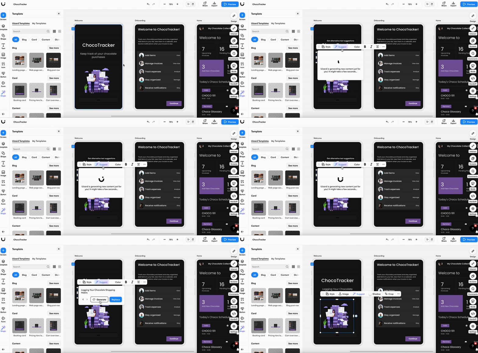
Text and image assistants: Auto generated text and images will be added to your design screens, and the results of this will depend on the prompts you have originally provided. If you want to change these, all you need to do is select the image or text and click ‘Suggest’ to generate more options. Or edit them manually.
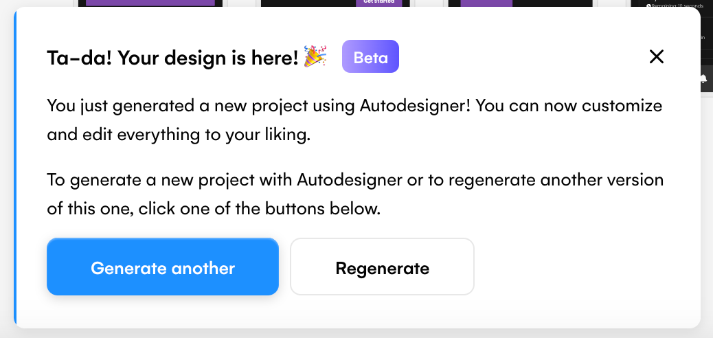
Regeneration options: If your design is not what you had envisioned, you can regenerate using the pop up message, or start again and generate a new design. (The message will look like the image below.)
5 AI generated UI design examples
You don’t need to be a professional designer to get amazing design results. Using a simple prompt you can take an idea and turn it into a fully-fledged design. To give you an insight into the magic of Uizard Autodesigner, here are five AI generated UI design examples.
1. Plant shop web design
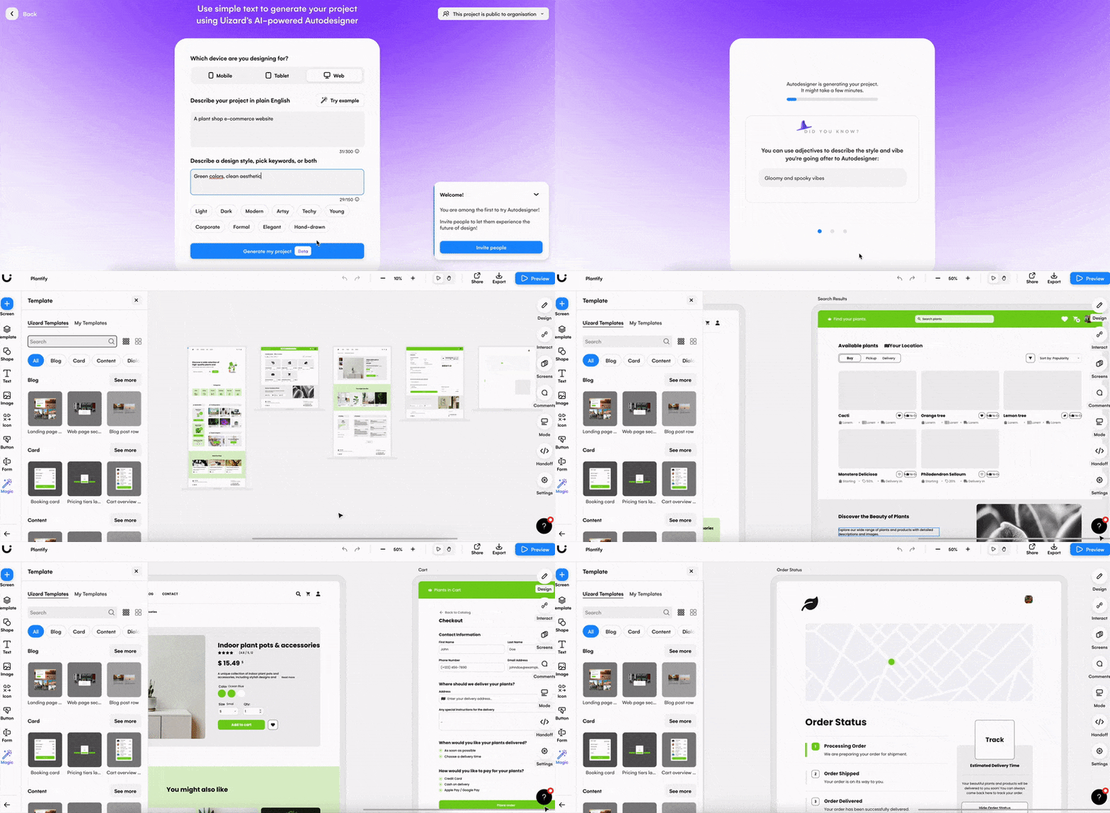
Device: Web
Description: A plant shop e-commerce website
Design style: Green colors, clean aesthetic
Keywords: Light, modern and young
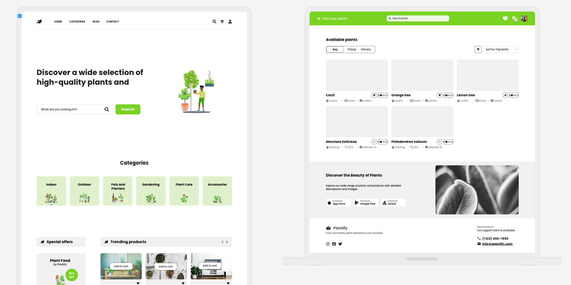
For this design, the idea was to create a plant shop web design. Once entering the prompt, and describing the design style, five screens were generated. They include a landing page, a search results page, a screen for product details, and more. For this web design, simple prompts were used, but you can of course use more detail when generating with Autodesigner.
As requested, the colors on the web design are green, and the overall aesthetic is very clean and bright. You will notice that snippets of text and some images are added into the design, and these can be kept as they are, or edited to better fit the design.
2. Sci-fi movie streaming app design
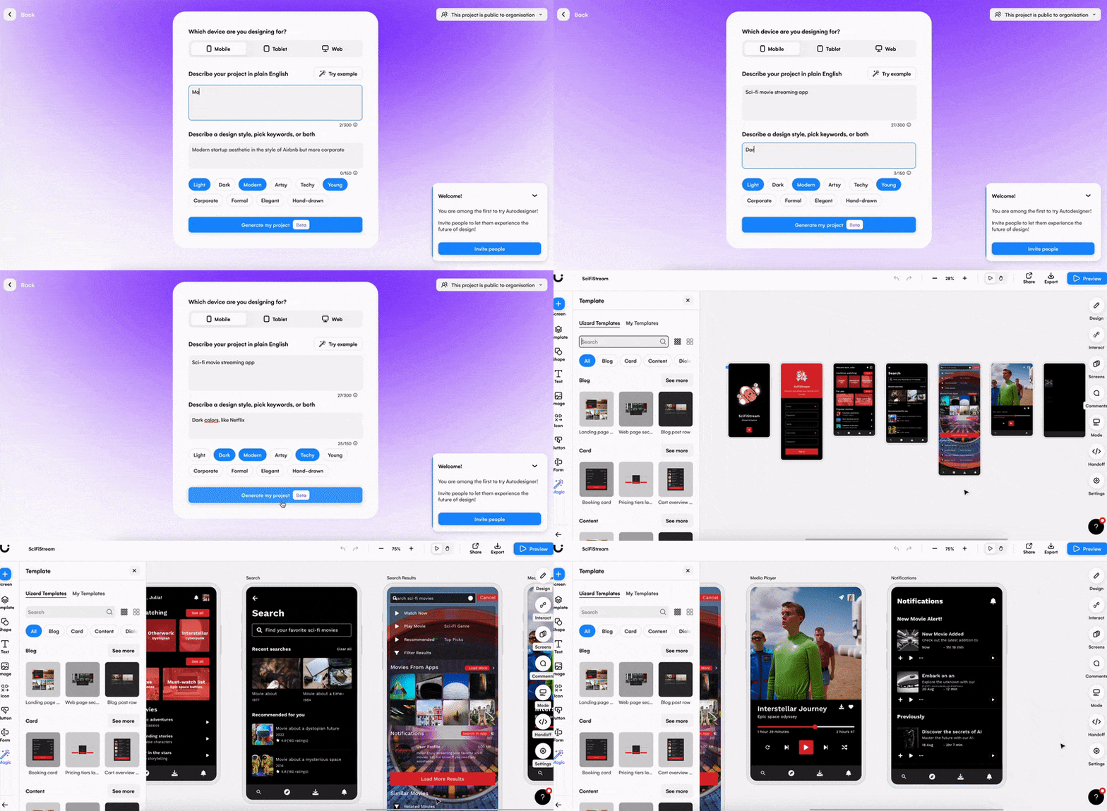
Device: Mobile
Description: Sci-fi movie streaming app
Design style: Dark colors, like Netflix
Keywords: Modern and techy
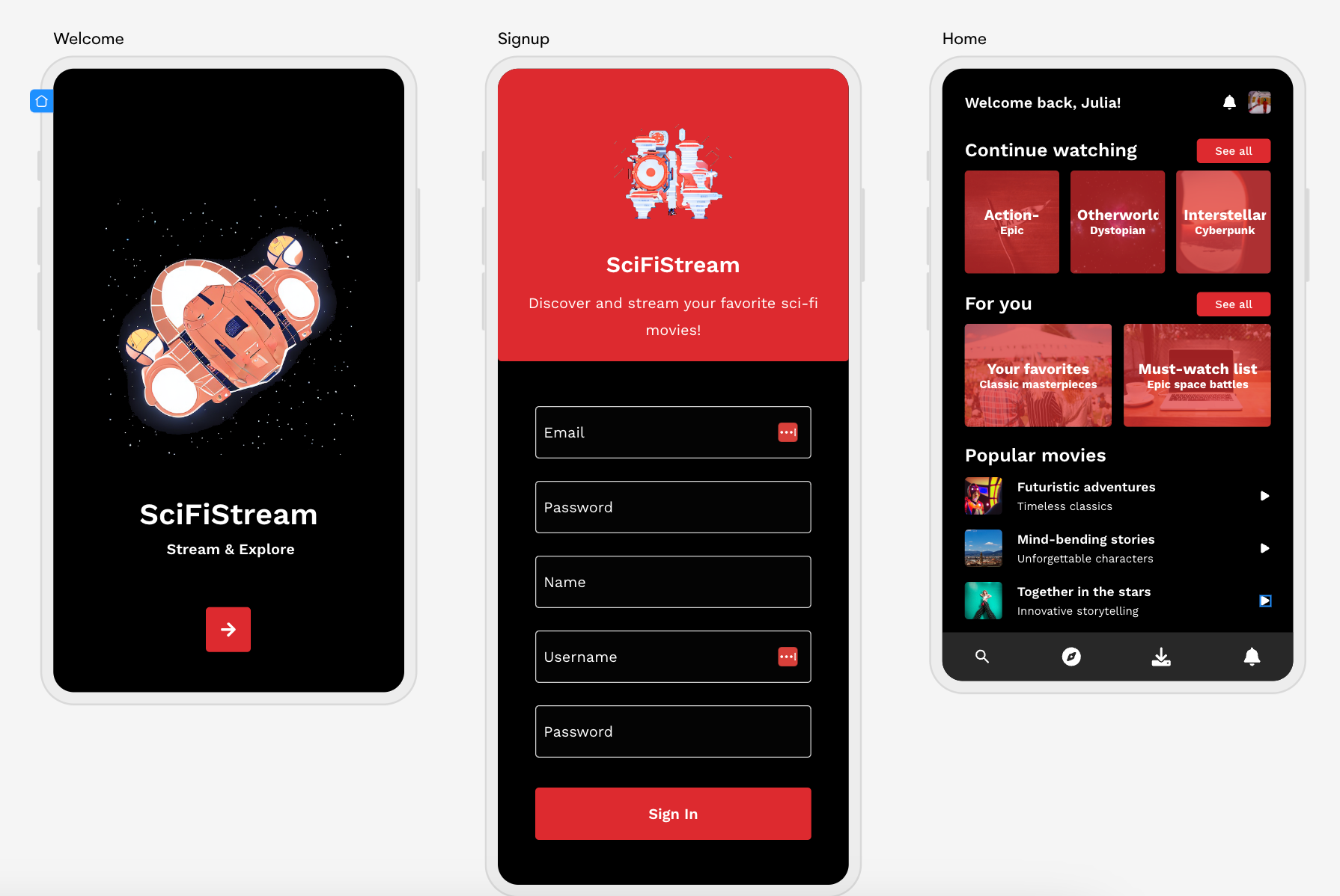
This next AI UI design is an app that gains inspiration from a popular streaming service, but is slightly more niche in its offerings. Think Netflix, but purely for sci-fi movies. SciFiStream has seven generated screens that can be used either straight out of the box, or edited using the drag-and-drop editor.
As requested in the design style prompt, this app design contains black design screens, with red buttons and icons, to fit the Netflix aesthetic. With auto generated text and images relating to the sci-fi genre, only a few simple tweaks are needed to perfectly suit the desired project.
3. UK hotel booking app design
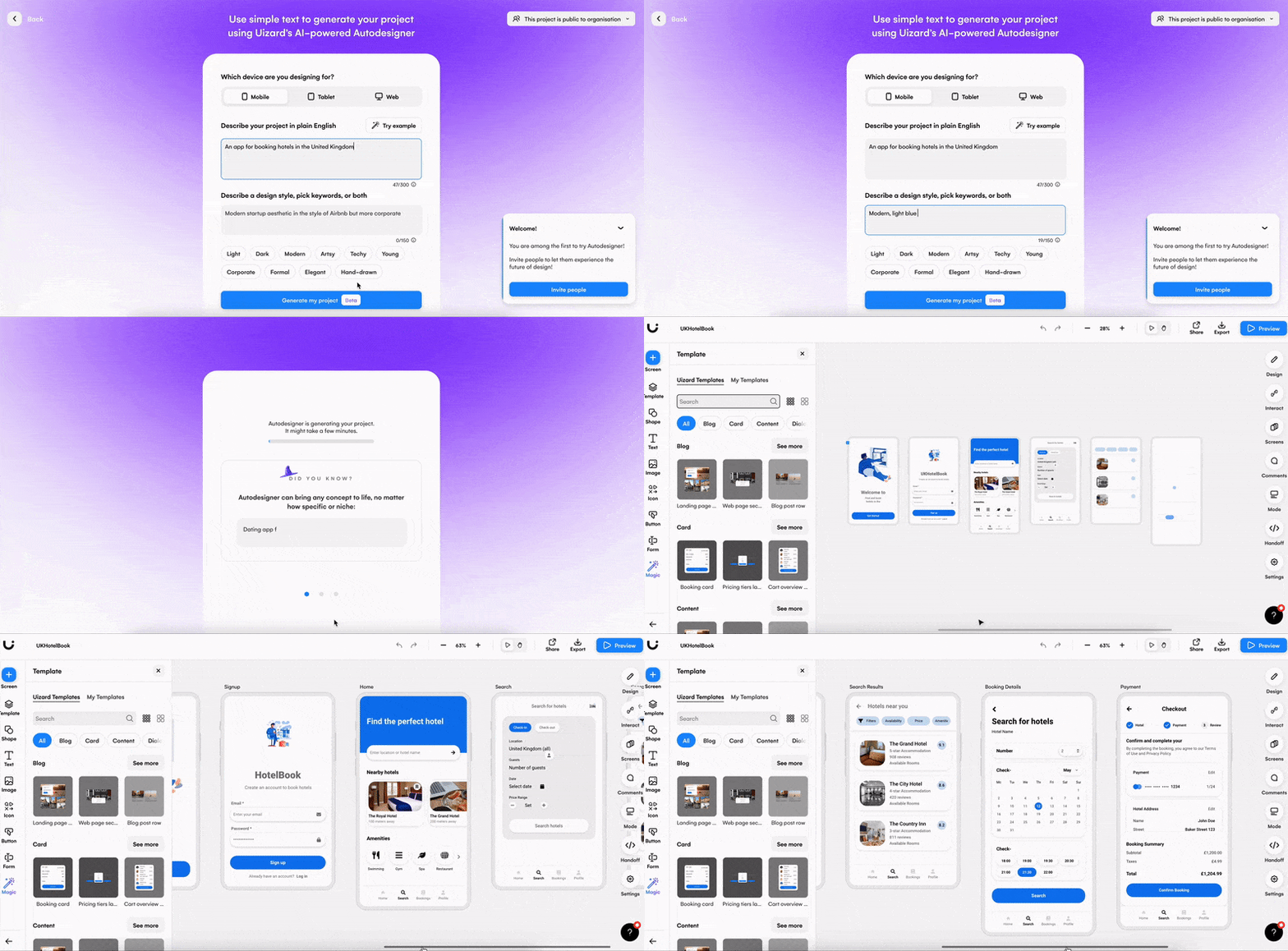
Device: Mobile
Description: An app for booking hotels in the United Kingdom
Design style: Modern, light blue button and icon colors
Keywords: Light and modern
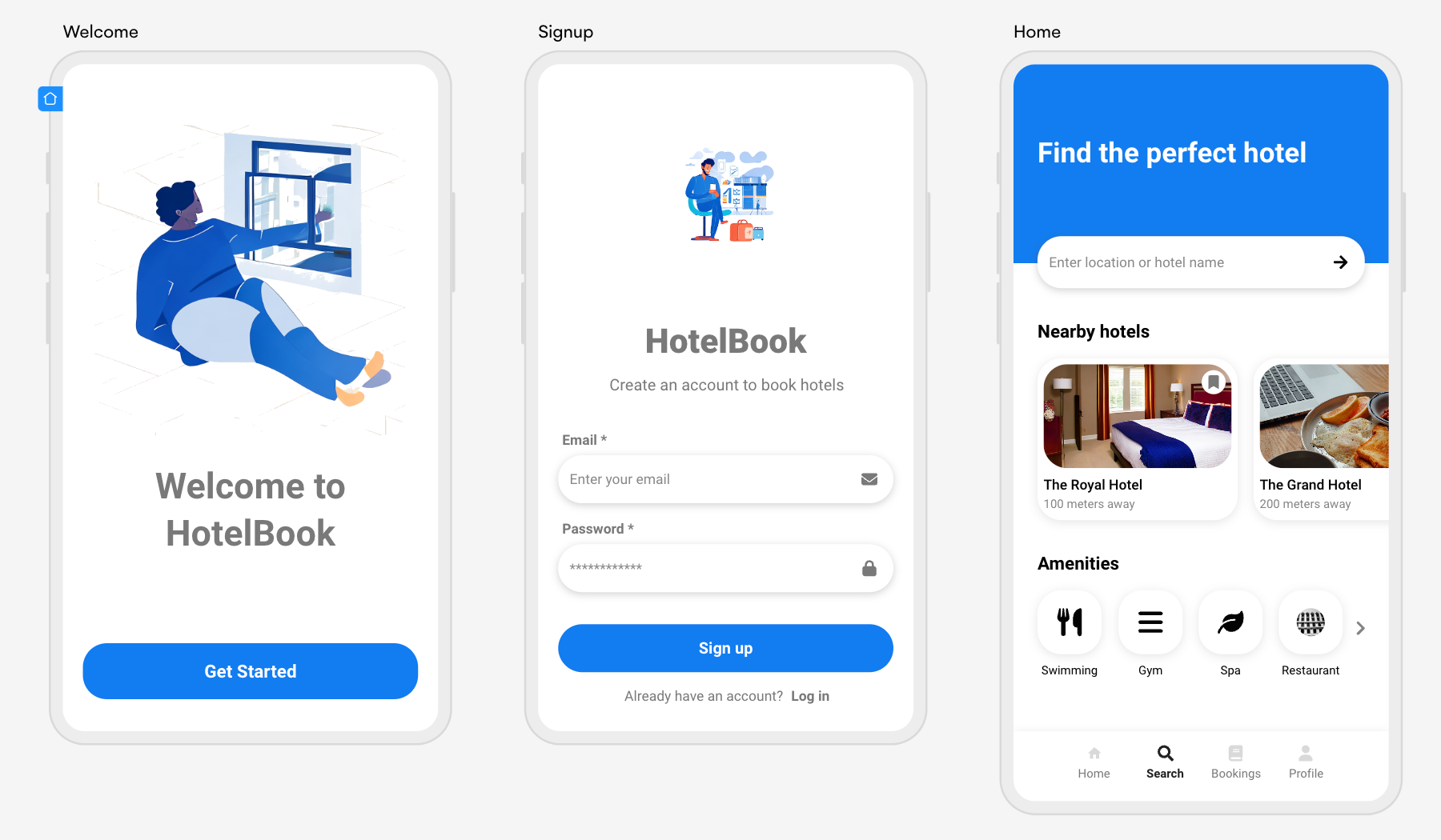
Ever feel overwhelmed by the choices of destinations on a booking app? With this Autodesigner creation a user can get information regarding hotels solely in the UK. Seven design screens document the user journey all the way from sign up, to booking and payment. With a pre-mapped user flow between design screens, it’s easy to test various user interactions on this design.
Using the ‘Preview’ function in Uizard, you can click through your AI UI design as if it were an interactive app. From here, you can make small edits to the user flow using the interaction mapping tool. To do this, all you need to do is click on an element, and select the lightning bolt icon next to it. This allows you to connect your element with another design screen to represent the user journey.
4. Chocolate tracking app design
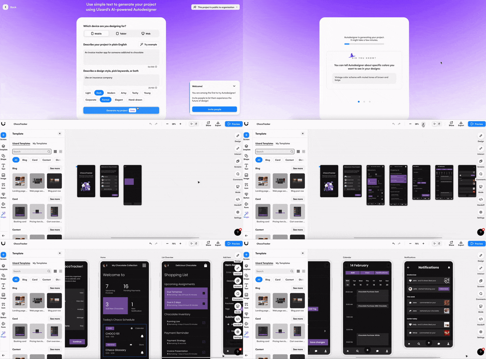
Device: Mobile
Description: An invoice tracker for someone addicted to chocolate
Design style: Like an insurance company
Keywords: Dark and formal
Stuck for ideas? Uizard Autodesigner has a handy feature that can auto generate ideas and design styles for you. Simply click the ‘Try example’ button on the Autodesigner screen to give it a go. Using this feature, prompts for a chocolate tracking app were implemented. For this particular design, the prompts were left as they are, but they can also be edited to your liking.
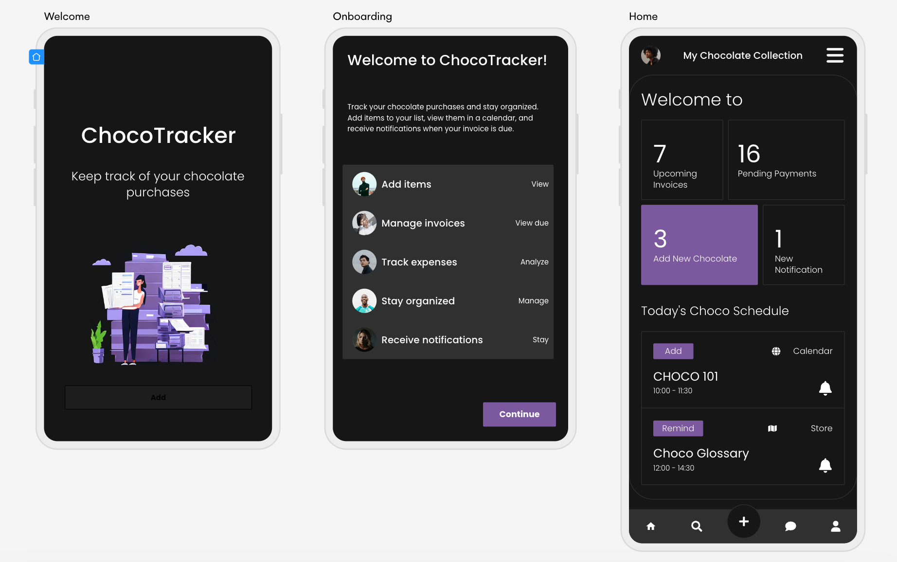
ChocoTracker consists of seven design screens, with a purple and black theme throughout. There is also text that relates directly to the topic. If you decide that this AI generated app design isn’t what you’re after, you can use the pop up message to regenerate the same design, or start from scratch with new prompts. This pop up will appear as soon as your UI design has been generated, so be sure not to close it.
5. Charity donations web design
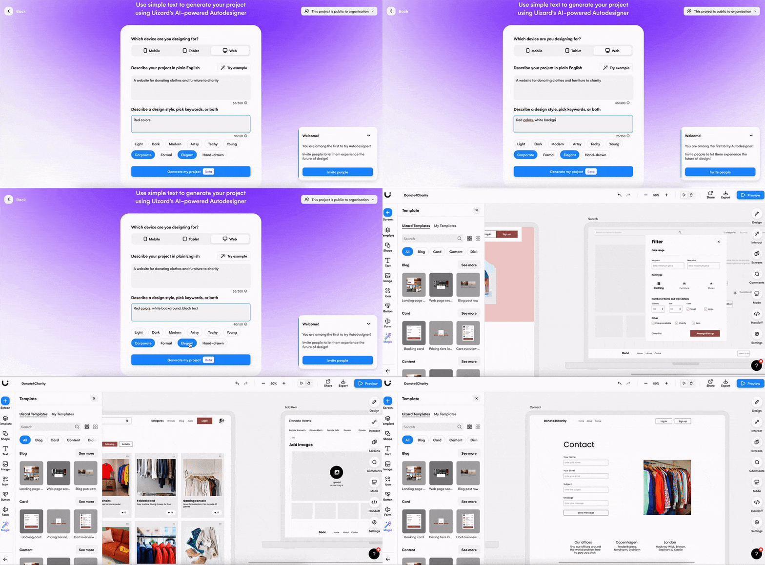
Device: Web
Description: A website for donating clothes and furniture to charity
Design style: Red colors, white background, black text
Keywords: Corporate, formal, and light
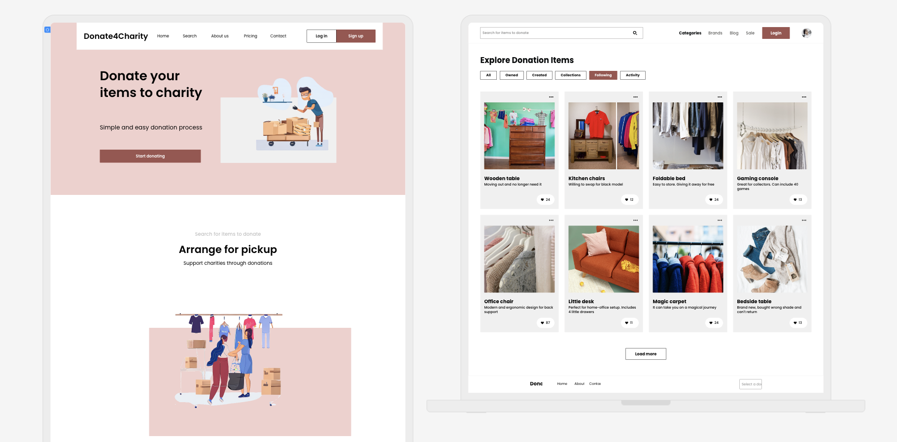
Allow users to donate clothes and furniture to a good cause with this web design. For this next AI generated UI design, the design colors described were slightly more specific, and Autodesigner created a design that matched perfectly. With a red theme throughout, and evenly spaced elements and components, this web design has everything a UI designer needs to get started with their project.
However, if you decide that you want to expand your Autodesigner project, you can add a new screen and design it from scratch. Select ‘Screens’ in the right control panel in Uizard, and then click ‘Add new screen’. From here you can drag-and-drop as many premade components, and singular elements, as you would like to create your new design screen. Your new design screen will be the same color as the other screens generated, but you can also change this if you decide to.
Looking for more Autodesigner information?
For an in-depth look at Uizard Autodesigner, including tips and tricks, check out the video below.
Interested in creating your very own AI generated UI design? Get ahead of the design curve and sign up to Uizard Pro to use Autodesigner today. For more articles like this one, check out our blog.
