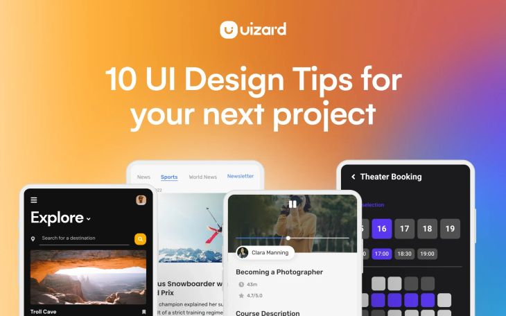
10 UI design tips for your next project
Without a really great UI design, not only would apps and websites be tricky to use, but they also wouldn’t look half as good. With the advent of easy-to-use, rapid design tools such as Uizard, UI design has opened its doors to the masses, and UI designers of all skill levels are having a blast creating app and website designs.
Whether you’ve been designing for years, or you’re just getting started, in this article we’re going to give you some helpful tips on how to produce user-focused, aesthetically pleasing UI designs.
Skip to section:
UI design tips for your next project
UI design tips for touch screen
Use these tips to create a UI design with Uizard
UI design tips for your next project
Design continuity across one device, or multiple devices, can be tricky to achieve. There will be variations in the way your web design looks on a laptop compared to a mobile browser. But it’s important for user experience that the usability, look, and feel of your UI design remains the same — no matter where a user chooses to access it.
With that said, there are a few UI design tips that can help to keep your users happy and your UI designs looking amazing. To give you the best overview possible, we’ve split our tips into four categories:
- Layout
- Touch screen
- Text
- Images
UI design tips for layout
The layout of your UI design is an important usability factor. Users need to be able to understand your design, navigate it, and most importantly, reach their end goal. Pre-made UI templates are a great starting point when designing and organizing a user-focused layout. However, for your design to live up to user expectations, there are a few UI design tips that you can utilize during the design process.
Ensure proper formatting
UI designs should be optimized to fit not only web but tablet and mobile devices too. No matter how great a UI design looks in web format, improper device formatting can hinder UX on both mobile and tablet.
Zooming or scrolling to access parts of a navigation bar, or to read extra sections of content, is a big no-no when it comes to UI design. Make sure that you check the formatting of your UI design across all device types, and that your design is optimized for various screen sizes.
Organize your layout
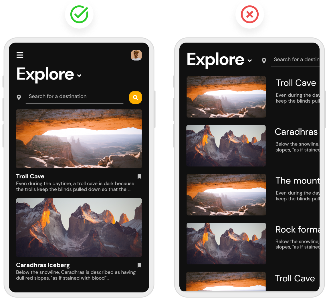
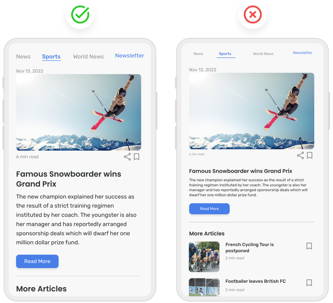
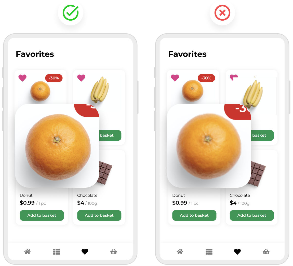
Content, images, and other UI components should be organized in an easy-to-understand layout. Placing relevant content and elements in the same proximity is one of the easiest ways to add continuity to the organization of your UI design layout.
Suitable alignment of components
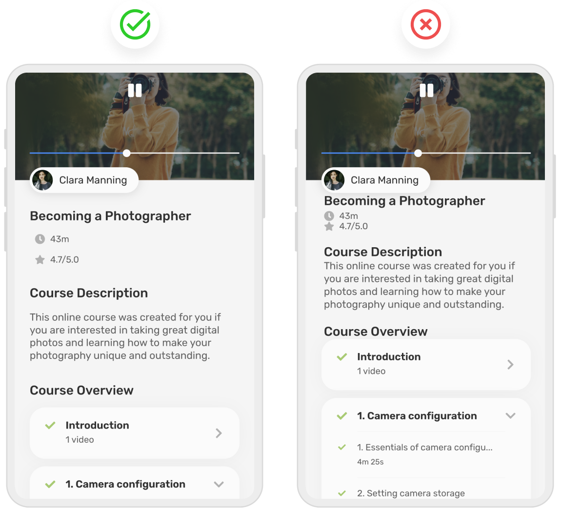
A strong UI design uses alignment to demonstrate the relationship between various components. For example, headings will typically be in line with their respective content blocks. The same goes for images and other UI elements. The purpose of alignment is to naturally draw a user’s attention from one area to another, whilst keeping a level of consistency throughout the rest of the design.
Struggling to perfect the alignment of your app or website? With Uizard you have access to a multitude of components from Uizard's UI components library. Once dragged and dropped into a design, you can use Uizard’s snapping guidelines to align components and elements with ease.
UI design tips for touch screen
When designing for mobile and tablet, as well as a select few laptop devices, touch screen optimization is key. This includes not only selecting the right elements and components to use, but also making sure that these controls are easy to click via a touch screen. To keep you in the loop, the next few UI design tips are all about designing for touch screens.
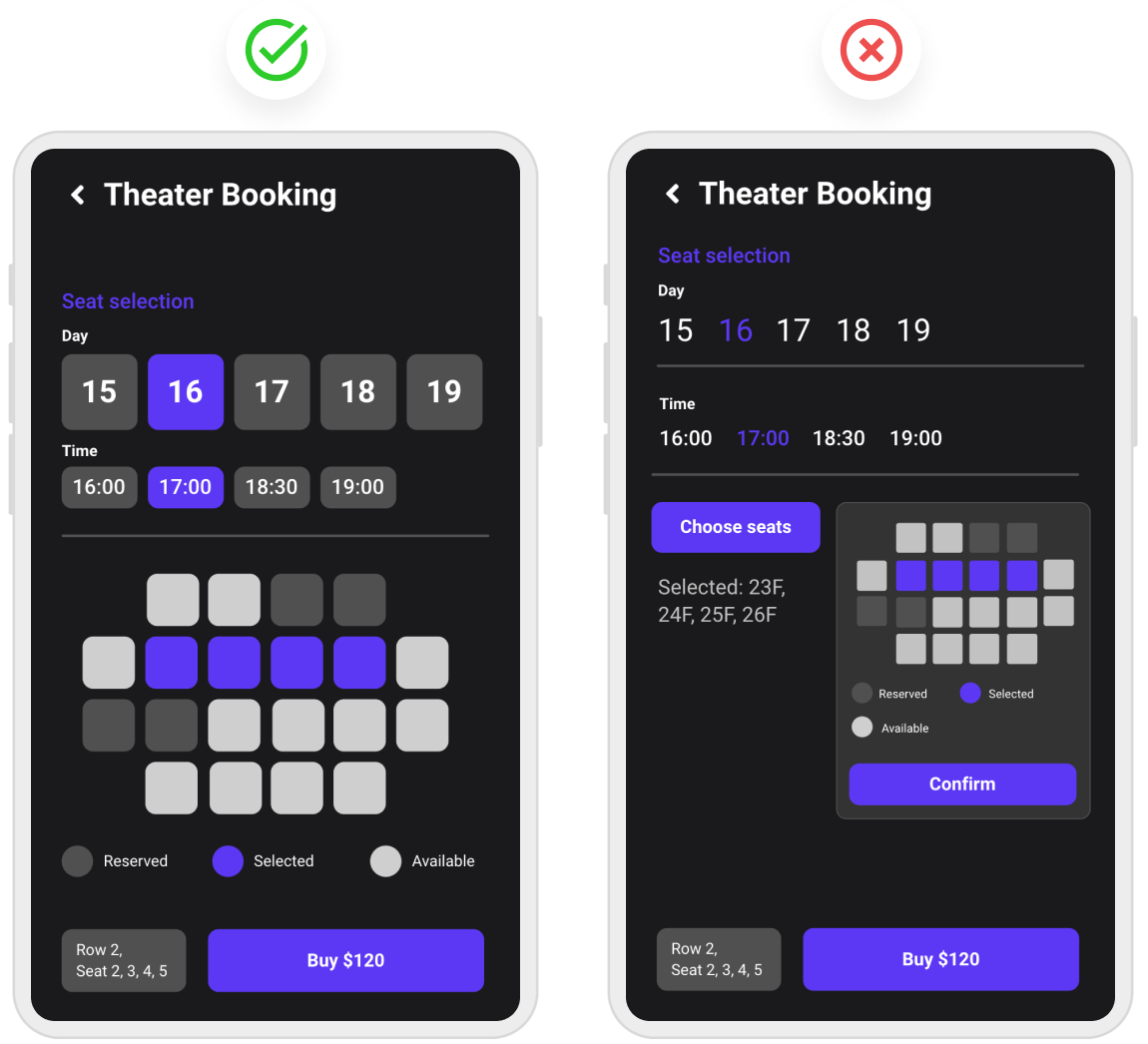
Choosing touch screen controls
With limited space, some UI design elements are more appropriate for touch screens than others, and these are the ones that you should be using in your UI design. Simplistic icon elements that are easy to click on and components that demonstrate scroll or dropdown options to minimize space are the preferred choices when it comes to apps that rely on touch.
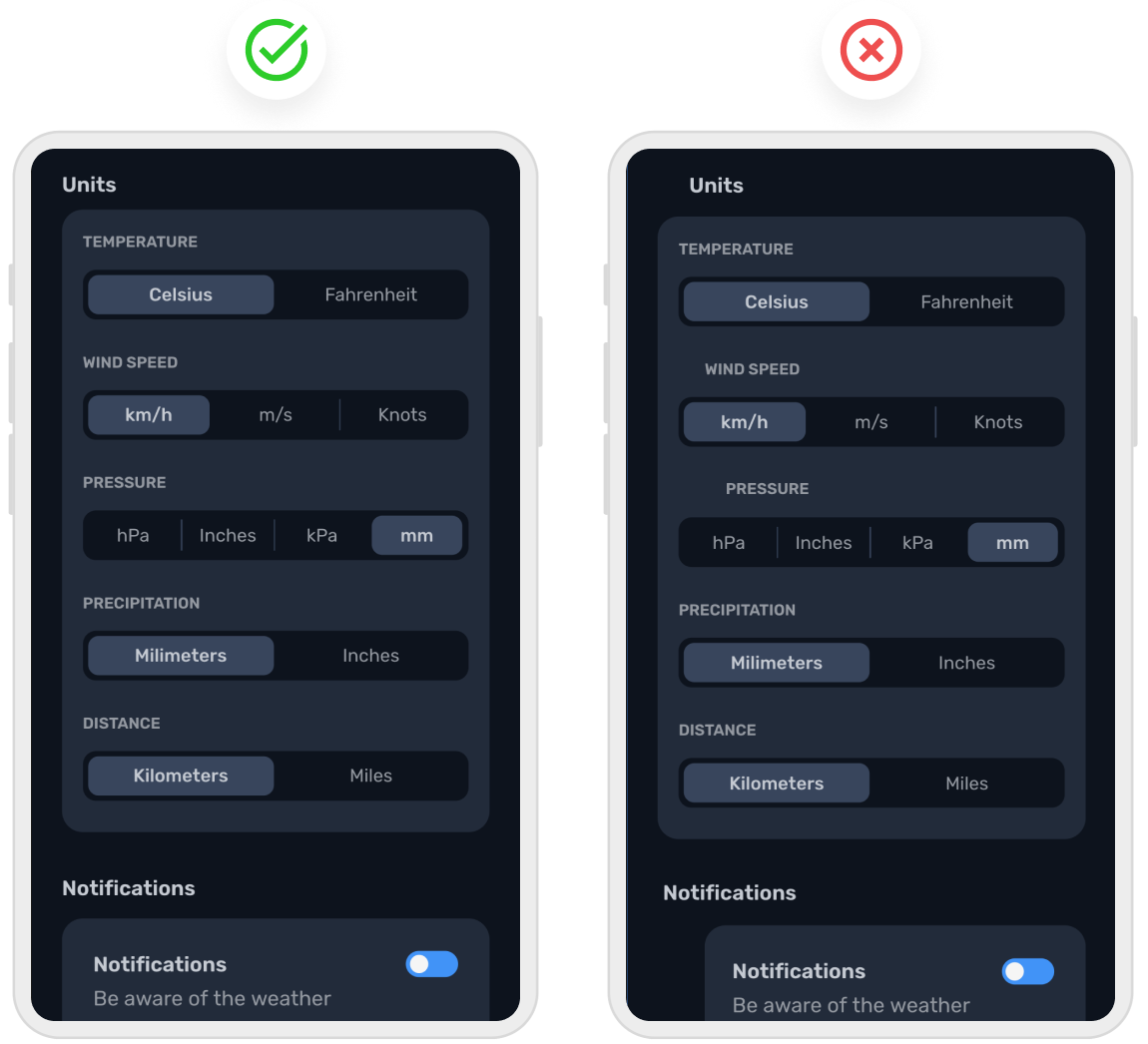
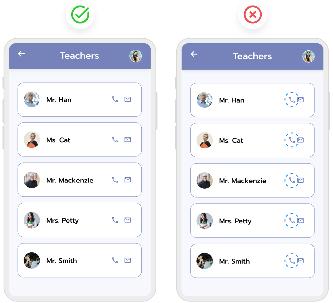
Spacing of touch screen controls
When users tap on touch screen elements they usually expect to select the one that they’re aiming for. That’s why touch controls need to be formatted and spaced properly, to prevent users from clicking on other sections. Spacing between icon elements needs to be substantial enough so a user doesn’t accidentally click on another element next to it. However, the spacing should not be so large that it throws your design off balance.
UI design tips for text
Ensuring that the content in your UI design is appropriately sized, spaced, and legible is important when conveying information to users. When text is small, squished together, or both, it makes it difficult to read. To help you get to grips with the text elements of your design, take a look at the text UI design tips below.
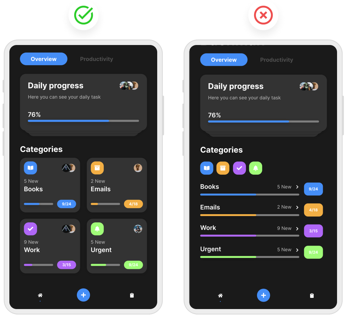
Readable text sizes
The text size of your UI design is important. Too small and it might be illegible, requiring users to zoom in to read it. Too large, and the content will look out of place. It’s important to get the right size of text on your design. Make sure to format your text accordingly depending on the device.
Text and background contrast
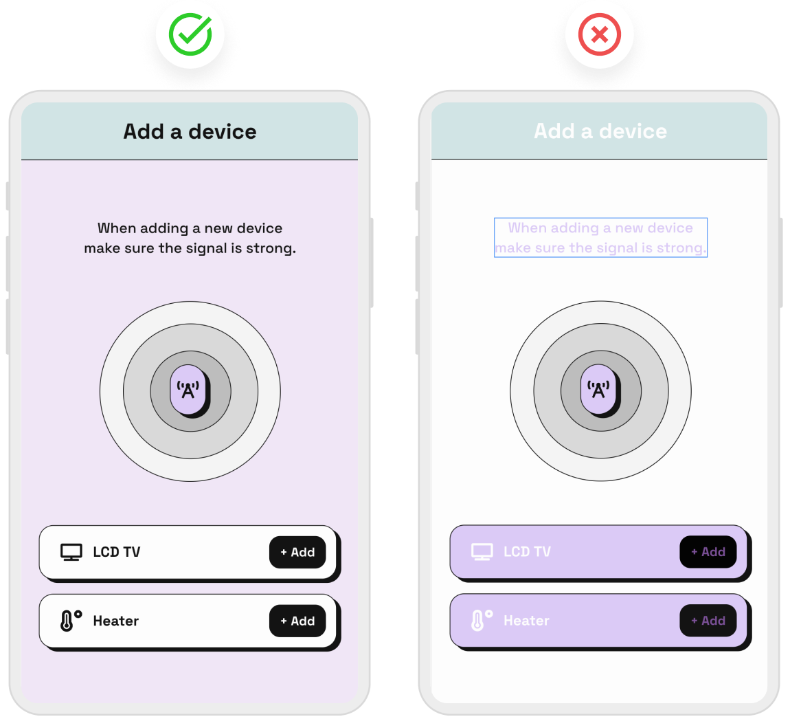
Although pink text on a purple background may seem like a cool idea, in practice — not so much. Text, icons, and other elements need to have an appropriate color to stand out against the background of your UI design. For a user to see the various aspects of your UI design, there needs to be a sufficient level of contrast. That’s why black text against a white background works so well — the text is super clear and easily comprehensible.
Correct text spacing
Leaving appropriately sized gaps between words, and lines of text may not seem like a big deal, but it is essential for the readability of the content in your design. Proper text spacing ensures that users can read content quickly and easily. Prevent text overlapping by enforcing regulated spacing in your UI design on all devices.
UI design tips for images
Visuals are an important part of a UI design, and this of course includes images. Choosing beautiful images for your app or site design is important, but if they’re not high quality or they don’t use the correct aspect ratio, you may run into some issues.
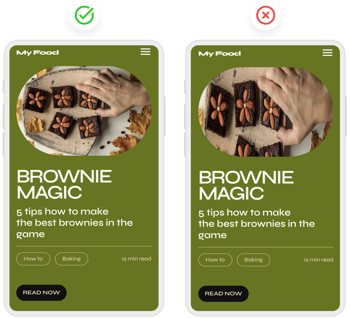
Only use high-resolution images
Every image in your UI design should be a high-resolution asset. Blurry images will not only look unprofessional, but they will also take the focus away from the other great areas of your design. When designing for various devices, ensure that image resolution is consistent across different screen sizes.
Avoid image distortion
Using the proper aspect ratio of an image is important if you want to avoid distorted pictures in your UI design. Make sure that your images are to the same standard across every device your UI design is accessible on; that means no warped or stretched images. Using resizing tools or editing your image to fit the specifications of your UI design is the best course of action to prevent image distortion.
Use these tips to create a UI design with Uizard
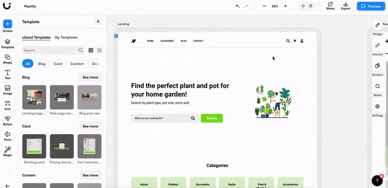
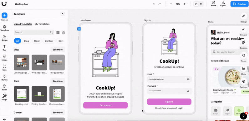
With these UI design tips at your disposal, kickstarting your own web or app design project has never been easier. With Uizard, you can start a project from scratch or you can use a pre-made UI design template to really fast-track your success. Uizard templates come with all the must-have components and user journeys built in, meaning you can use them as they are or adapt them in no time at all with Uizard's drag-and-drop editor.
Our cooking mobile app template, for example, comes with ten pre-made screens included. Once you open the template you can edit the color, style, and text of each component to make the design your own.
If you’re interested in learning more about all things UI design, check out our blog for more helpful articles like this one. Whether you’re an experienced designer, or new to the industry, with Uizard you can create wireframes, mockups, and prototypes quickly and easily. Sign up today to get started.