Wireframe vs. mockup vs. prototype: What’s the difference?
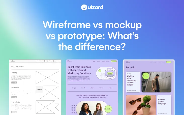
It’s possible that you will have heard the terms wireframe, mockup and prototype thrown around — maybe even interchangeably. Whether you know a little, or a lot, about the design process, one thing is for certain, each of these terms play an important role in the creation of a UI design.
So what do these terms mean? Wireframes are low-fidelity sketches of a website or app, mockups are medium-fidelity visualizations of a UI design, and prototypes present a high-fidelity final design inclusive of the user journey within a digital product. Don’t worry, this was just a quick overview, and in the next few sections these terms will be explored in greater depth.
This article will take a look at wireframes vs mockups vs prototypes, what the purpose is of each, how they compare to one another, and run through how Uizard can help you with each stage of your UI design project.
Skip to section:
Wireframe vs mockup vs prototype summary
Wireframe to mockup to prototype with Uizard
What is a wireframe?
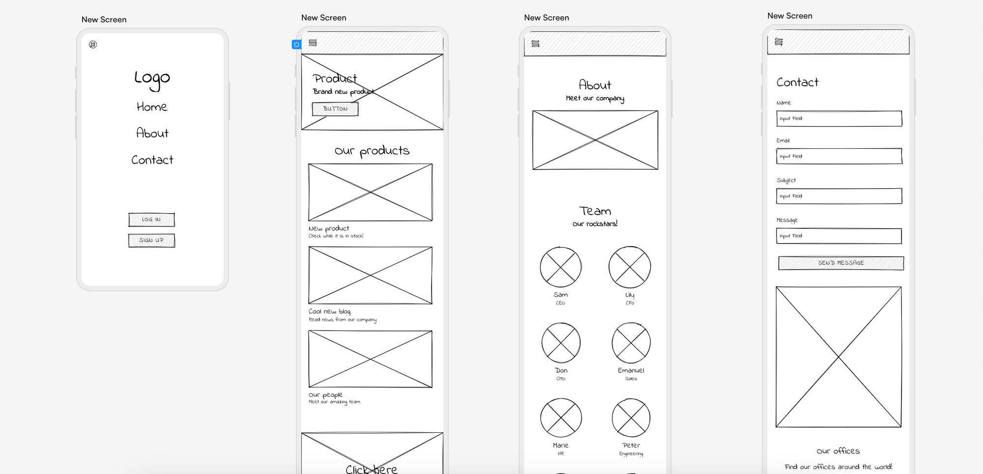
So what are wireframes? Well, a wireframe acts as a low-fidelity blueprint for UI designs such as websites and apps. They provide an outline of the layout and structure of one screen, or multiple screens, of a design. Wireframes are the first step in the design process, and every great website or app has most likely started out as a rough wireframe draft on a piece of paper.
Classified as low-fidelity, wireframes possess no colors, images or large chunks of text, and they are simply a sketch of a web or app page. These sketches are usually drawn by hand, but UI design tools such as Uizard makes online wireframing a possibility too.
With Uizard, you can switch on ‘Wireframe Mode’ that allows you to add low-fidelity components and elements to your screens, and also render your design as a hand-drawn sketch.
What is a mockup?
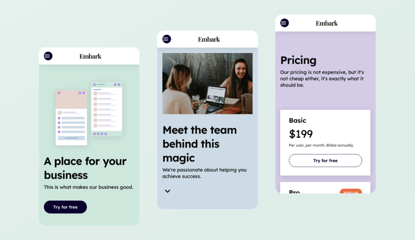
A mockup is a medium-fidelity visualization of a UI design, such as a website or app. With all of the aesthetic elements and components in place, including branding, color and typography, mockups are used to demonstrate how a finished product would look and feel. As the next stage in the design process, mockups incorporate the draft of a wireframe to build a visually appealing ‘mockup’ of a website or app.
As a medium-fidelity design, mockups are not used to show the interactivity of a digital product, and they act as a static version of a finished product. UI design mockups can be created from scratch on a range of design tools, including Uizard, or from a premade UI template.
For a deeper look at mockups, take a look at our guide to mockups.
What is a prototype?
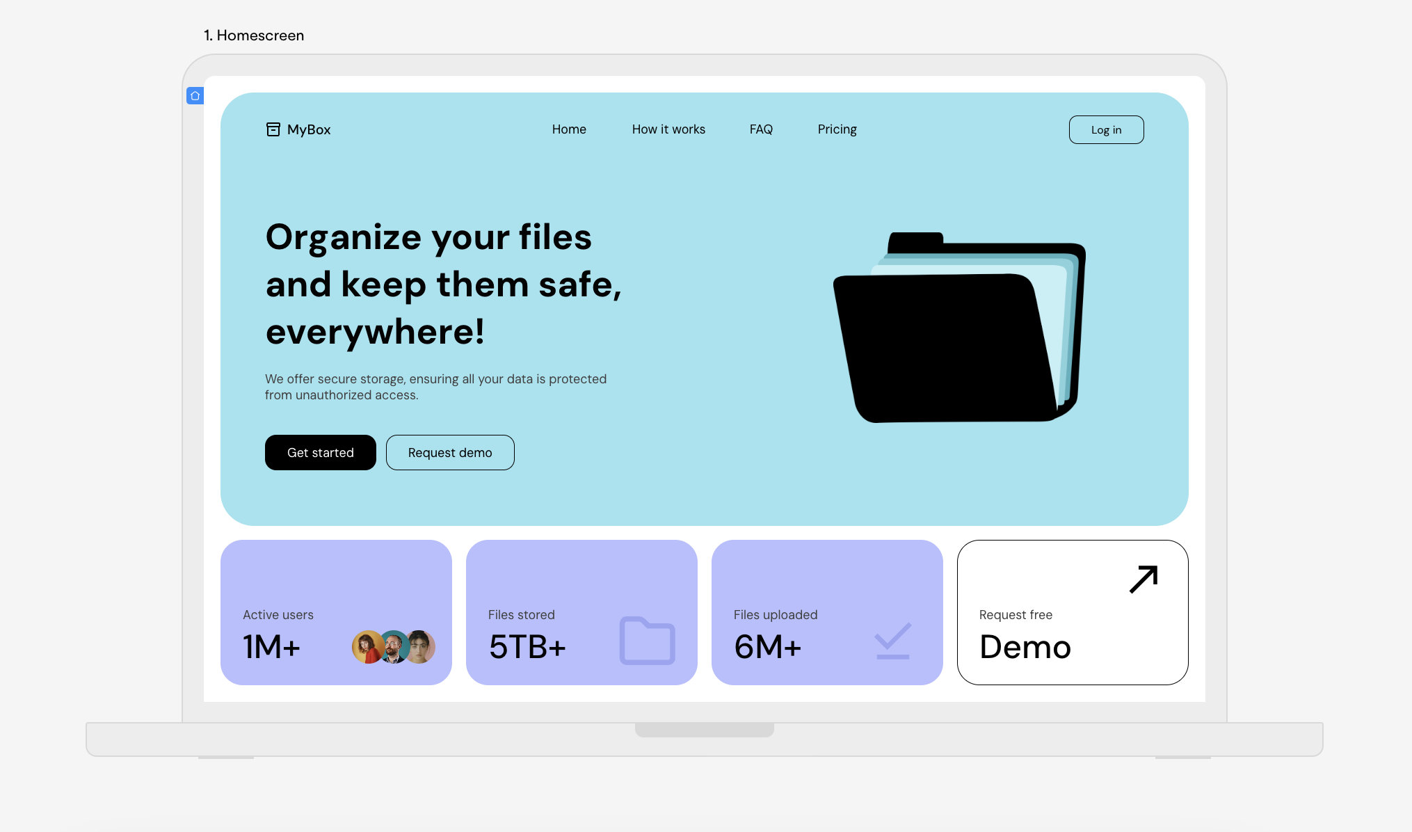
A prototype is the closest step in the design process to a finished digital product. Prototypes demonstrate aesthetics, and functionality, whilst showing how users would interact with a website or app. A step up from a mockup, prototypes have increased detail and are all about user flow.
As a high-fidelity design, prototypes can help in the ideation phase when gathering feedback, and are also great for testing user journeys before the final product is created. With Uizard, you can add interactions between the screens you have created and preview to see the user flow.
Interested in learning more about prototyping? Check out our in-depth guide to prototyping.
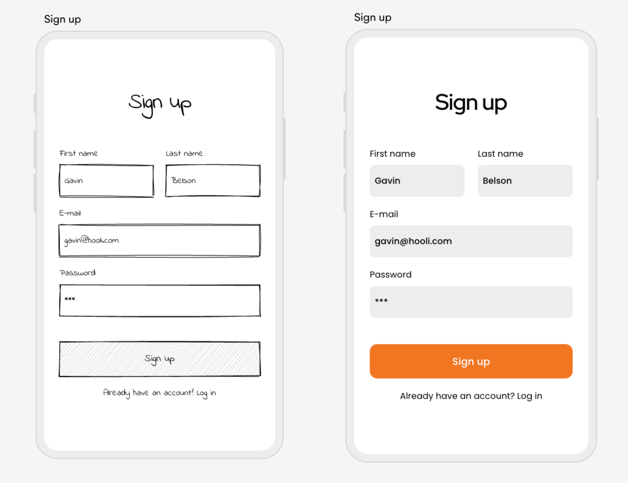
Wireframe vs mockup
Placing a wireframe and a mockup side by side presents some noticeable differences. More noticeable than say, a mockup vs prototype. As a wireframe is low-fidelity, they are just a rough sketch in comparison to a medium-fidelity mockup. With color, imagery, defined elements and components, a mockup stands out massively besides the monochrome appearance of a wireframe.
The reason for these visual differences is solely due to the varying purposes of a wireframe vs mockup. Whilst a wireframe is used to gather initial feedback about a potential design, and can go through several iterations, a mockup is a slightly more refined version of the design. With detailed elements and components, mockups are not too far from what a finished website or app may look like. However, without a doubt, designing mockups and wireframes are both key stages in the design process and are both equally as important.
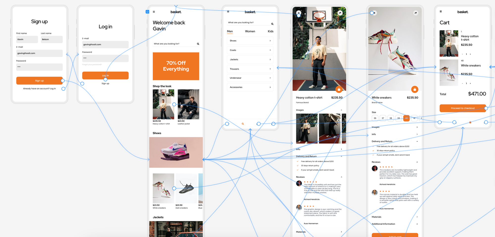
Mockup vs prototype
So, what is the difference between a mockup and a prototype? Whilst in appearance they may look similar, for instance they’re both visually close to the final product, there are slight differences. As prototypes represent the complete final design of a website or app, aspects such as content are much more detailed than on mockups. Large blocks of content are not usually found on mockups, but on prototypes they are essential in demonstrating exactly what a user would see on a UI design.
Despite having one purpose in common, which is to present a likeness of a digital product, a prototype goes one step further than a mockup. High-fidelity prototypes are used to show how a user would interact with a website or app, this means they focus on the user journey. Linking screens, components and elements together is beneficial for user testing and to iron out any issues before a design reaches development. Which is why a prototype is the final piece of the design puzzle.
Wireframe vs mockup vs prototype summary
Every step in the design process is valuable. Wireframes, mockups, and prototypes help you learn what’s working and what isn’t. And they allow you to try out different layouts, colors, components and elements. But their chief purpose is to start conversations with team members, clients, and users in order to ensure that your final prototype is perfect for everyone.
Below you will find a summary of the wireframe vs mockup vs prototype debate, and hopefully this will help to signify the part each of these terms play in the creation of UI designs.
| Wireframe | Mockup | Prototype | |
|---|---|---|---|
| Definition |
A sketch of the layout and structure of one screen, or multiple screens, of a UI design. | A visualization of a site or app, including aspects of branding, color and typography. | A more developed visualization of a UI design, showing user interactions between screens. |
| Purpose |
To collect feedback about design formatting and layout. | To demonstrate how a finished product would look. Detailed feedback is used to make adjustments. | To gain insight from user testing, and implement any final design changes. |
| Design fidelity |
Low | Medium | High |
| Elements and components? |
Outlines of component blocks and elements such as images and icons. | Detailed components and elements. Including snippets of text. | The final look, with blocks of content and interactive elements and components. |
Wireframe to mockup to prototype with Uizard
With Uizard you can easily speed up your design process. From wireframe to mockup to finalized prototype, every stage is covered. So whether you want to begin by importing a screenshot of your hand-drawn wireframe with Wireframe Scanner, editing a premade UI template with our drag-and-drop editor, or generating a fully-fledged prototype from a prompt with Uizard Autodesigner — you can do it all with Uizard.
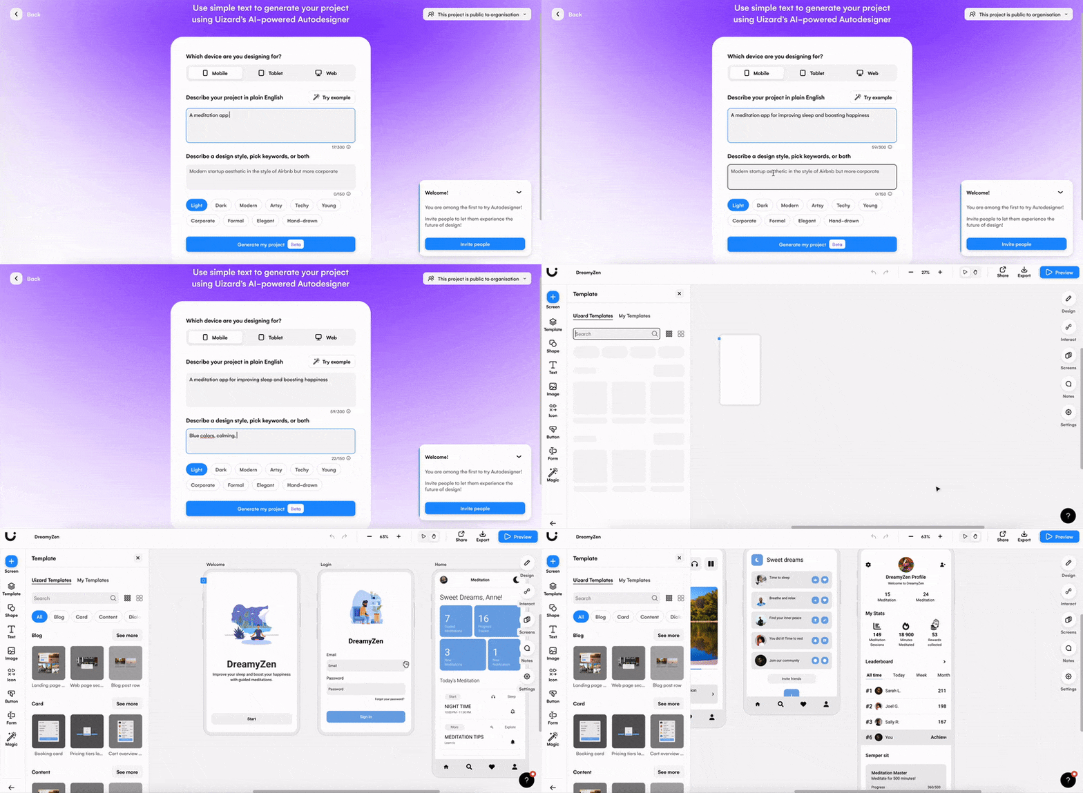
From wireframe to mockup to prototype, evolve your design every step of the way with Uizard. Sign up today to get started on your design journey. If you’re looking for more helpful articles, take a look at the Uizard blog.
