10 laws of UX you need to know

UX is a broad subject. Whether you are designing a website, app, or something else entirely, there are a huge number of considerations you need to be factoring in during early-stage design. So, how exactly can you ensure that you design products that are built for UX success every single time you work on a project?
A great place to start for any aspiring UX designer is with a clear set of guiding principles to help shape great UX design and maintain a catalog of best practices for future projects. This is where the Laws of UX come in.
Originally curated in the book Laws of UX, author and product designer Jon Yablonski cited 21 laws that every UX designer should be aware of when designing digital products, helping product managers, founders, and consultants alike to tap into the core psychological principles that govern great user experience.
In this article, we have picked out our top 10 UX laws that you need to know to nail your digital product UX every single time, with some bonus examples showing you how to leverage Uizard’s amazing AI tech to make difficult UX design a thing of the past.
Skip to section:
10 UX laws with practical examples
- Jakob’s Law
- Aesthetic-Usability Effect
- Fitts’s Law
- Law of Common Region/Law of Proximity
- Law of Uniform Connectedness
- Law of Prägnanz
- Hick’s Law
- Tesler’s Law
- Postel’s Law
- Law of Magic
10 UX laws with practical examples
Want to get ahead with your UX game? The following laws of UX are our top 10 that you need to know if you want to design thoughtful, considered UX with every project you work on.
Jakob’s Law
Design your app or website the way other apps or websites have been designed…
Jakob’s Law was originally coined by Jakob Nielsen, the director of the Nielsen Norman Group. The core premise is that users have expectations of what an app or website should look like and, as a UX designer, you should not stray too far from these expectations.
Essentially, what we are talking about here is designing for familiarity. If you create designs that conform to established models of how user interfaces look and feel, you are greatly reducing the cognitive burden on users to understand how your UI works. Great examples of this are commonly deployed UI features such as navigation bars, which have common placement across all websites and apps.
We’re not saying that Jakob’s Law excuses the need for innovation and experimentation, however, you should be catering to user expectations at a very basic level with the general structure and the interactive elements of your app or web design.
Uizard hack: Use Uizard’s Screenshot Scanner at the design prototyping stage of your project and turn the the framework of a successful site or app into an editable design screen.
Aesthetic-Usability Effect
Sites or apps that look great are assumed to perform well.
First impressions matter. As far as the user is concerned, if your app or web design looks visually appealing then it is more likely to function and perform well.
This has even been tested in scientific studies. How visually appealing a design is can significantly improve user first impressions, but it can also encourage them to appraise your app or website more favorably from a usability point of view. This isn’t an excuse for having poor UX or bad UI design, however. With a clear correlation between visual appeal and user interest, your design needs to consider form and function equally.
Uizard hack: Use Uizard UI design templates to fast-track your design project. Uizard templates are made by designers and come with all the main UX considerations baked in giving you a real head start for mastering UX design.
Fitts’s Law
Ensure the primary target action of your app or website is always easily accessible to the user, thereby reducing the legwork the user has to do to complete the action.
Fitts’s law was coined by psychologist Paul Fitts, who stated that usability increases by making sure interactive elements are always visible and easily accessible. Here are some examples of how you should be considering Fitts's Law in your UI design:
- CTAs should be large enough for users to click, which can be supported with adequate whitespace around the element
- Action elements (whether that be CTAs, interactive visuals, or form data) should be separate from other elements in the user interface
- These elements should also be clickable anywhere so it’s easy to carry out the action
- The elements should always be within user reach (head over to the Screenshot Scanner page and check out how the main nav with the ‘Log in’ CTA freezes during scroll to ensure the user always has access).
Uizard hack: Use Uizard’s smart sharing feature to share your web or app prototype with prospective users for valuable feedback. You can gather qualitative data on specific user journeys and actions to get an understanding of how your design might function out in the wild.
Law of Common Region/Law of Proximity
Users will cognitively group elements that sit next to each other with a defined boundary/Users will also mentally group together elements or objects that are positioned closely together.
When users open an app or visit a website, they quickly group sets of elements on a subconscious level. This can occur when objects share a defined space (like products on a carousel block) or when they sit next to each other on the page (such as navigational elements presented in a uniform list).
Bearing this in mind when you create your web or app design can be a great cognitive hack to reduce friction for your users and ensure they are seeing the true value of your product. In practice, you should think about how you draw the attention of your users when they visit certain areas of your UI.
Uizard hack: Use Uizard’s AI-powered Attention Heatmap on your prototype to understand where a user’s focus will be drawn when they interact with your design. From this, you can ensure you are clustering elements appropriately to reduce issues.
Law of Uniform Connectedness
Visually connected elements are perceived to have similar purposes and intent, more so than non-connected elements.
According to the Law of Connectedness, visually similar items or elements are more likely to be appraised as semantically similar by the user.
Imagine for a moment you have multiple CTAs across the landing page of your app design. You might have a navigational CTA, a banner for sign-up, specific CTAs for editorial content, and a CTA for secondary landing pages. Now imagine that each of these CTAs are different shapes, sizes, and colors. In this example, you would be greatly increasing the cognitive burden on users to discern what specific elements do and how to interact with them to the point where it might not be clear which elements are CTAs and which are not.
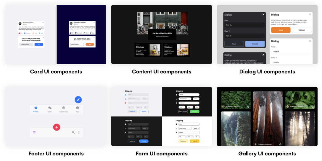
Uizard hack: Utilize Uizard’s vast UI components library to ensure uniformity across all your component types. Once you have settled on a specific shape and color styling for a CTA type, for example, ensure you maintain that cadence throughout your design.
Law of Prägnanz
Users interpret complex designs in simple forms to reduce the cognitive burden.
In layman’s terms, simplicity trumps complexity in UI design every single time. In practical terms, if your design is overly complicated, you are going to be looking at muddled user journeys across your app or website that boost bounce rate, not conversion rate.
Uizard hack: Check out our UI design fundamentals guide to getting the basics right. If you find yourself straying into the territory of increasingly complicated UI design then remember, every design choice should be made with a user-first approach. Why, you ask? Let’s take a look at Hick’s Law to find out why.
Hick’s Law
If your app UI contains too many choices or choices that are too complicated, this will reduce the chance of the user making the right choice (or any choice at all for that matter).
Created by psychologist William Edmund Hick, Hick’s law states that overwhelming your users with a litany of choices or presenting them with confusing choices is not just bad UX, it will also reduce the chance that your users will make a decision at all. Again, it comes down to the cognitive burden your UI places on the user, you should be making life as easy as possible for them, not more difficult.
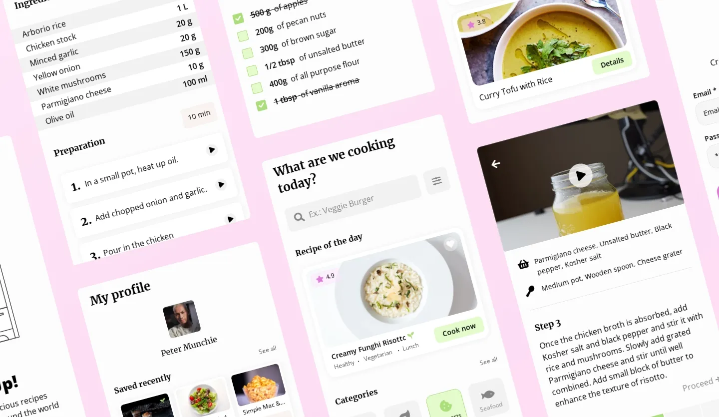
How you get around the issues of overwhelming your prospective users will come down to the type of app or website you are designing. If you are creating a dating app design, for example, you need to think about what your core user journeys are and how you are going to signpost them appropriately throughout your design. Check out our dating app template below to see this in practice.
Uizard hack: Explore our library of app templates which come with all the core UX considerations baked in.
Tesler’s Law
There is a certain amount of complexity in any system which should be accounted for
Tesler’s law serves as a sort of counterpart to Hick’s Law, stating that a certain amount of complexity is inherent in any system, therefore, in the world of UX design, the goal should be to reduce complexity where possible for the user.
A common example of this is particularly prevalent in the world of SaaS, where apps often include onboarding flows that guide the user through their first steps of using the software. This circumvents the issue of complexity potentially putting users off i.e., the complexity is necessary but the cognitive burden on the user has been mitigated through the use of tutorials.
When it comes to other areas of design, however, you might also find complexity in user flows i.e., how you get the user from point A to point B, whether that be purchasing items in an ecommerce store or creating playlists in a music streaming service.
Uizard hack: Try sharing your prototypes with both internal and external stakeholders to test your core user flows. Based on feedback, you can streamline the most important ones and remove any user flows that don’t serve a clear purpose or add unnecessary friction to your UI. You can also test your user flow using the preview function and click through your design as an interactive prototype.
Postel’s Law
Don’t be too restrictive with what you ask from your users.
Postel’s law, also known as the robustness principle, includes two core principles. The first is to be flexible with what you ask from users, the second is to ask for limited information from the user.
Essentially, you need to allow for a wide margin of error from your users when it comes to interactions, data input, or indeed any action within your UI. The classic example of Postel’s Law is form data during sign up. Only aim to make vital data points such as the user's name and email non-optional. Any non-essential data points should be left as optional to reduce friction and user frustration.
Law of Magic
Automate your design choices with the magical power of AI to create UX perfection with every single project you work on.
Ok, so we kind of made this one up, there is no Law of Magic, but the core principle is sound. If you are a founder designing your SaaS app for an emerging niche, be sure to remove unnecessary complexity for your users by making use of Uizard’s AI design features.
Whether you start from scratch with your web or app design or use a Uizard template as a launchpad, Uizard’s AI features will ensure you are eliminating a lot of the common UX/UI issues you commonly see out in the real world. You can generate text using Text Assistant, import screenshots of tried and tested websites or apps with Screenshot Scanner, you can even generate a UI design from a text prompt with Uizard Autodesigner!
Uizard hack: Isn’t it obvious? Sign up to Uizard and join the magical design revolution!
UX design made easy
Ready to perfect your UX design? Uizard is here to support you through the design process, ensuring that you craft fantastic UX during wireframing, functional prototyping, and iteration of your design ideas. Uizard’s drag-and-drop editor is super easy to use. Simply drop premade UI components onto your screens, add user journeys with a click of a button, and transform how your design looks with the power of Uizard’s AI Theme Generator located in the widget at the bottom of the editor.
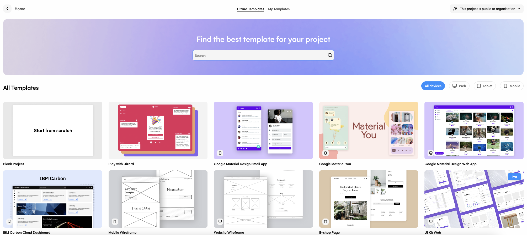
Want to get ahead with your design project? Our library of UI templates includes a whole host of fully fleshed-out mobile apps, web apps, and website mockups that will supercharge your design flow with built-in considerations around UX elements and best practices. For example, if you are designing a social media app for mobile, you can simply open the template, update it to suit your own design aesthetic and branding, and move the design on to a developer for build. It really is that simple!
Want to learn more about the world of design? Head over to the Uizard blog where we discuss everything from design strategy to the application of AI in the design world. Got a design in mind? Sign up to Uizard for free and bring your idea to life in next to no time.