Android app design tips

Designing an Android app is arguably one of the more complicated app designs. This is because, unlike iOS apps, Android apps can be used on a large variety of mobile devices — any that have access to the Google Play Store. Which means that varying screen sizes can make it difficult to define app design parameters and dimensions.
It’s important for user experience that your Android app design is adaptable and can be used on different mobile devices. Following Android’s key metrics and guidelines will help you to achieve this. To ensure that your Android app design is created thoughtfully, and with the user in mind, this article will guide you through a set of top app design tips.
Tips for designing an Android app
Android has lots of useful resources for app designers looking to design a mobile app for their platform. Android’s UI design guides contain lots of useful content for both beginners and those looking to upgrade their app design knowledge.
In the following sections, inspiration from Android’s design guides has been incorporated into 10 app design tips that will help to improve your mobile UI design.
1. Use system bars
2. Color consistency
3. Use color to design an accessible app
4. Color themes
5. Practice layout basics
6. Pick a clear layout option
7. Use a variety of elements and components
8. Don’t overcrowd the navigation
9. Reachable and tappable elements
10. Spacing, sizing and alignment
1. Use system bars
Within every Android app design, you will find system bars, and these are made up of two components: the status bar and the navigation bar. The status bar displays system icons like the time and battery level, whilst the navigation bar provides a way for a user to navigate the app.
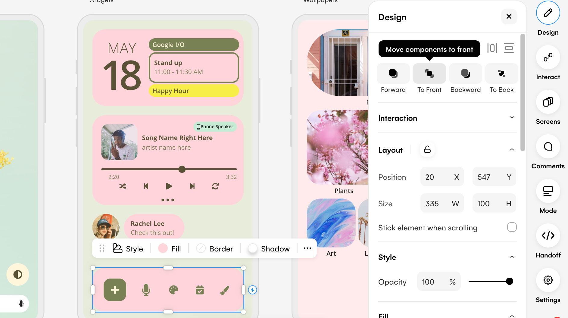
Android advises to keep these system bars as a top layer in your app design. Designing in Uizard makes this easy. Just select your pre-designed system bar, and use the controls at the top of the right design panel to bring it to the front.
To make sure that these bars don’t take away from your design, you can make them transparent so as to blend in. Otherwise, a solid color that matches your Android app design aesthetic works too.
2. Color consistency
Sticking to a palette of colors throughout your app design is a must. It helps to relate colors to actions, for instance using pink for each of your buttons notes to users what to expect when they see this color. It also just makes your design look more consistent when there is a set color scheme used throughout.
With Uizard as your app design platform, you can easily generate color palettes with the in-app color generator. Simply select an element, click on ‘fill’ and then opt for the generator option. Using a simple prompt you can generate color schemes that you can use throughout your app design.
3. Use color to design an accessible app
Color choices are not only important for aesthetic purposes, but they help to create accessible designs too. People with color blindness have difficulty with the readability and navigation of app designs that lack contrast. To prevent this, stay away from using color tones that are similar to one another in your Android app design.
Another thing to note is that the colors you pick may not look identical on one device compared to another device. The hues and tones you opt for may be slightly lighter, or darker, so factor this in to optimize your app design for accessibility.
4. Color themes
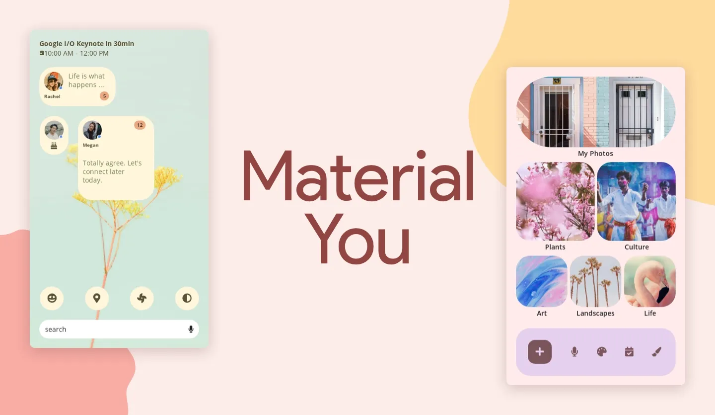
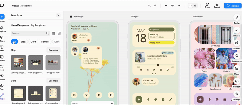
As with most mobile devices, themes are common practice. They give users a personalized app design experience, and most devices offer either light or dark themes, but Android offers its users one step further. User-generated color themes use dynamic color to apply colors from a user’s wallpaper to their apps — which first started with Android’s Material You. Make sure that your app design supports theme changes appropriately.
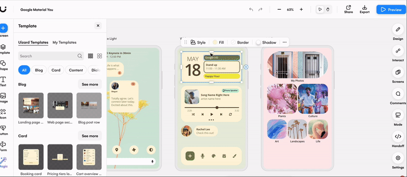
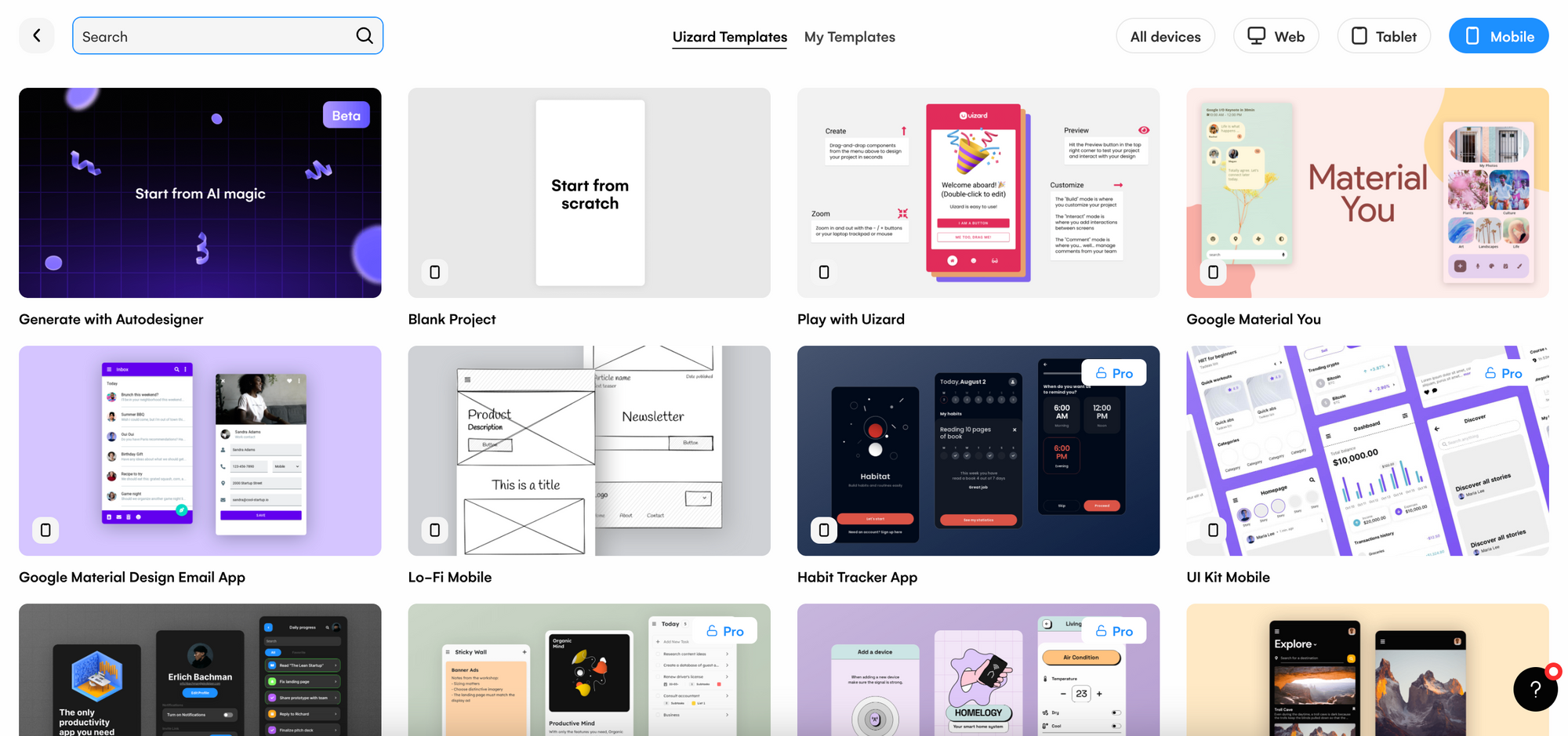
To see this in action, why not try out Uizard’s Google Material You template? It’s fully customizable and can be edited using the drag-and-drop editor.
5. Practice layout basics
For an Android app design there are three clear design areas: the status bar at the top, the navigation bar at the bottom, and the body region which sits in between the two. As a bare minimum, your design should feature these three areas.
As the system bars are the top layer of your app design, the body region needs to carry on underneath them. For instance, when a user scrolls through an article, the words would disappear underneath the top and bottom bars. This makes sure that a user can interact successfully with your design, whilst offering you creative freedom within the body region.
6. Pick a clear layout option
A good layout ensures that users aren’t overwhelmed by the placement and sizing of components and elements. You can achieve this by using certain layout styles.
Common layouts to use:
-
Feed layout: Arrange elements in a grid for a quick overview of lots of content. And you can use cards or tiles to present a feed-like layout.
-
List layout: For app designs that require lists of items, such as messages and files, a list layout can be used. Users can easily explore lots of items without dealing with a cluttered app design.
-
Supporting pane layout: Support on-screen content by giving extra context in a separate pop-up pane. This pane appears directly over the on-screen content. Again this helps to avoid a cluttered Android app design.
Achieve one of these layouts using Uizard’s premade component templates. Use the search function, or the tags, to locate the perfect component and then drag it onto one of your design screens. You can even create your own customized component templates which can be used throughout your Uizard designs.
7. Use a variety of elements and components
Make use of the different elements and components at your disposal. Use action elements such as buttons with CTAs to get users to complete an action like signing up. Use communication elements such as progress bars to offer helpful information. Or group together lots of related elements to make it even easier for users to understand your Android app design.
In Uizard, you can find premade components, as well as lots of individual elements in the left hand side panel. These can be personalized to fit your Android app design aesthetic, and purpose.
8. Don't overcrowd the navigation
Keep the navigation of your Android app design to a five icon maximum, however three destinations is preferable. This avoids clutter on your navigation, and ensures that there is a good amount of spacing between icons no matter the device your users are using.
Using a premade footer or navigation component template in Uizard ensures that there is sufficient spacing between icons. Make your Android design navigation easy to use and understand.
9. Reachable and tappable elements
As you are designing for a touchscreen device, make sure that each element is easily tappable by a finger or thumb. This means keeping a good amount of space between elements, as well as ensuring that they are not too small or too large.
Your design should also be adaptable to keyboards. For instance, your app design should move to show the text field a user is typing in, as well as the whole keyboard.
10. Spacing, sizing and alignment
Elements should be sized appropriately across your Android app design. There should also be a form of consistency across your app design, for example the same element being the same size across different pages. This is also the case for alignment too. Proper alignment of the components and elements within your Android app design is essential. It makes your app design look professional, and helps a reader to follow your layout.
Spacing, sizing and alignment are made easy with Uizard’s snapping guidelines. Click on the element or component you want to edit, and use the blue lines that appear to align, resize or respace parts of your app design.
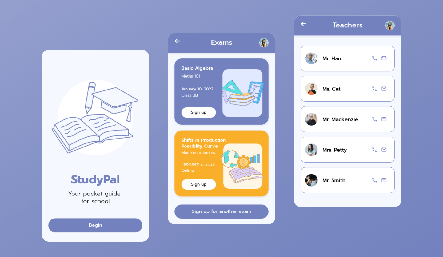
Use a Uizard app design template
As mentioned above, Uizard has a whole host of great app design templates to use. From audiobook app designs to dating app designs, Google Material You and more, it’s easy to customize a Uizard template to suit the needs of your Android app design project.
Want to try your hand at Android app design? Why not start by designing with Uizard? Simply sign up today to get started. For more articles like this one, check out the Uizard blog.