Bad UI design: 5 things you definitely shouldn't do
We’ve all been there. You click on a social media ad or a Google search engine results page listing only to be greeted by the kind of painful UI design that wouldn’t seem out of place in a beginner's computer science class. From intrusive light boxes and dead-end links to broken CTAs and cornea-dissolving color contrasting, there really are some cowboys out there in the wild world of UX design.
As a product manager or startup founder, why should you care about UI though? Getting your product under the noses of your soon-to-be captive audience is all that matters, right? Well, not exactly. If you think of great UI design as the silver bullet that ensures all your users have a seamless and smooth experience, then bad UI design is the rotten apple that can spoil the whole barrel, potentially taking your product down with it.
Whether you are a product manager pulling your first mockup together with UX design software or you are a founder with a product already out there in the real world, you need to keep a vigilant eye on your UI design and strategy. Fall foul of one of the five monstrously bad UI website design decisions covered below and you could find yourself scratching your head when things don’t play out quite as you’d hoped.

Skip to section:
Websites with bad UI, what to look out for…
5 things you definitely shouldn’t do with your product UI
What makes for bad UI?
Before we take a tour of our top five disastrous UI mistakes, let’s first look at what makes for good UI and what leads to a bad UI design. As we discussed in our guide to UI design, the golden rule of UI design is keeping things simple. What do we really mean by “keeping things simple”, though? Well, it’s a UI design approach dedicated to maintaining a level of simplicity in your app or web design, particularly from the user’s point of view.
Good UI usually stems from a user-first approach, where any design decisions are run through the framing of, “will this benefit my user and how will it impact their journey?”. Conversely, if good UI design is about a customer-first approach, then bad UI design stems from design that is detached from the only people that really matter… your users or customers.
How does non-customer-led UI design manifest? Usually as a clunky Frankenstein’s monster of bad UI; overly complicated click journeys, intrusive and obnoxious interstitials (pop-ups); broken calls-to-action (CTAs) to name just a few of the most common howlers.
Websites with bad UI, what to look out for…
We’ve painted quite a binary picture when it comes to bad UI and good UI, a sort of angel on one shoulder of the designer and the devil on the other, but it’s not always as straightforward as good UI vs. bad UI, there is a huge grey area in UI design. Your product or app might tick the good UI design box with 70% of its features and have only a few standout issues holding its success back.
So, how do you spot bad design out in the real world when things aren’t that clear-cut? The number one thing you should be on the look out for as a user is how aware of the UI you become during use. If you leave your experience having been made consciously aware of clear sticking points or areas of friction, the UI design of that product likely isn’t as strong as it could be. If you come away from your experience having not been made consciously aware of the product’s UI at all, it’s probably done its job.
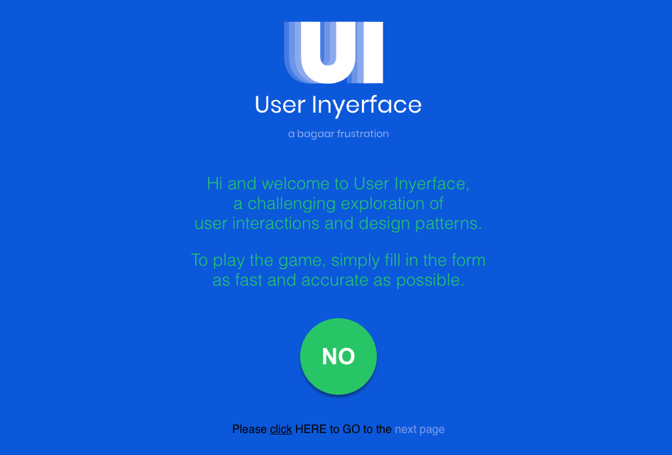
Essentially, the key emotion you should be on the lookout for is frustration. If your potential customers or users become frustrated navigating your UI, then you know something has gone badly, badly wrong. You have almost certainly encountered dodgy UI design at some point in your own digital lifetime, but to give you a clearer picture of how bad UI design can really get, below is a very funny (and intentional) example of soul-destroying UI. See if it rings any bells from the real world…
5 things you definitely shouldn’t do with your product UI
Now you’ve got to grips with the impact that bad UI design can have, here are 5 things you definitely shouldn’t do with your own web or app UI design…
- Intrusive interstitials
- Broken links
- Content clutter
- Color and contrast overload
- Poor alignment and touch targeting
Intrusive interstitials (AKA the pop-ups that won’t pop off)
Pop-ups might seem like a great way to advertise your mailing list or let your customers know about sales or discount codes, but swamp your interface with multiple pop-ups or pop-ups that are difficult for a user to clear and you are certain to turn your users off.
Solution: Minimize your use of pop-ups so that your customer is free to navigate your app or site at their discretion. If you want to call out a specific message, an exit pop-up is a great technique for conversion rates.
Broken or misleading links and CTAs (AKA the calls to no action)
If you are going to include navigational or contextual links or even CTAs in your design, then make sure they actually end up in a logical place once clicked. A classic example is a 'Sign up' CTA leading to a log in page, with the user then needing to click another link to actually land on the sign up page.
Solution: Review your user flows thoroughly during the prototyping and production phases of your design. Ensure your click journey is direct and shows the users only what they want to see based on the context of the links they click.
Content clutter (AKA the landing page traffic jam)
Whatever you do, don't pack your landing pages out with endless amounts of content. You've probably seen examples of this many times before; overlapping assets, tightly packed clickable elements, frustratingly small navigational elements.
Solution: Keep your app or web UI clean and simple. Include plenty of white space to make your design pop and draw focus to interactive elements.
Color and contrast overload (AKA the visual nuke)
Harsh, acid yellow CTAs against a neon pink background probably isn't the best way to signal user flows to your prospective users. As well as making your site difficult to navigate, you might also be at risk of giving your users a migraine.
Solution: Ok, so this is technically more of a general UX or design issue, but aggressive color profiles can have a real impact on how your users navigate your product. Try sticking to one primary colour with plenty of darker shades for contrast.
Poor alignment and touch targeting (AKA the haunted interface)
There is nothing worse for a user than clickable elements moving all over the place or touch targeting being so far off that they need lottery winner levels of luck to advance through their click journey.
Solution: Make sure your elements are aligned and clickable elements follow the same functionality conventions across all areas of your design.
How to resolve a bad UI
Have you fallen foul of one of the five examples of bad UI app or web design? Fear not. Resolving bad UI design, especially in the early stage of the design process, isn’t all that tricky. If you are currently in the process of building out your app or web prototype, or you have a product that is already in production, then it’s good to remember that there is always time for user testing.
You don’t need to get your product or design into the hands of actual customers if you’re not quite at that stage, but you can get it in the hands of colleagues, team members, or even friends and family. How do you banish the specter of bad UI design then? Firstly, always consider your users during any design decision-making but, perhaps more importantly, test and iterate, test, and iterate, test and iterate – you’ll thank yourself in the long run.
Do you have a digital product, web, or app design that you want to see built out into a high-fidelity, prototype? Sign up to Uizard for free and bring your idea to life in minutes. Got more questions when it comes to the world of design? Head over to the Uizard blog to find out more.