UI design fundamentals

Looking for the basics of UI design? Understanding the fundamentals of UI design can greatly improve your projects, and help to boost the UX of your designs. From fundamentals such as typography, to basic UI design principles, and color theory, this article will go through each in detail to help you create an amazing UI design every time.
Each UI design fundamental discussed in this article will also give you tips and tricks on how Uizard can be used to aid and implement design changes. And with a plethora of AI design features, you can do so quickly and easily.
Skip to section:
Typography
Great typography can tell a story, set a mood or just look super aesthetic on your design. It can also impact the readability of the content on your UI design. That’s why it’s important to get to grips with how to use it properly. In this section you will learn what typography is, and how to use it effectively on your UI design.
What is typography?
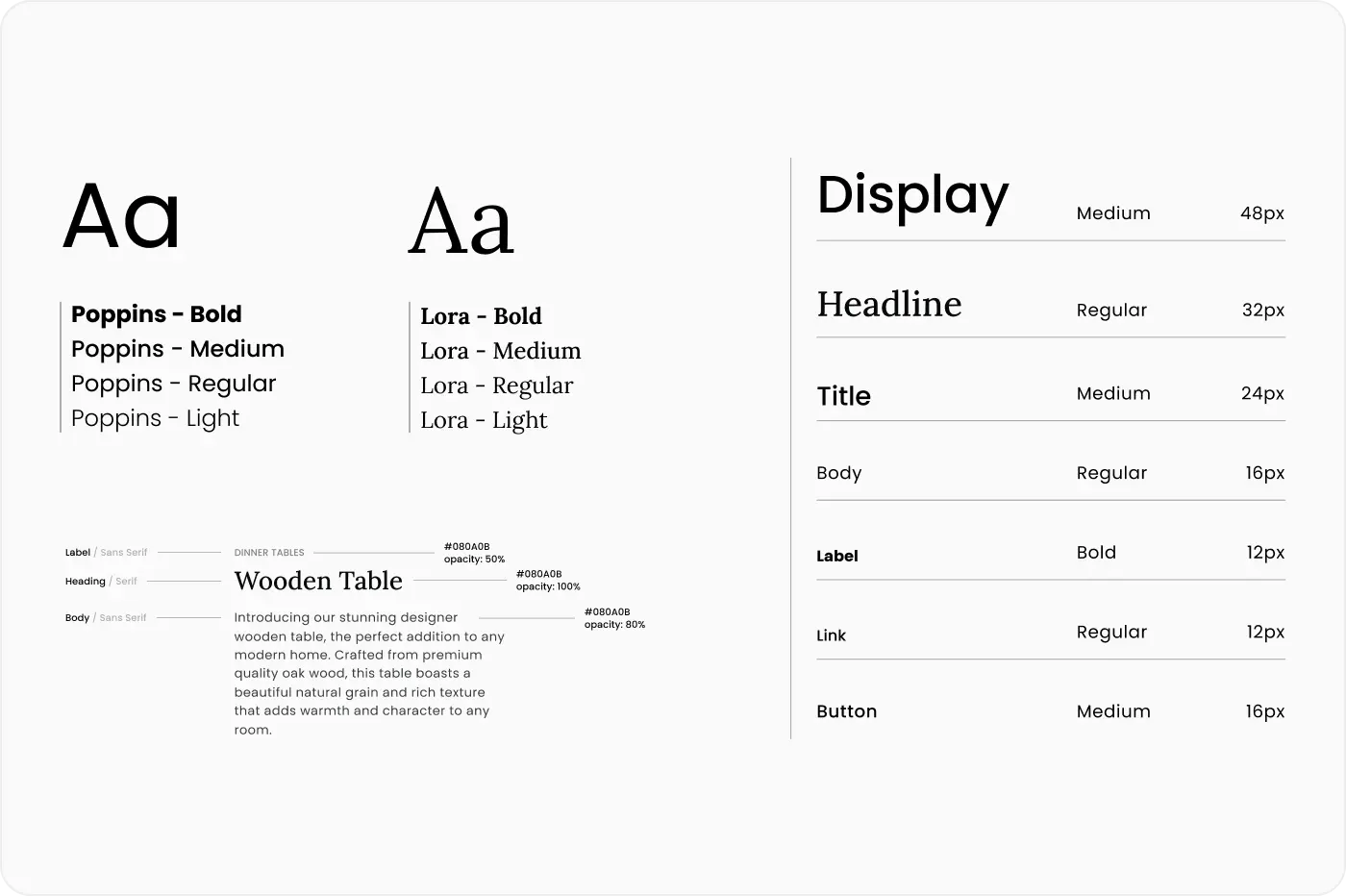
Typography is used to create aesthetically pleasing text. And it can be found basically anywhere that text is used, for instance: on signage, in print, and online too. Typography includes all facets of the stylistic elements in a given design, from font, to font size, all the way through to text spacing and alignment.
The first heading you see on a web page may be larger than the rest, in bold, or in a different font, and this is a simple example of typography being used on a UI design.
Serif and sans serif typefaces
There are two types of font families, or typefaces, that are to be mentioned here: serif and sans serif. The way to tell these apart is by looking at the top and bottom of your text.
The serif family has slight lines that extend off of each letter, for instance the font ‘Merriweather’, is part of the serif family. And as you can see in the image below, there are small lines extending from each letter.
Compared to a font in the sans serif family, such as ‘Comic Neue’, this typography looks a lot more rounded on each letter, and doesn’t have any extending lines.
Using different typography families can help to distinguish headers from a main body of text.
Typeface relationships in typography
Concordant
This is when you only use one typeface, so you might just choose to use sans serif. In this instance you would distinguish between headers, subheadings and blocks of text by changing the size, alignment, or choosing to bolden a heading.
Conflicted
This is when two different fonts from the same typeface are used. As the two fonts are similar in appearance, it can be difficult to tell them apart. As with the concordant relationship, you would need to use other measures to separate headings and sections of copy.
Contrasting
For a contrasting relationship, there is a clear difference in UI design. Two different typefaces, and two different fonts, are used. For example, a serif font such as ‘Merriweather’ may be used for a heading, and a sans serif font such as ‘Comic Neue’ may be used for the body of text. Create contrasting typography by altering the size of your text, using styling such as italic and bold, or changing the font.
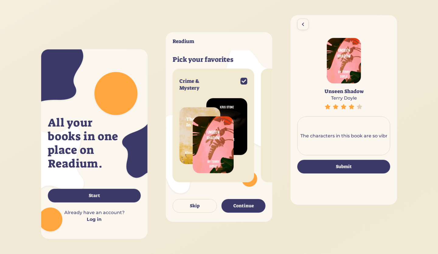
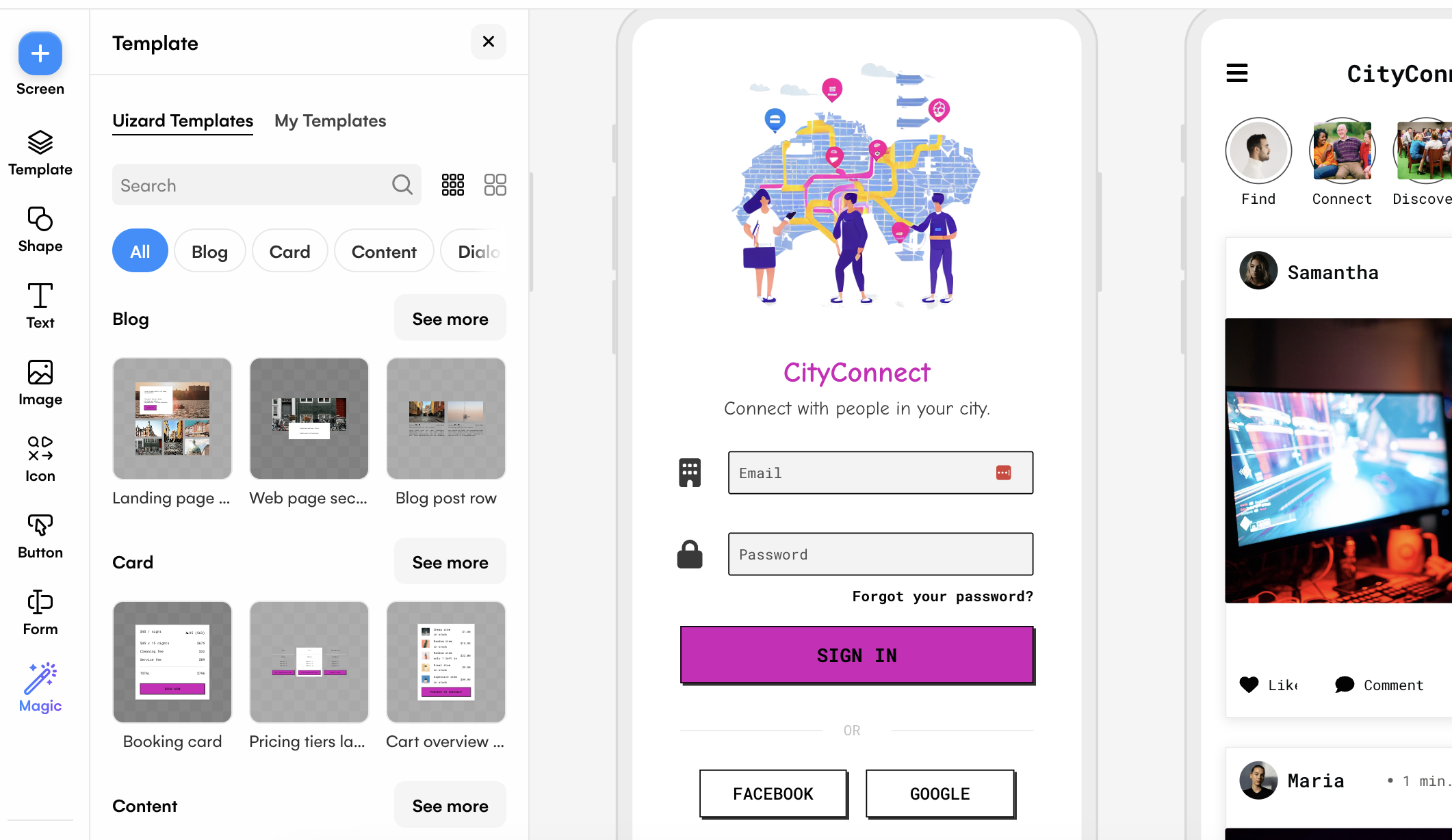
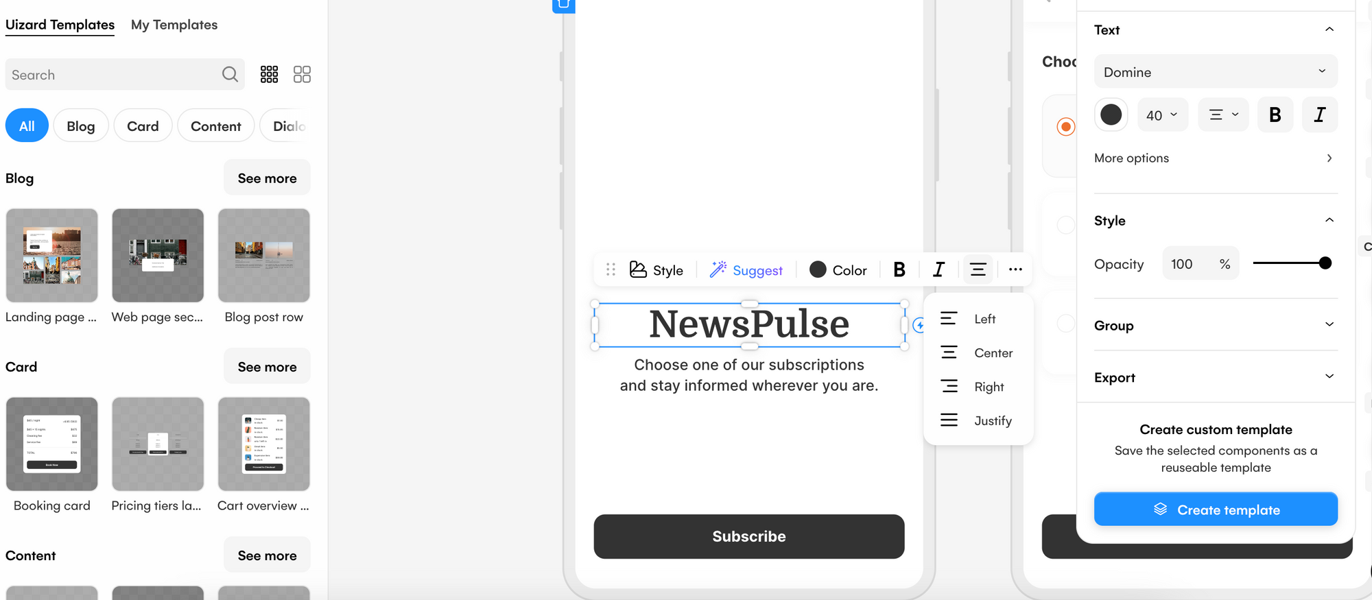
Editing typography in Uizard
Making small edits to your text, such as making your heading larger than a body of text or changing the font, will greatly improve the readability of your UI design. Using the right design control panel, you can easily edit your typography in Uizard. Whether you want to change the typeface you are using and pick a new font, edit the size of your text, alter the spacing between words, or change the case and color of your text — you can do so.
Design Principles
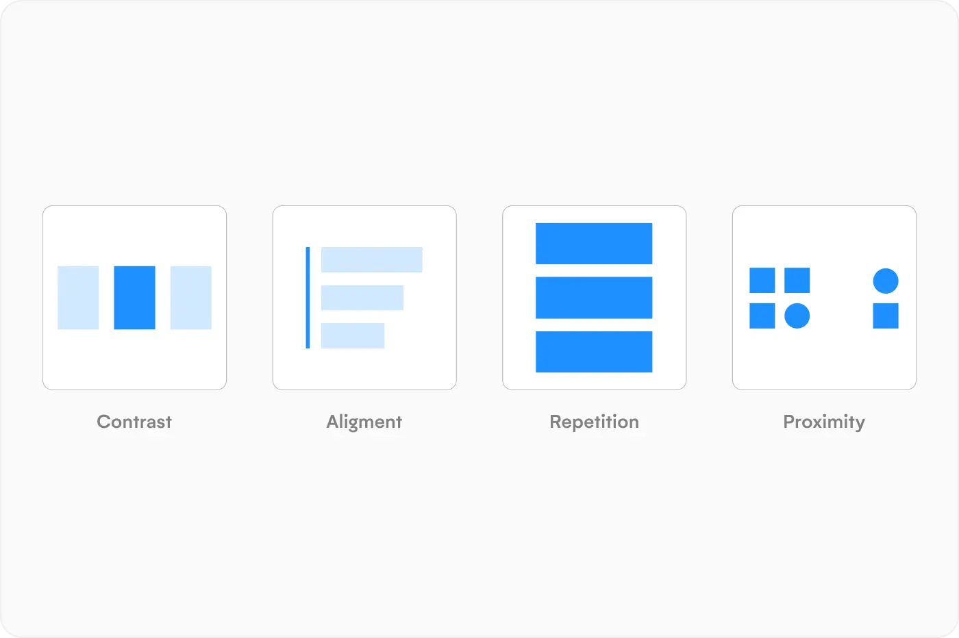
There are a few basic principles of UI design that you should be aware of when creating your designs. And in this section there are four that will be discussed in depth: contrast, alignment, repetition, and proximity.
Contrast
Contrasting elements are an important part of a UI design. Creating contrast between elements can be as simple as using black text on a white background, or a large, bolded heading at the top of a page. Typography can also create a great contrast, and there are two ways to achieve this. Either you can use both sans serif and serif fonts, or two different fonts within the same typeface.
An example of contrast not being used properly could be the use of an orange button with red text. In this instance, little to no contrast is provided, and some readers may not be able to see the text clearly at all. Contrast is great for UX and can be used to prioritize areas of a design, and draw attention to certain areas.
There are a few ways to create contrast in Uizard. Using the right design control panel, you can edit typography, color, text size, alignment and case. It’s quick and easy to make edits, and for elements to contrast one another.
Alignment
There are three forms of alignment on a UI design, right, left, and central. Proper alignment of elements and components on a UI design is essential for UX and readability.
Aligning text elements in Uizard is simple. Select the text you want to edit, and click on the ‘Change alignment of text’ option. From here you can choose an alignment option from the dropdown menu. The right design control panel in Uizard also allows you to edit text alignment too.
Repetition and unification
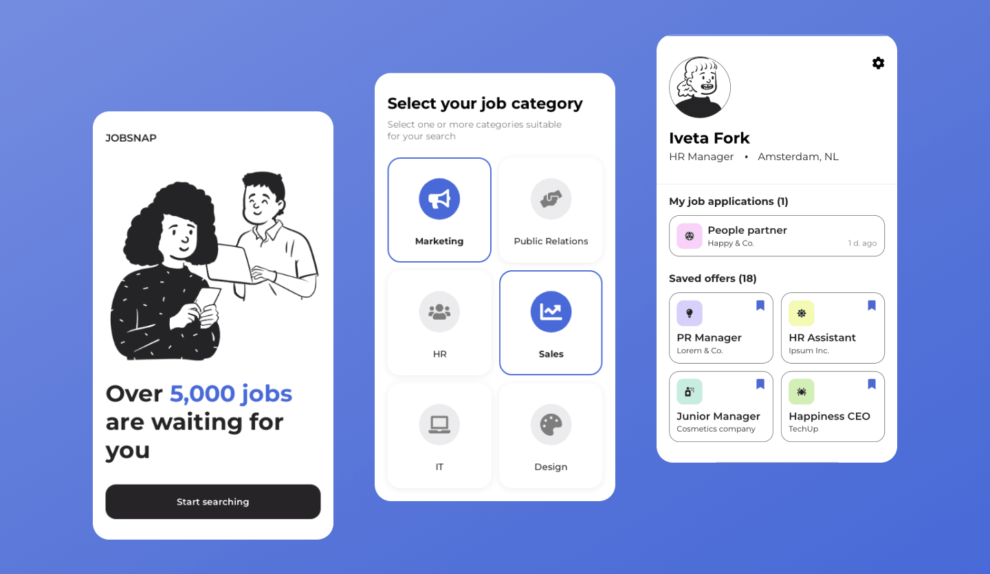
Repetition in UI design can mean a number of things. It can include ensuring that each heading is the same size across every design screen, or keeping a consistent font throughout, or even something as simple as incorporating your brand logo on every page. It can also mean the grouping of similar elements with a common factor such as the same alignment. Repetition should be used to unify UI design aesthetics.
With Uizard you can save your components as templates which means that you can easily use them multiple times throughout your UI design.
Proximity and blank space
Proximity is the distance between elements and components, it separates headings from subheadings, and it is found on every UI design. Also known as blank space, it is used to keep a UI design from feeling cluttered and to prevent overwhelming a user.
Blank space should be even and uniform throughout a design. For instance, if you use blank space to separate content blocks, use the same amount throughout your UI design. It’s also important to understand when to reduce the proximity between related elements and sections. An example of this would be if you have a button that is directly related to a particular content block then a small amount of blank space would be used to signify that these two elements are related.
It can be difficult to know how much white space to use, and where to use it, but with a Uizard UI design template, this is all taken care of. Several premade design screens are complete with elements and components that are already slotted into place, with appropriate proximity between each of them.
Color Theory
Some colors are easily paired. Why? Well, they just look good together. However, there are some rules of thumb when it comes to using color on a UI design. In this section, color theory, color psychology and the relationships between colors will be analyzed, along with how you can use Uizard to help.
What is color theory?
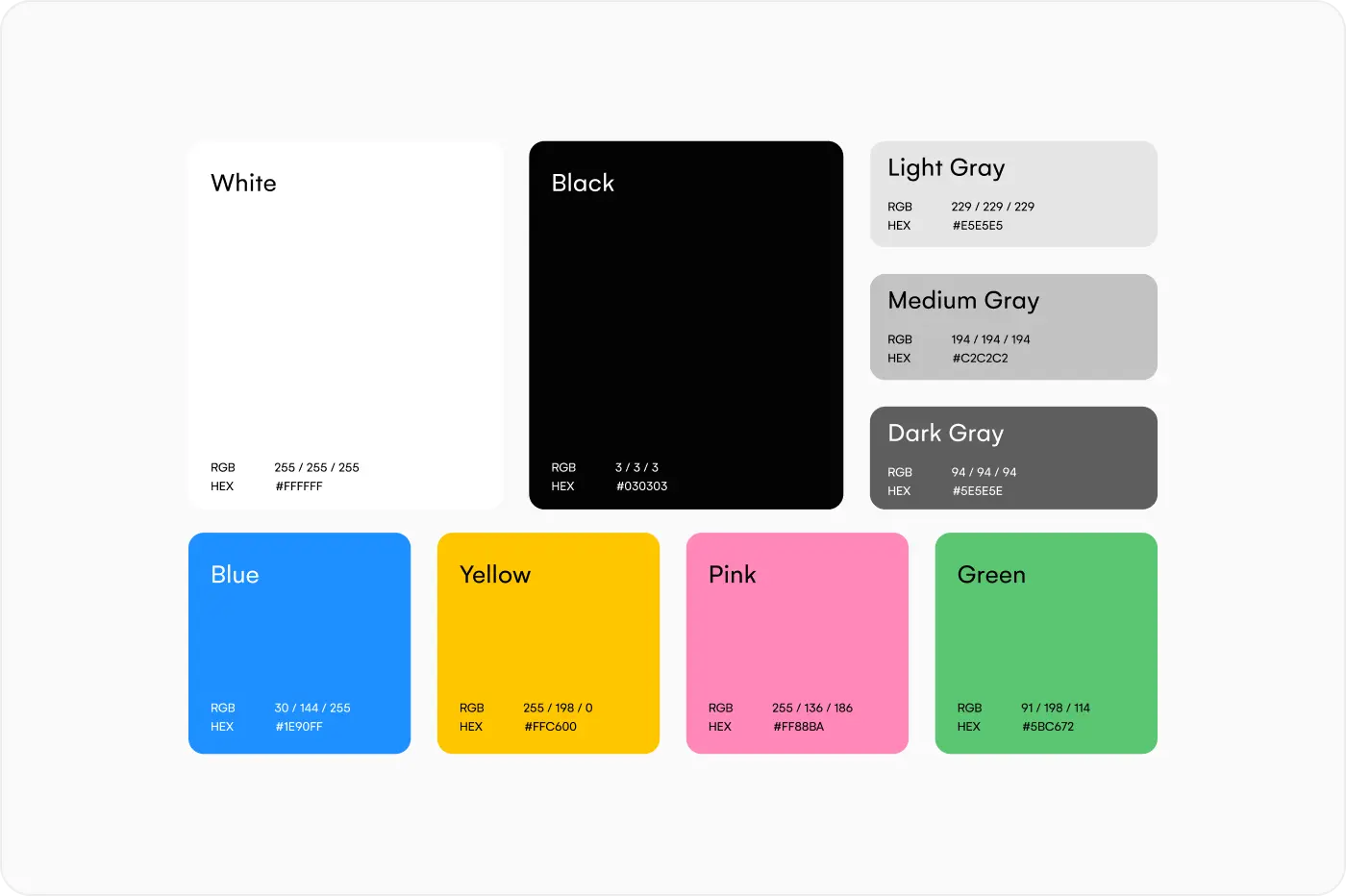
Color theory is used by UI designers to decide on which color schemes and palettes to use on their designs. Using a color wheel, designers can easily pair and match colors that would work well together on a UI design. But what is a color wheel?
A color wheel presents the relationship between primary, secondary and tertiary colors. Primary colors include: yellow, blue and red. Secondary colors include: green, orange and purple. And every color can be derived from these six colors. Tertiary colors on the other hand, are a combination of both primary and secondary colors, for instance, red-orange and blue-green.
What is color psychology?
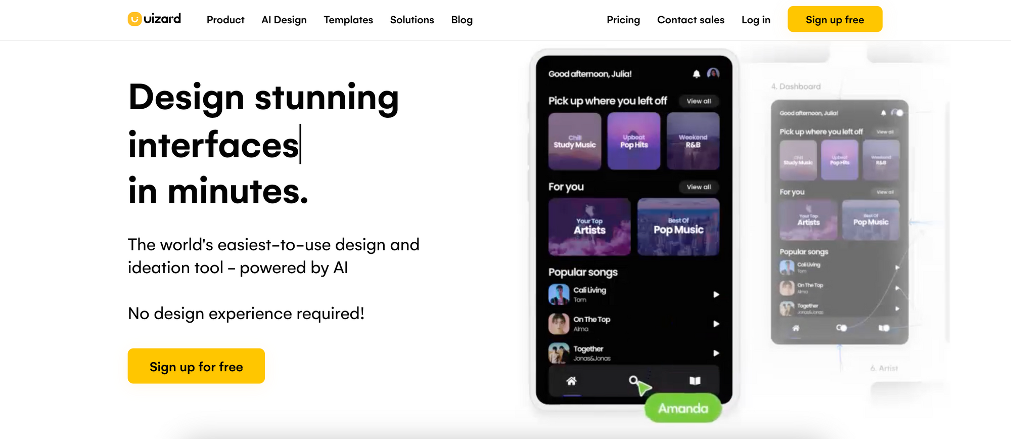
Although we may not realize it, colors evoke feelings when we see them. And this can be used to your advantage when creating a UI design. Taking a look at the Uizard website as an example, yellow is consistently used throughout the UI design. The color yellow represents warmth, happiness, energy and fun.
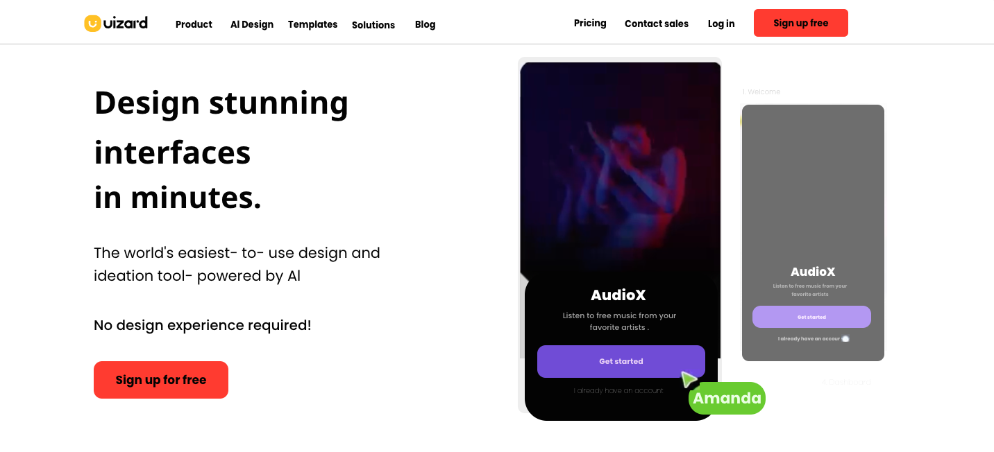
Replacing the color yellow with something like red, would give off a very different feeling in comparison. Red signifies passion, anger, love and even danger. That’s why red is commonly used on UI design error messages, or anywhere else that requires immediate attention.
Every color you decide to use on your UI design has emotional connotations attached, so keep that in mind when adding colors to your design screens.
Color relationships
There are four color relationships that will be looked at here. And each one can help you to better understand how to use color in your UI design.
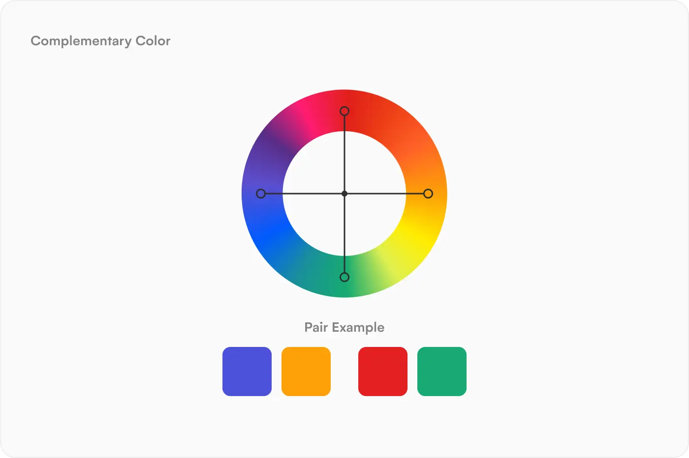
Complementary colors:
Complementary colors sit across from one another on the color wheel, and they provide a high contrast. Red and green are complementary colors, and so are blue and orange, as well as yellow and purple.
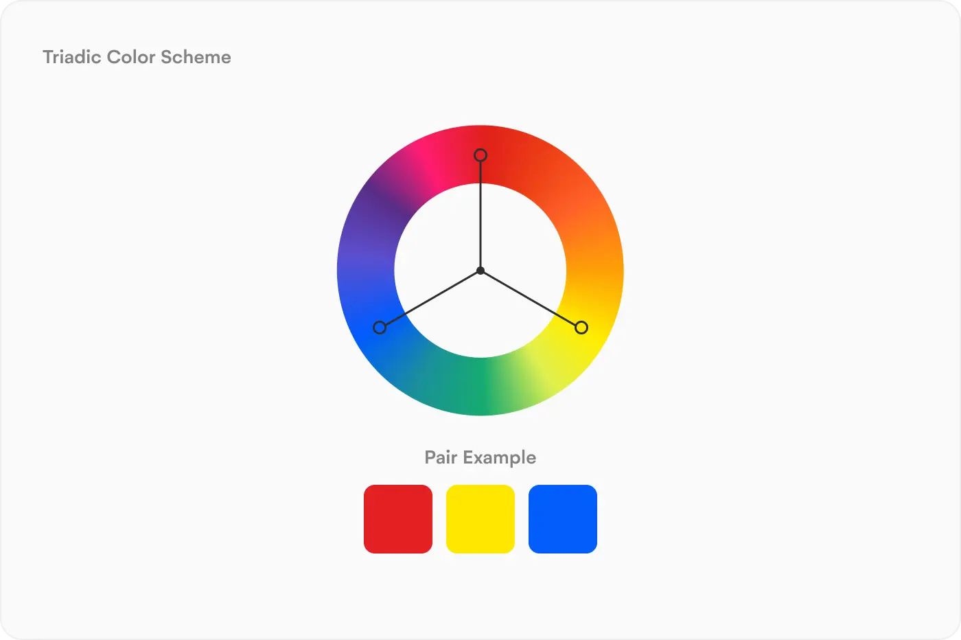
Triadic colors:
Triadic colors sit in a triangular formation on the color wheel. When a triangle with lines of equal length is drawn on a color wheel, triadic color relationships can be located. Yellow, blue and red are triadic colors as they sit in this formation on the color wheel.
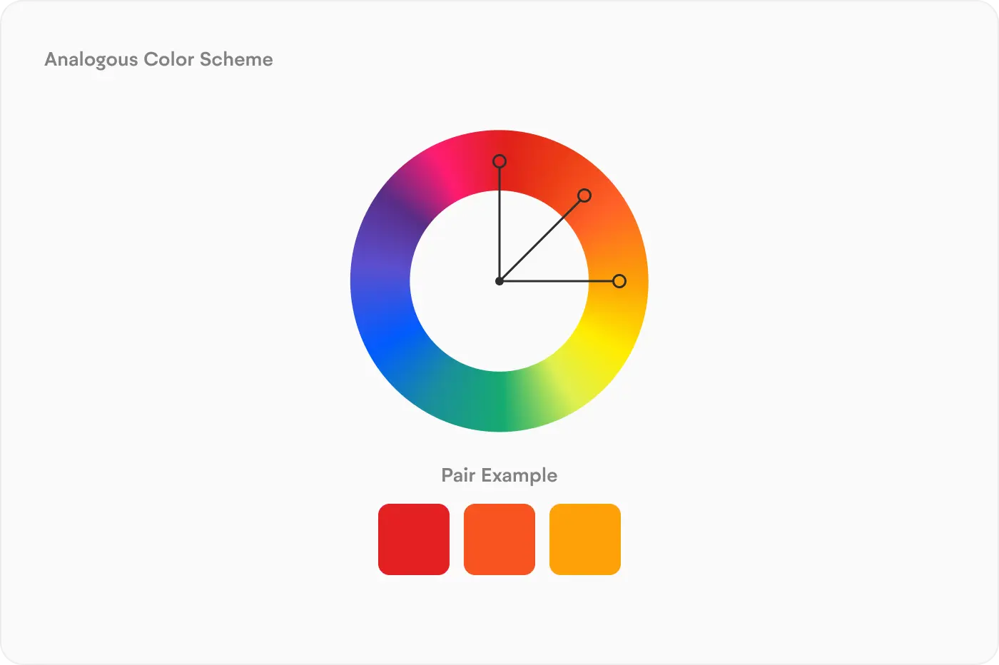
Analogous colors:
Analogous colors sit in a line, or directly next to each other on the color wheel. They provide an aesthetically pleasing appearance when used on a UI design, unlike the contrast of complementary and triadic colors. To locate this relationship on the color wheel, select one color, and use the two next colors along the wheel. And this can be clockwise or anti-clockwise.
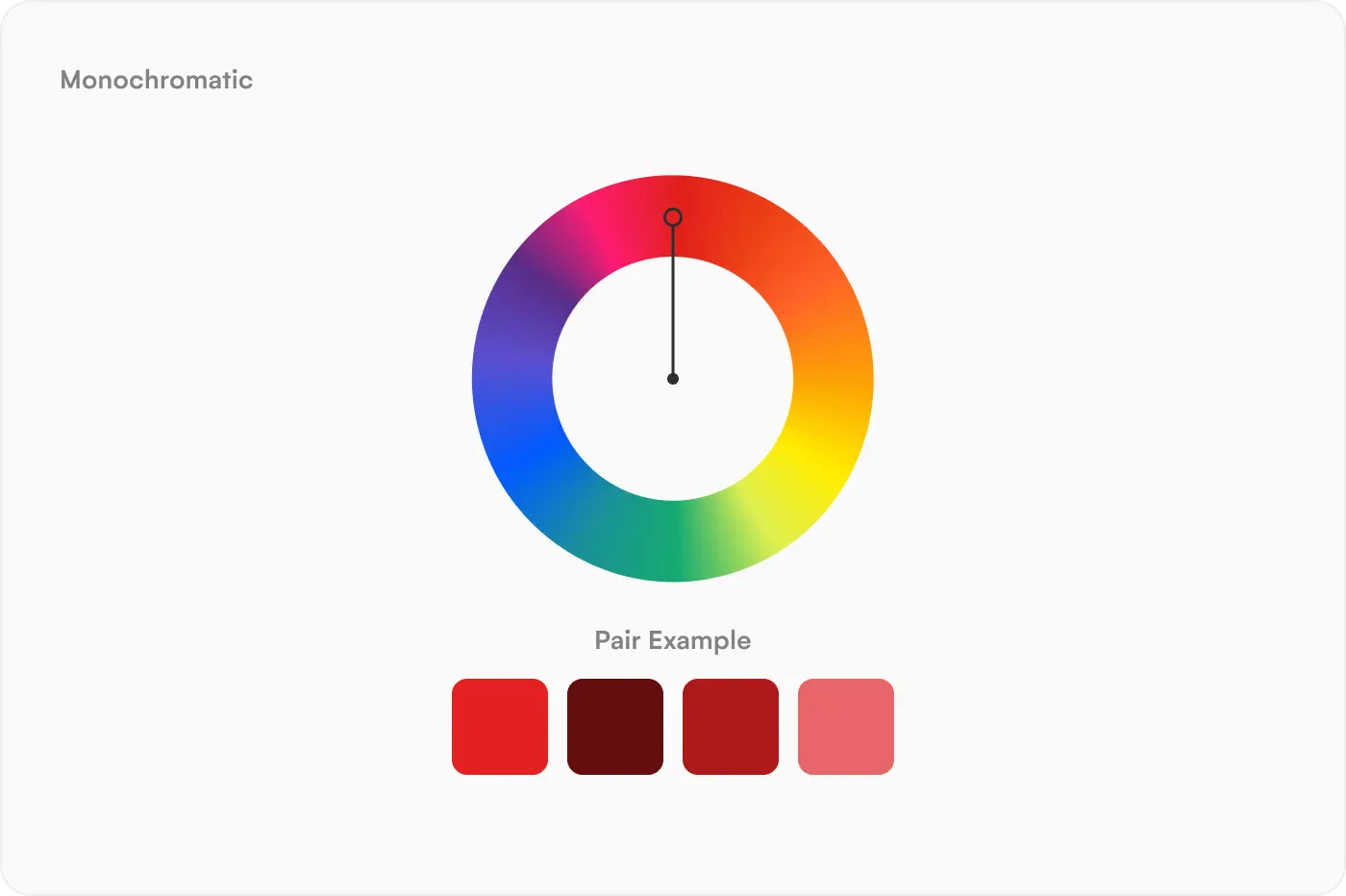
Monochromatic colors:
Monochromatic colors use various shades of the same color. In a UI design this would appear as different hues and tones of the same color being used throughout. This can look very appealing, however the contrast between the shades may be too low so aspects like text on buttons and backgrounds may require other, bolder colors.
Changing UI design colors in Uizard
In Uizard you can easily change the color of elements and design screens. To change the color of an element quickly and effectively, all you need to do is select it, and then click on the ‘color’ option on the control panel that appears. From here you have a number of options for editing that particular color, including adding in a particular HEX code within the ‘picker’ tab.
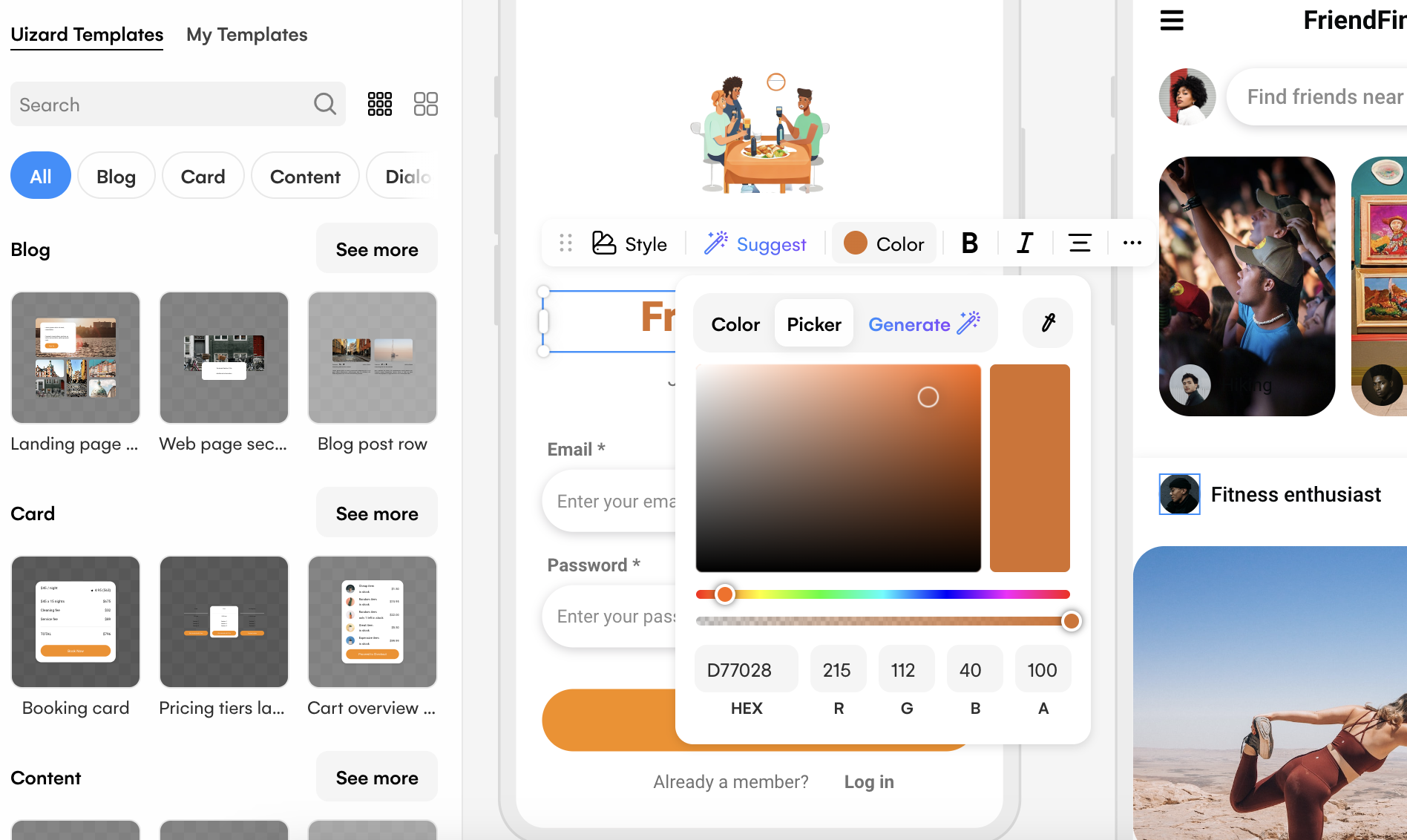
If you want to test out one of the AI-powered features within Uizard, you can use the color generator tab. From here all you need to do is input a simple prompt to receive palettes and schemes with colors that are perfectly compatible with one another.

Interested in getting started with a UI design in Uizard and trying out some of our amazing features? Why not sign up today? Or, check out our blog for more articles about UI design.