A comprehensive guide to information architecture

If there’s one thing that’s certain, it’s that the internet isn’t short of content. From lengthy blog posts to detailed product descriptions, text ads, and videos, we’re constantly being bombarded by information.
But how can you as a UX designer, project manager, or marketer ensure that your app or website conveys the right information to your users at the perfect moment? With the vast amount of content out there, it’s vital that you organize the structure and information contained within your digital product as logically as possible.
What we’re talking about here is information architecture (IA). Get your information architecture right, and not only will you ensure that your app or website is extremely accessible, but you’ll also make life easier when it comes to driving your customers from point A to point B.
Want to know more about information architecture? Or maybe you want to build up a bit of an understanding of the relationship between IA and UX. We discuss all in our comprehensive guide to information architecture in UX design.

Skip to section:
What is information architecture in UX?
Why is information architecture important for UX design?
Information architecture systems
Best practices for a great information architecture
What is information architecture in UX?
Information architecture (IA) is the logical structure of a product, such as an app or website. The purpose of an IA is to make life easier for a user when they are navigating a product. For this reason, navigation systems are usually a big part of creating a well-rounded IA, allowing users to flick through content and pages easily. No one wants to deal with a messy website or app, and if you employ a proper information architecture — your users won’t have to.
So where does UX come into this? Well, whether the product is a mobile app or a corporate website, IA works in a similar way across the board — with the user in mind. A well-structured information architecture will help the user reach their end goal as painlessly as possible.
Why is information architecture important for UX design?
Information architecture is a key part of UX design. It creates logical and intuitive ways to sift through lots of information. This means that users can locate what they’re looking for easily.
The aim of every UX design is to ensure user satisfaction, and there’s no better way to do so than with a solidly structured IA. UX designers can utilize a well-thought-out information architecture to help users reach their end goal, and to also encourage them to do things like purchase an item or enquire about a service. Essentially, IA is crucial if you want to create an amazing user experience for your target market.

Information architecture systems
Information architecture works in not-so-mysterious ways (translation: we can tell you exactly how it works). So, let's take a deeper look at the systems that reside within information architecture, and how they help UX designers flourish when it comes to creating user-friendly and accessible design interfaces.
1. Organization systems
Organization is an integral part of information architecture, and there are three ways this type of IA system can categorize information on your UX design:
- Hierarchical: By importance —a great example of this would be a sitemap, with the main category pages at the top, filtering down to pages of lesser importance.
- Sequential: By logic — this is usually in a step-by-step format, leading the user to one final page or action.
- Matrical: By the user — for instance clicking through internal links to reach other areas of a site or an app.
Many sites and apps encompass a little bit of each of the three systems above. As we said earlier, organization is key and will boost the effectiveness of your UX.
2. Labeling systems
Labels make a product understandable, but they also represent information a user is yet to discover. For example, hovering over sections of a navigation bar might lead to a drop-down menu, but the user will have to click to find out more.
So, what happens when these labels are taken away? Imagine entering a site, and finding no headings and an empty navigation bar. Pretty scary stuff. Labels are essential to information architecture as they separate content into digestible segments. Without them, the user will quickly become overwhelmed and close your site or app.
3. Search systems
Information architecture includes search functionality to optimize for user experience. Search components allow users to easily access any page or product they desire within a design system.
Something we all take for granted is the ability to search. Whether you’re searching a site for something super specific, like a wizard costume — with a cape, hat, and wand — or a more generic topic on a news app, the search feature helps a bunch. It can also drive users to pages or products that they hadn’t even considered.
A great example here would be our grocery delivery template. This template includes UI components that showcase search functionality, as well as mockup filters, to demonstrate how products can be easily located by a prospective user.
4. Navigation systems
An important part of every IA is the user-facing navigational system. A strong Information architecture utilizes clear design features such as navigation bars, hamburger menus, and breadcrumbs to improve user experience and support users to achieve their target action.
We touched on the horrors of having an empty navigation bar earlier, but imagine if there was no sort of navigation at all. It would be chaos. That’s why you’ll rarely come across an app or site without some form of navigation — unless, of course, that site consists of a single landing page.
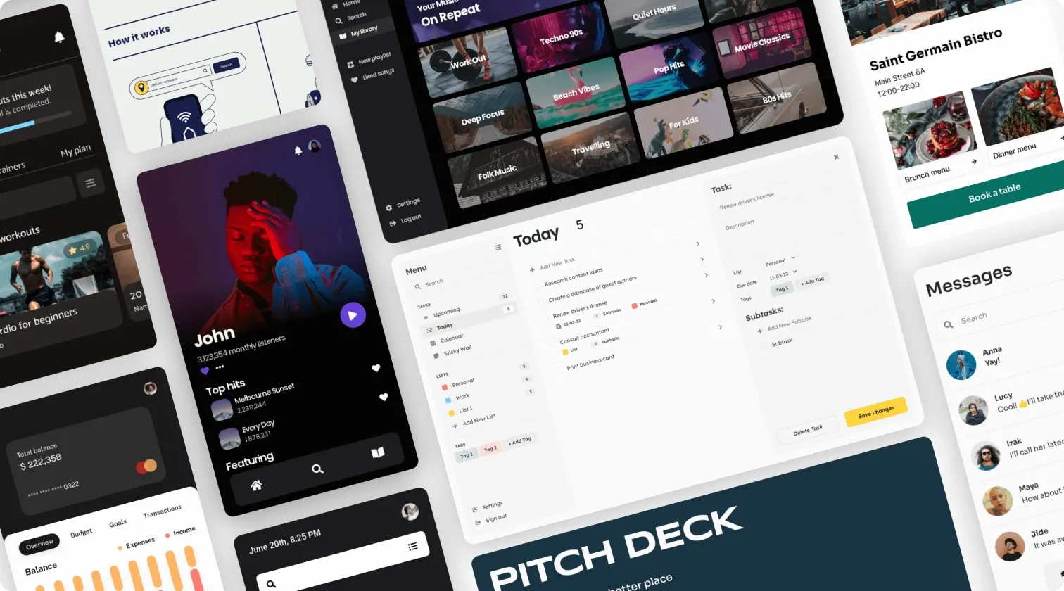
If you’re looking for a place to get started with your UX design, our UI templates are perfect for both beginners and experienced designers. They come with all the must-have UX design components baked in, including navigational elements, to clearly demonstrate your prospective user flows and click journeys.

Best practices for a great information architecture
Getting started with an information architecture can be tricky for anyone. That’s why we’ve put together a few tips to make the road to an amazing UX design that little bit easier.
1. Keep the user in mind, at all times
The first best practice on our list is all about your users. These are the people who will actually be using your platform, so it makes sense to structure your information architecture around their needs. Keep them in mind at all times as you develop the IA within your UX design.
2. Think logically
IA is based largely on logic, so we recommend hopping into the mind of your users, and planning your IA as if you were them. This will prevent users not knowing how to navigate your platform, or pages and products being lost in the background because no one knows how to get to them. Make sure that all of your content is logically accessible.
3. Do some research
Research is also really beneficial when it comes to designing an information architecture. Your UX design should always focus on your users, so getting to know them in more detail never hurts. It might even give you the inspiration to create a new web category page or to incorporate more features into your app.
4. Assess your IA at the design stage
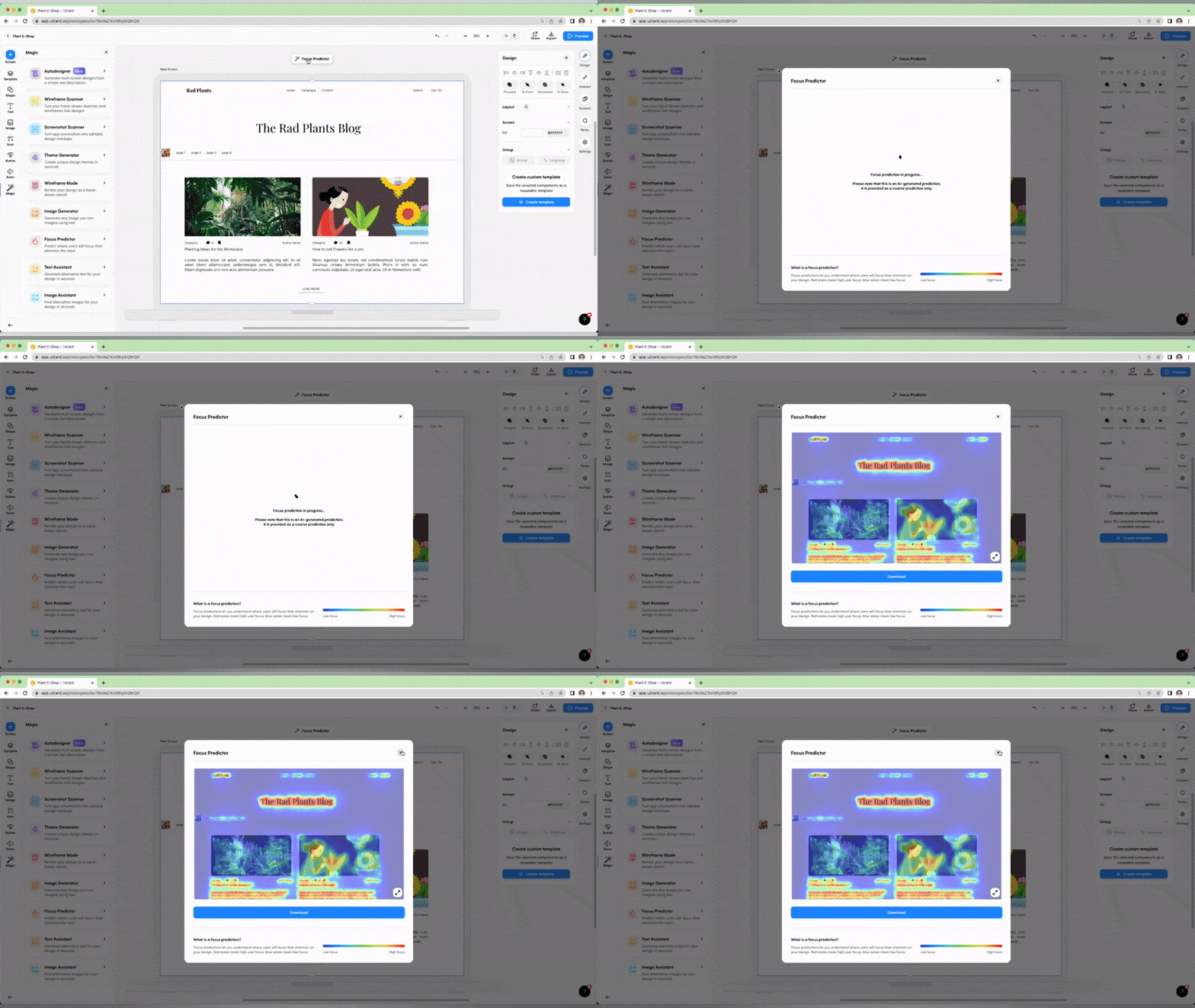
Before you even think about pushing your design idea into development, you should be reviewing and iterating the structure of your UX designs, as well as reviewing how well you users can navigate your design. With Uizard, you can use a little AI magic to do just that. With Focus Predictor, you can generate attention heatmaps for your UX design to see what areas of the page your user's attention will be drawn to.

5. Consistently develop your IA
You information architecture is never complete. What we mean by this is that as your site or app grows and changes, so too should your IA. It’s even more important for larger platforms with more pages and products to have a great IA, so make sure you don’t forget about the structure of your content.
Uizard is an AI-powered design tool, perfect for creating wireframes, mockups, and prototypes. Sign up and design your dream app or website with our UX design tool. Interested in learning more about UX design? Check out the other magical articles on the official Uizard blog.
