The ultimate guide to homepage design

It’s true what they say, the homepage really is where the heart is. If you’re in the process of bringing your digital product to market, or you're refining your UX design flow, then we’re here to tell you that your homepage design matters.
Think about it. Your homepage is effectively your shop window, it’s the first thing your potential customers are going to see when they land on your website. Sure, months down the line you’ll likely start to see customers landing on your secondary landing pages, but when you first get going, how you've set up your homepage is going to be crucial to your success.
People really do judge a book by its cover when it comes to websites and mobile applications. Get your UI wrong, make a mess of the branding, or confuse your users with cluttered design elements and you might just find that your bounce rate hits the roof before anyone has even had a chance to read your mission statement or find out about the service or products you are offering.

Skip to section:
Why great homepage design really matters
How to design a homepage in 3 easy steps
Homepage design best practices
How to design your product homepage with Uizard
Why great homepage design really matters
Great homepage design will not only help you to transform your web or app clicks into converting customers, but it will also help you stand out from the crowd in what is becoming an increasingly noisy market for most niches. Sure, you might be building a completely unique product in an emerging niche but, more often than not, you are going to be taking on a market leader when you go live. Creative homepage design can be a great way to stand out from the crowd and truly hammer home what makes you different and demonstrate why you are a market disrupter and not just the latest rip-off.
The 10-second rule of digital product design
When it comes to all things digital, whether that be homepage visits or product display page conversions, you should always keep in mind the 10-second rule. Countless web and app usability tests have found that, by and large, most users will abandon a session if they do not find what they are looking for in the first 10 seconds of a visit, whether that be hard transactional activity or a specific piece of informational content they might be searching for for research purposes.

Bearing this in mind when you are creating wireframes or prototypes for your own web or app homepages can be a great way to help you solidify the purpose of your page however, it is often a lot easier to do when the page in question has a clear and obvious customer touch point. Creating a Contact Us page that has clean and simple contact information, for example, is always going to be a lot more straightforward than crafting a great homepage that instantly makes your product or service clear whilst also outlining your mission statement.
How to design a homepage in 3 steps
So, what’s the best way to achieve your dream homepage design? And what do you need to include in your project to ensure you create a homepage that will smash your conversion goals and truly stand the test of time? Here is how to design a homepage in 3 easy steps…
Step 1: Keep things simple
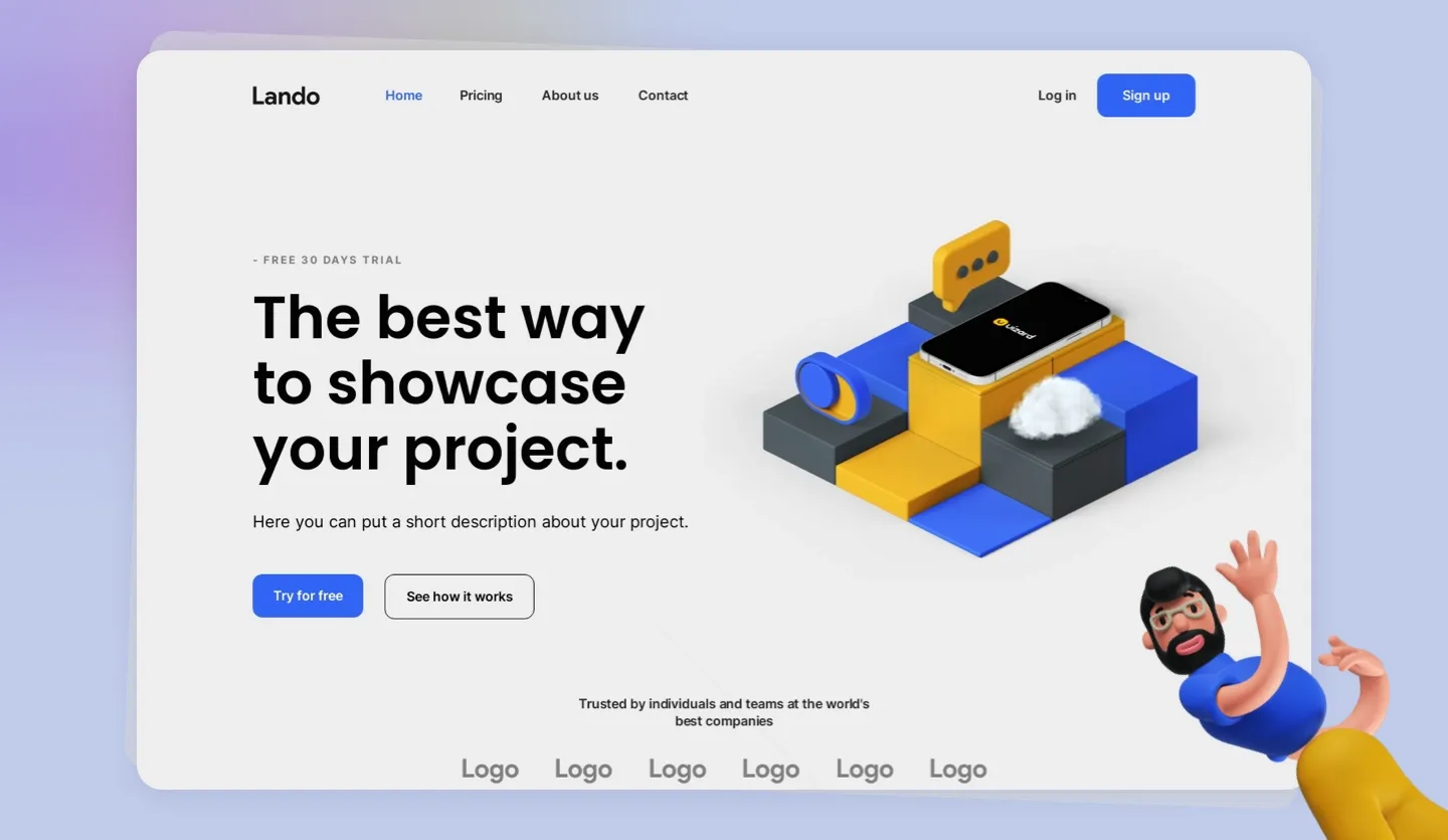
The main thing you need to bear in mind with your app or website homepage design is to keep it simple; this isn’t the kind of space where you want to be reinventing the wheel (remember the 10-second rule). Most homepages only need a handful of elements to drive success. This usually includes the following:
• A main navigation calling out secondary landing pages
• A clear headline and descriptive content block clearly defining your brand or MVP and its benefits
• A small amount of supporting content for secondary messaging
• Descriptive imagery that supports your primary messaging
• Social proof (this could be testimonials or a banner calling out third-party reviews)
Step 2: Centralize your product or service
This one might sound obvious, but you need to make sure you center your product or service on the homepage so that it’s the first thing your potential users see. When you initially launch your website or app, it’s likely that word of mouth will be the main driver of visits, but you’ll also generate incidental traffic and, eventually, non-branded traffic through search engines.
Make it super clear for those that don’t know (and those that do) what exactly it is you do, why you do it, and how you do it better than everyone else. This goes for SaaS homepages, e-commerce homepages, and even blog homepages.
Step 3: Think about your user journeys
And, finally, make sure you don’t fall into the trap of thinking your job is done once you’ve perfected your homepage design, there are still plenty of opportunities to really annoy your users and drive them to one of your competitors. Make sure you use clear CTAs and navigational elements to guide your user on to the next step of their journey whether that be making a purchase, signing up to your newsletter, or reading some of your blog content.

Homepage design best practices (homepage dos and don’ts)
If you're ready to brave the world of homepage design with our easy three steps, then just be aware that there are some common dos and don'ts that you will want to factor in to your design flow...
Homepage imagery
Do: Use images that explain your product or service or reinforce your messaging
Do: Use images that are formatted appropriately (WebP is the preferred image format for search engines)
Do: Make sure your images are responsive to device type to accommodate both mobile and desktop users
Don’t: Use images that have no relevance to your MVP, everything you include on your homepage should support your core mission statement
Don’t: Upload images in outdated formats or formats that will add a huge load burden to your page (we’re looking at you JPEG)
Homepage typography
Do: Use consistent fonts throughout your homepage. Although it is fine to use multiple fonts, a single font keeps your brand image cleaner
Do: Ensure you make a clear distinction between headings and regular content with headings typically larger and bolder than plain text
Do: Markup your headings with the appropriate tags for search engines (H1s, H2s etc.)
Don’t: Use more than one or two colors for text, it’s just jarring
Don’t: Use technical jargon in place of clean and clear language unless it is wholly relevant to your target market
Homepage CTAs
Do: Have clear navigational links both in the main navigation and across the page itself
Do: Use clear descriptive language in your CTAs that accurately describes the target page (this ensures you are meeting your user expectations)
Don’t: Use popups that bamboozle your users as soon as they land on the page (the exception here being a footer popup for cookie consent which is a must-have (for now at least 👀))
Don’t: Use misleading text in your CTAs such as a ‘shop now’ button that doesn’t lead to a transactional page
Design your product homepage with Uizard
There we have it, our ultimate guide to building the best landing page for your mobile app or website designs. If you’ve read this guide and still feel you need support with your landing page design, then Uizard is here to help. You can sign up to Uizard for free and start building out your own homepage rapidly and collaboratively. Simply start a new project, invite your team members, and let the wireframe and design fun begin.

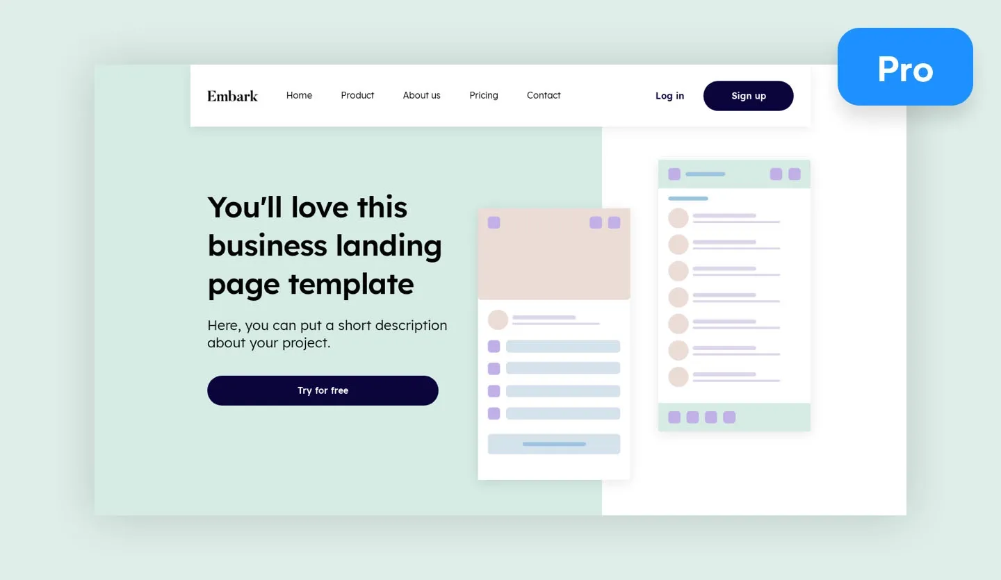
Looking to streamline your homepage UI design flow even more? Our landing page UI design template comes with everything you could possibly need for a great homepage design (we’ve taken care of the dos and don’ts, so you don’t have to). Simply open the UI design template and customize it to fit your own brand, service, or MVP.
Want to learn more about the world of design? Head over and check out the Uizard blog now where we talk about everything from wireflows to prototyping for beginners. Ready to give Uizard a try, sign up now and get your homepage design underway.
