Four UI design examples to inspire your next project

UI design examples are not hard to come by, in fact, you’re looking at one right now. Any website, app, or digital product you interact with, you do so thanks to user interface design. The truth is, there are loads of truly amazing UI designs out there in the digital world.
In this article, we've picked out a handful of UI design examples that we love. So, join us as we walk you through why we think they're great, what sets them apart form their competitors, why they work from a user experience point of view, and how they can inspire you with your next Uizard project.
Skip to section:
Four UI design examples you can learn from
Four UI design examples you can learn from
Whatever digital product you’re designing for, UI design inspiration is never far away. From websites and web apps, to designing for mobile, we’re surrounded by UI designs carefully curated by UI designers.
There are hundreds, if not thousands, of great UI designs out there, but let's just focus on a few of our favorites. We’re going to look at four UI design examples, both website and app UIs, and give you some tips on how to create similar versions of these UI designs with Uizard.
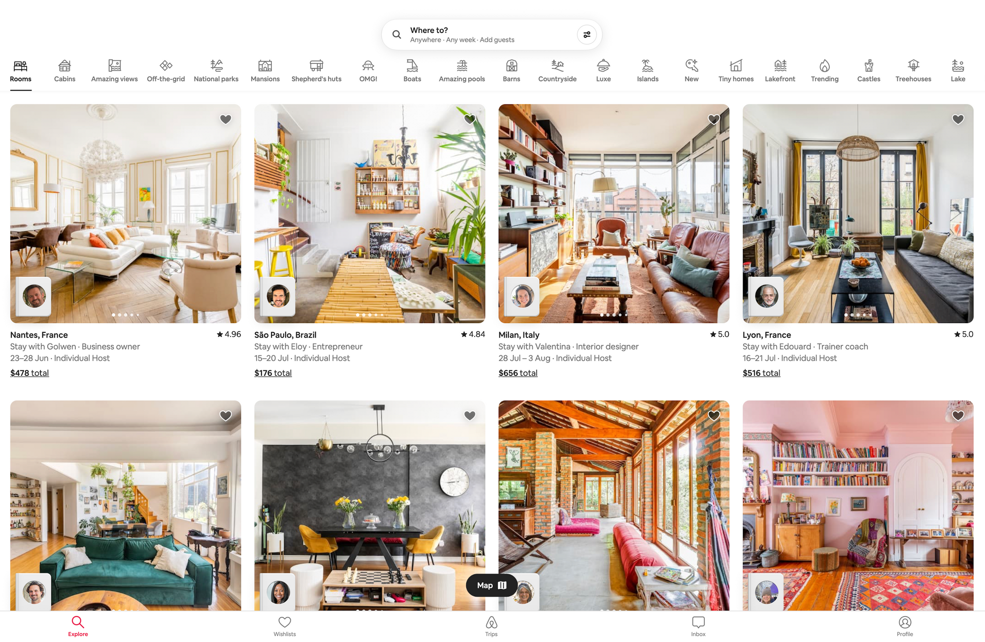
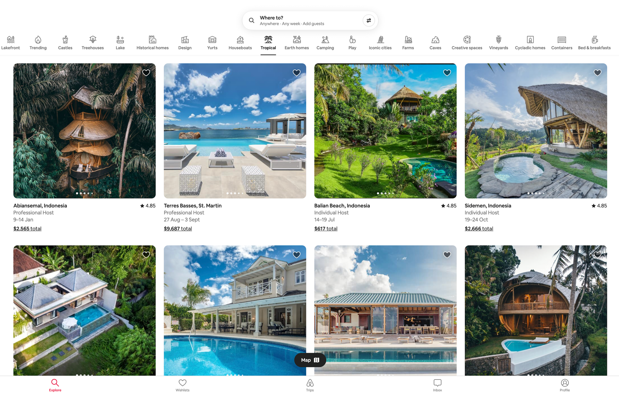
Airbnb web app
Airbnb is an accommodation booking platform with a plethora of holiday homes and rental properties for users to pick from. We are taking a look at the web app version here, but Airbnb is also available as a mobile app too.
Why we love it
Locating your next getaway has never looked so good. With beautiful accommodation photos paired with a simplistic and modern design, Airbnb knows how to entice users. The Airbnb UI design awakens the explorer in all of us, so let’s take a look at this impressive UI design in more detail.
Layout, elements and components
The UI design of this web app focuses on large card UI components as the main visuals, along with a minimalistic, icon-based header, footer, and search navigation. These card components are made up of elements such as large images, with corresponding text detailing the location, the type of host, the dates in question and the cost.
Usability
Airbnb uses a hefty collection of icons as an alternative search function for users. For example, if you were to click on the ‘tropical’ category, you’re greeted with a new search focused solely on tropical destinations. Not only is this a fun option for users, but it's also very handy for navigation purposes. The large images are eye-catching and they give a clear indication of what to expect when clicking on one of the card components — which is great for users who are trying to make a quick decision on a getaway.
Looking to use Airbnb as design inspiration? Uizard can help with that.
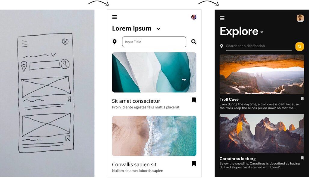
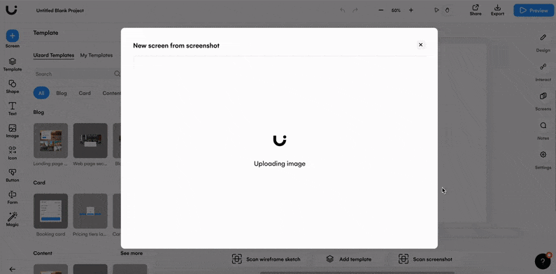
Creating UI designs can be a lengthy process. But you can save mountains of time by simply importing a screenshot and editing it directly in Uizard.
With Screenshot Scanner this dream is a reality. Once you've uploaded a screen grab of your favorite app, you can easily edit and update it to suit your own project (just like in the Airbnb example below).
You can try Screenshot Scanner for free, so sign up today!
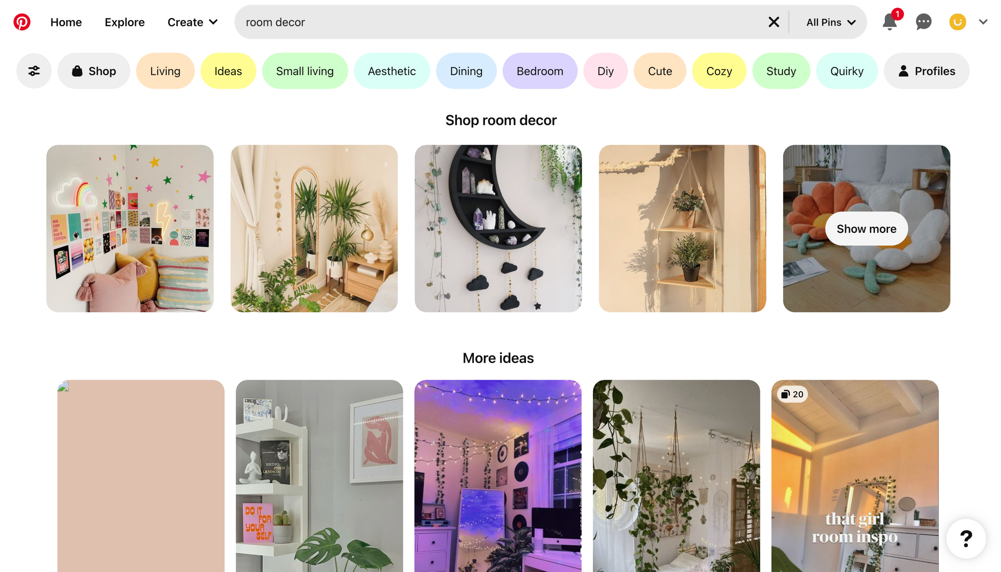
Pinterest web app
Pinterest’s UI design allows users to search for terms, and in response the design presents related images. These images are relayed back to a user in the form of pins, and these can then be used to create boards — which are a compilation of pins.
Why we love it
To look at, Pinterest has an extremely appealing aesthetic, and its ability to feel inviting is one of the reasons it is a great example of a UI design. With pastel colors and a clean-cut layout, what’s not to love about Pinterest’s web app design?
Layout, elements and components
Pinterest has a unique UI design, which is why it deserves a mention in this article. To look at, the design is quite simple, but as we dive into the details, you’ll find that it is more complex than it appears.
Pinterest uses a number of different UI elements and components. Text, images, buttons and input fields are all featured within the UI components on this site, and are used to support the navigation function, as well as to format images. Interestingly, Pinterest does not opt for a footer on its web app, however there is one featured on the Pinterest mobile app.
Usability
The rapid generation of images based on a user’s search query is impressive, but in terms of usability, Pinterest have a few other tricks up their sleeve. Category buttons are also generated based on your search terms, which are consistently visible under the header component. For instance, if you searched for ‘room decor’, then terms such as ‘living’ and ‘bedroom’ would appear. This provides a secondary form of navigation, allowing users to view a more specific set of pins if they wish.
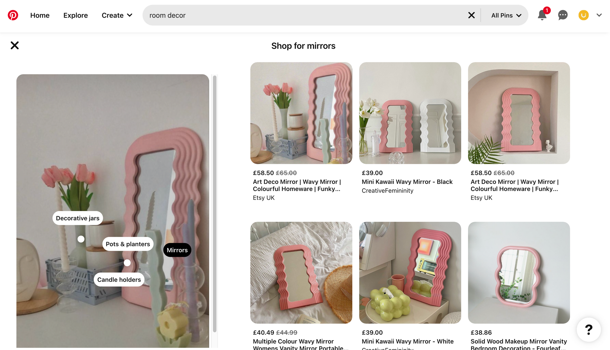
Pinterest’s UI design is also very useful for online shopping, and this is due to item tagging in their pins. These tags are added to specific items in an image, and once a user clicks on a tag, they’re immediately taken to a shopping section. A user can then scroll through specific items relating to the tag. By connecting users to various stores through tagged items, Pinterest has created a whole new way for users to shop online, and to find items they didn’t even realize they needed.
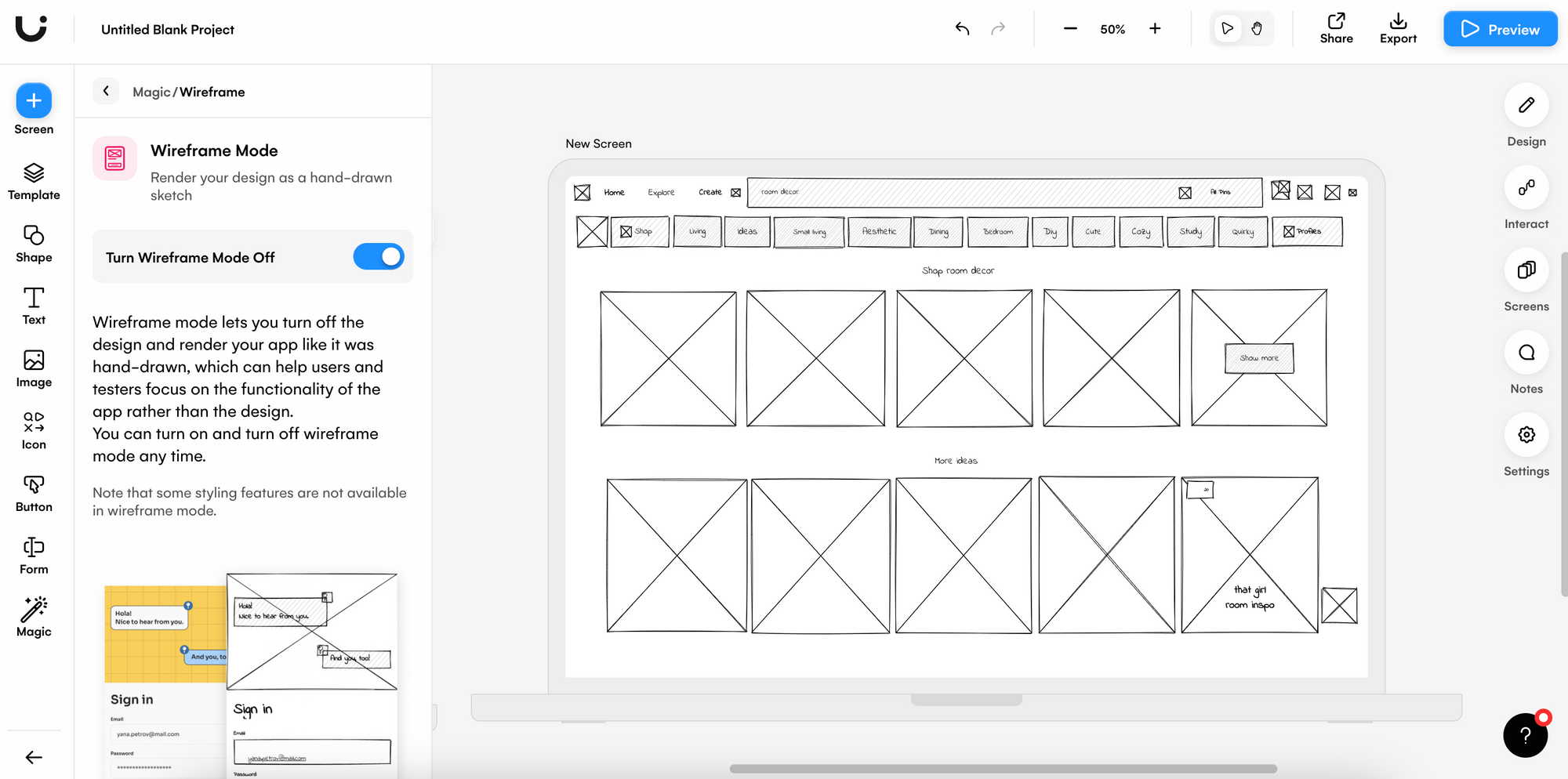
To give you an idea of where to start with a UI design such as the Pinterest website, why not take it back to basics with none other than our very own wireframe mode? By importing a screenshot of Pinterest into Uizard you can test the functionality of this UI design without the glitz and glamor of bright colors and images.
Sometimes a wireframe is all you need to get started on a project, and to develop your own detailed mockup.
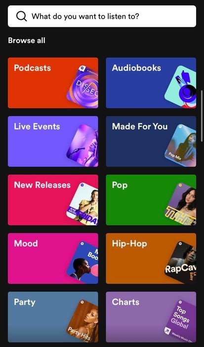
Spotify mobile app
With approximately 515 million users, Spotify is a household name that we’re all familiar with. Available as both a web app and a mobile app, Spotify acts as a music, podcast and audiobook player that users can either access for free with ads, or as part of a premium subscription.
Why we love it
Spotify is an unmatched audio player, and their mobile app design is pretty cool too. Brimming with personality, bright hues are contrasted against a dark background for that ultimate eye-catching experience. Spotify, in our opinion, is onto a winning UI design example, so let’s break it down.
Layout, elements and components
The Spotify app utilizes a mixture of UI elements, such as pause and play icons, and components, such as search bars, to facilitate a great user experience. The overall aesthetic of Spotify’s UI design is relatively bright — with a range of vibrant colors being used. These colors are emphasized by a black background, which is used to contrast against text, images and card components. Jam-packed full of interactive button elements, and card components, Spotify is easy to understand, navigate and use.
Usability
The home screen of this UI design is all about personal touches. From suggested playlists, to playlists made especially for you, Spotify knows how to design with the user in mind. Messages such as ‘Good Morning’, and ‘Good Afternoon’, also appear at the top of the home screen, which is another nice addition.
Moving onto the explore page, a user is greeted with buttons and card components leading to various genres and other sections of the app. This layout gives the user an alternative to a manual search, and it’s also a fun way to get users to interact with the design. Spotify is a great example of an easy-to-use UI design.
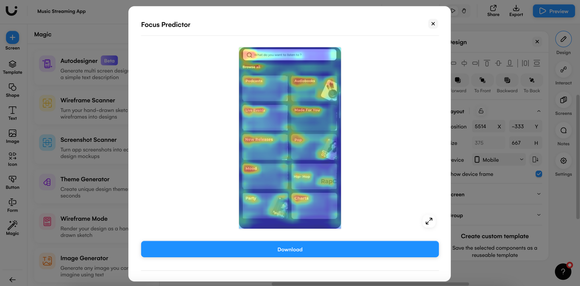
Interested in which areas of the Spotify app draw the most attention? Using a combination of Uizard screenshot scanner and focus predictor, it's easy to isolate the elements and components users are drawn to.
To get started, import a screen grab of Spotify’s explore page to our screenshot scanner, thus creating a new design screen. Next, select the screen that you’ve added your screenshot to, and click the ‘focus predictor’ icon at the top of the design and let the magic begin. Uizard will then highlight the areas of your design screen using a heatmap to indicate which areas are most likely to be clicked by users.
From this point on, designing your own music streaming app with Uizard is a breeze. Make use of our pre-built design screens, as well as a library full of UI components, to create the perfect music mobile app.
Calm website
Calm is a sleep, meditation and relaxation app, and has had over 100 million downloads. Users have the option to listen to calming music, learn to meditate and to improve the quality of their sleep via the Calm app. We are going to take a deep dive into their particularly interesting web UI design.
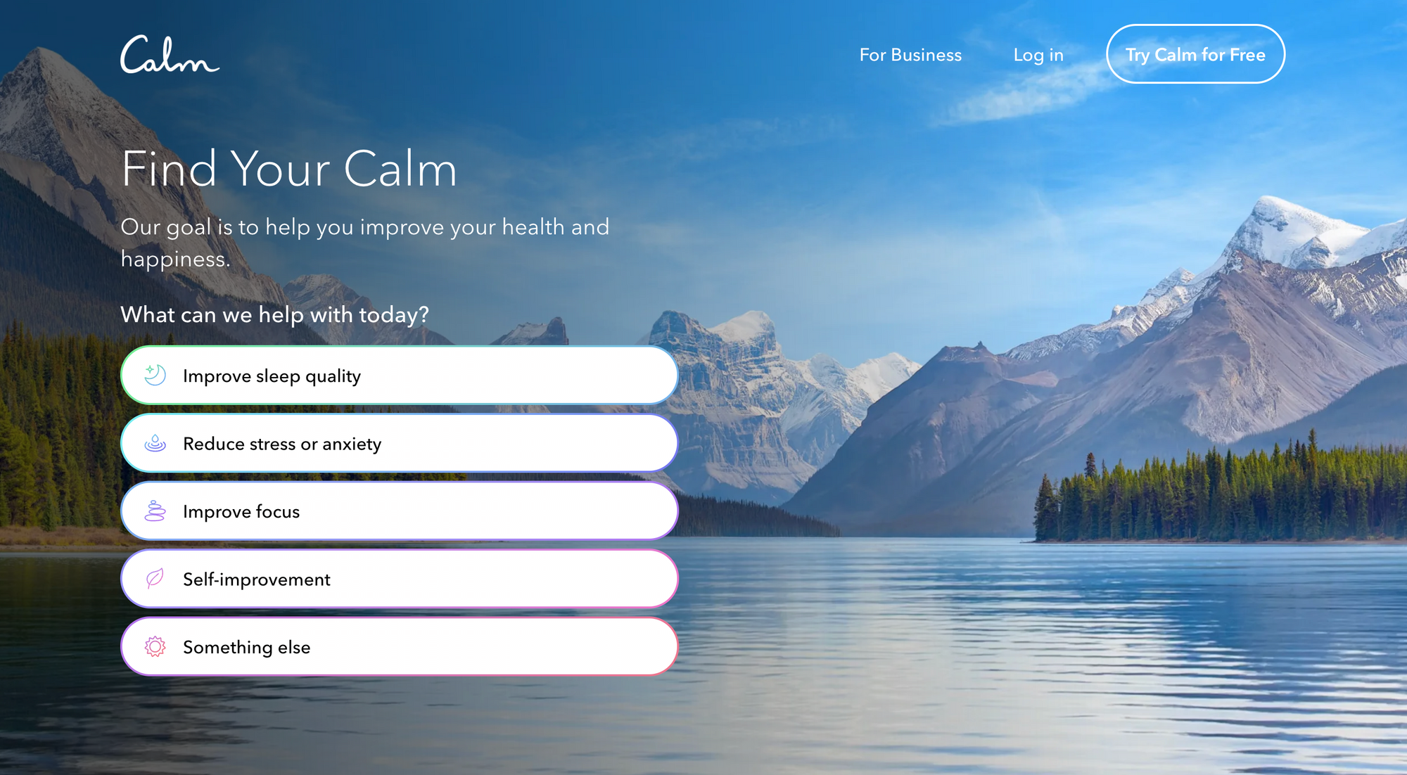
Why we love it
Just looking at the mountainous range of Calm’s website background evokes a feeling of tranquility in the user. The cluster-free UI design is peace inducing and is optimized for an amazing user experience. With an unusual first appearance, this UI design example had to be included in our list.
Layout, elements and components
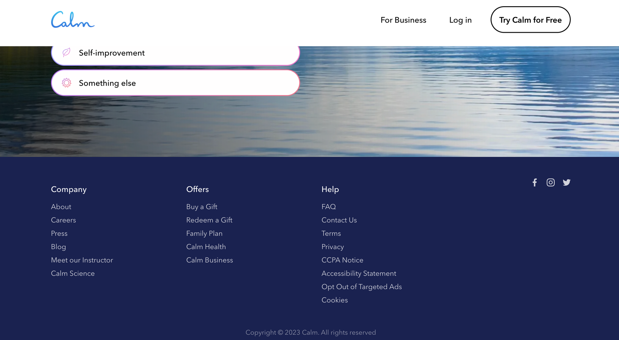
The landing page itself is very simplistic, with a sparse, three-button, header navigation. The footer component is actually the place where users can access the majority of the other pages, as well as their two subdomains — Calm Health and Calm Business.
The Calm website design uses a small variety of elements and components on its main site, but this variety does increase on Calm Business and Calm Health. The most notable elements used on the main site would be images, buttons and text. The blue-toned colors they have chosen for their site are very calming, which we’re sure is not a coincidence.
Usability
Now this UI design is slightly different to the rest we’ve come across, and it focuses on a question user pathway as the main site navigation. The user is provided with five categories on the landing page, of which they can select one or multiple options. Clicking continue takes the user through a set of questions surrounding the level of sleep issues they might be experiencing.
Although these questions lengthen the time for a user to reach their end goal, they make the site feel very personal and user-focused. It’s an interesting concept that adds another dimension to a website.
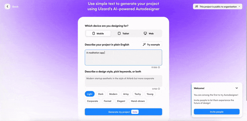
Generate your very own meditation app for mobile or web with Uizard Autodesigner. All you need to do to get started is to select a device, come up with a simple prompt, for instance ‘A meditation app for improving sleep and boosting happiness’ and make some choices about the aesthetic of your design. Finally, click the generate button, and voila!
If you want to see what else Autodesigner can produce from your prompt, you have an added option of regenerating your design. Create your dream meditation design today with Uizard. (Check out our generated app below!)
Designing a user interface for your own app or website has never been easier than it is with Uizard's easy-to-use, drag-and-drop editor! Sign up for free today, or head over to the Uizard blog to find out more about the world of UI design.