What are UI elements? User interface elements explained
User-centric designs have become an important part of our digital products, so naturally, the questions surrounding user experience in design have increased massively. This is where UI design comes in. But what exactly is UI design?
In simple terms, UI design is the creation of the visuals that appear on digital products such as websites and apps. Whether it's flicking between product pages, or reading a blog post, user interface design makes it all possible. If you want to get to grips with the basics of UI design, we suggest having a read of our previous blog post, ‘The Uizard guide to UI design’.
In this article, we’re going to take a deep dive into what UI design elements and components are, how you can use them to streamline your design projects, and include some examples from Uizard’s very own UI components library. Understanding these elements and components will level up your UI design game, and help you to create faster and more intuitively - so, let's get into it.
UI design in Uizard
Skip to section:
What are the types of UI elements?
What are UI design components?
What are the types of UI components?
UI design components in Uizard
How to use elements and components in your UI design
What are UI design elements?
UI design elements are the building blocks that make up a user interface. These can range from small items like buttons and icons to larger elements like image blocks and container fields. These elements play an integral role when it comes to creating effective and intuitive user experience for a digital product.
Typically, UI design elements can be used to guide user interactions, present information, or enhance the visual appeal of the user interface. UI elements provide a sense of familiarity for users whilst helping them to understand and navigate through an interface, providing a clear path to achieve a specific goal or action.
What are the types of UI elements?
UI elements are multi-functional and can be used across a wide range of project types. In the table below, we've broken down UI elements into their most common types, outlined their roles and functions, and discussed how they can be used to help create user-friendly UI designs.
| Element Type | Description |
|---|---|
| Buttons |
With a customizable shape and endless CTA text options, buttons are one of the most common UI design elements. Located on every app and site, they allow users to perform an action with one simple click. |
| Text |
From product descriptions to headings, text is constantly used within UI designs. Whether it’s used by itself, or inside a button, text offers extra context to users as they navigate a UI design. |
| Images/Videos |
Both images and videos are types of UI design elements, and they serve both an aesthetic and an informational purpose in a UI design. They provide a user with extra context about a page or product. |
| Icons |
Icons are UI elements that can be easily recognized by users. For example, pause and play icons. They’re a great way to improve visual aspects of a UI design, as well as offering users new ways to interact. |
| Input field |
Input fields are sections on UI designs that allow users to input text. Login and sign-up pages both use text fields to gather information about users and store it. Search bar components are also an example of a text field. |
| Input dropdown |
These UI elements allow users to select an option from a dropdown list. When selecting languages in the footer of a website you may come across this element. |
| Input stepper |
An input stepper provides a user with numerical values that they can then increase or decrease. Although less common, these UI design elements can be found on sites or apps that require sizing or measurements. |
| Slider |
A slider allows users to drag a knob or button to a certain point across a fixed space. Volume control is a great example of a slider element in action. |
| Toggle/Switch |
Toggles and switches signal on/off functions. Located in areas such as in-app settings or at the end of forms, they encourage users to personalize their app or web experience. |
| Checkbox |
A box that can be ticked or unticked within a UI is a checkbox. For example, if you’re signing up to a new app, and you want to opt out of email marketing, you would tick the checkbox. |
| Radio button |
Similar to a checkbox, but with a circular appearance, radio buttons signal ‘yes’ when filled in, and ‘no’ when remaining an outline. An example location would be checkout pages — they may appear when selecting a payment type. |
What are UI design components?
A UI component is a standardized container that is used for quick and easy design. UI components usually fit into one of three categories (namely informational, navigational, and input controls), and can be composed of multiple or single UI elements that represent specific functions.
An example of a UI design component would be a navigation bar component — it uses various elements such as icons, buttons, and text in order to demonstrate the structure and core pages of an app or website in a user-friendly and intuitive way.
UI design components vs. UI elements
Whilst the terms ‘component’ and ‘element’ may seem very similar, there is a bit of nuance when it comes to how the terms are used within the design sphere.
A UI component tends to be a composite block, card, or container that’s made up of one or more specific UI elements. These composite blocks are standardized for quick and easy design and represent specific actions.
Elements on the other hand are the basic building blocks of UI design and can be adapted for many different purposes. As an example, think of the many applications of an input field vs. its use as part of a search box component within an app design.
To summarize, UI elements are the smaller visual building blocks, while UI components are larger, self-contained, reusable entities that often incorporate multiple UI elements to provide specific functionality or perform a particular task.
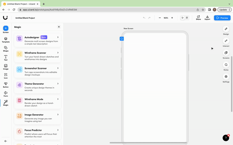
UI design with Uizard's drag-and-drop editor
What are the types of UI components?
There are three types of UI components which cover most of the standardized blocks you would need to use when designing an app or website. In the table below, we’ve taken a look at these component types in more detail and outlined some example elements commonly utilized across all three.
| Types of UI components | Description | UI elements utilized |
|---|---|---|
| Informational |
Informational UI components are used to share information with users. Examples here include content cards and video components. | Text, buttons, images/videos. |
| Navigational |
Navigational UI components help users to move around a design. Examples of navigational components are head navigation bars and CTAs. | Buttons, icons, text. |
| Input Controls |
Input UI components allow users to input information directly into a design. Examples here might include user input components such as onboarding components or checkout components. | Input fields, input dropdowns, input steppers, sliders, checkboxes, radio buttons, toggles/switches. |
UI design components in Uizard
Kickstarting your app or web design can be a little daunting, especially if you’re new to the world of UI design and prototyping. But design doesn’t have to be difficult with Uizard’s easy-to-use, drag-and-drop editor. To make things really simple, we've grouped the UI design components you'll find in the Uizard app into 17 easy-to-navigate categories...
- Blog
- Card
- Content
- Dialog
- Footer
- Form
- Gallery
- Header
- List
- Mobile
- Multimedia
- Navigational
- Panel
- Shop
- Social
- Table
- Web
Blog UI components
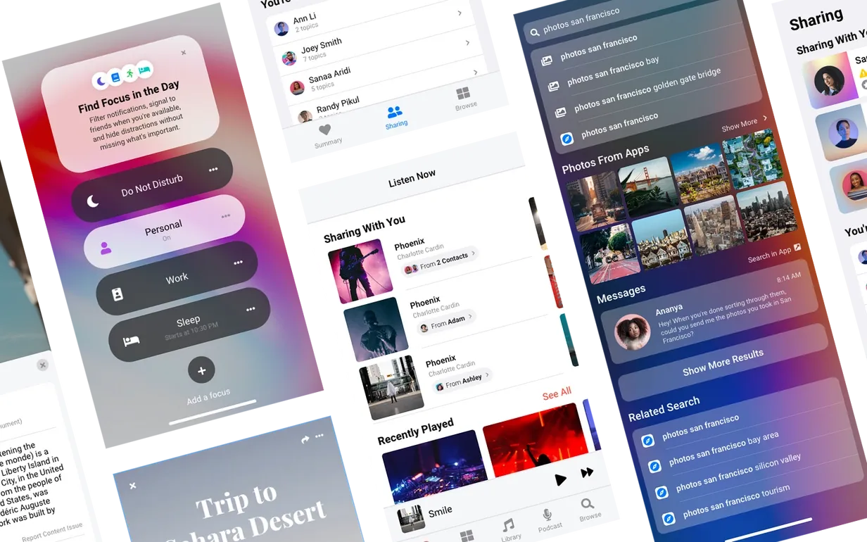
Looking to design a blog for your next project? Then you might want to utlize some standardized blog components to bring your concept to life. Uizard includes various blog components such as landing pages, blog carousels, and feature cards that can be dragged and dropped into your UI design. Check out our mobile blog app design template below to see these components in action.
UI elements used: buttons, text, images, icons
Card UI components
Card components group together UI elements in a square or rectangular format to resemble a card. These UI components can range from cart overviews and calendars to pop-up messages and pricing tiers. Cards are great to use when designing the UI for your app or website as they provide a condensed space for related informationa and interactions, which minimizes the risk of overwhelming your potential users.
UI elements used: buttons, text, images, input fields, checkboxes
Content UI components
A key part of any solid UI design is content presentation, and that’s where our content UI components can help. Content components are used to structure various screen types for the benefit of user navigation as well as to boost information digestibility. The combination of UI elements, such as text and images, within these UI components, aid the readability and aesthetics of content-heavy pages.
UI elements used: buttons, text, images, icons
Dialog UI components
Dialog components allow users to input text and make choices about the sort of information they want to provide. They include UI elements such as input fields, where users might type in their email, with accompanying buttons, for subscribing to newsletters. These elements help users to complete stress-free actions.
UI elements used: input fields, text, buttons, images
Footer UI components
Footer UI components sit at the bottom of a UI design and allow users to move from one page to another. The look and usability of your footer will depend on what type of digital product you're designing. For instance, many mobile app designs prefer to use simplistic icons as a footer, whereas a website design focuses on clickable text.
UI elements used: icons, text, images, input dropdowns
Gallery UI components
Images are essential for designing rich and engaging UI designs for your digital products. Not only do they look visually appealing, but they can also offer extra context where words can’t. A gallery UI component is used to lay out images on a UI design and, with a mixture of elements like text and buttons, they help to facilitate a richer and more interactive user experience.
UI elements used: images, text, icons, input fields, buttons
Header UI components
It’s likely that you will be familiar with headers. They are used as the main form of navigation and sit at the top of most apps or websites. Uizard’s header UI components contain various elements that help you demonstrate the structure and information architecture of your site or app design.
UI elements used: icons, text, images, buttons
List UI components
List UI components are exactly what they sound like, they’re the formation of a list of items. From a list of settings that users can switch on/off with toggles, to a track list with corresponding pause/play icons, these UI components can be used for all sorts of UI design projects.
UI elements used: radio buttons, toggles/switches, icons, text, images
Mobile UI components
Mobile UI designs utilize slightly different components to what you would see across web app or website design. As well as accommodating a different screen resolution, mobile UIs often take more of a minimalist approach due to the smaller screen size. Uizard's library of mobile components is made specifically for mobile app designs and can easily be dragged and dropped into your projects.
UI elements used: text, icons, toggles/switches, buttons, checkboxes, images, input fields
Multimedia UI components
Video and audio players are examples of multimedia UI components with each containing various UI elements such as icons for pause/play buttons, and sliders to show the progression of a video. In the Uizard app, you have access to multiple multimedia UI components, perfect for any web or app design.
UI elements used: video frames, image frames, text, sliders, icons, buttons
Navigational UI components
To demonstrate how your users will move from one page of your app or website to another, you're going to need to include some navigational UI components. Undoubtedly, you will have come across these components before, and they sit at the top, bottom, or side of apps and websites.
UI elements used: icons, images, text, input fields, input dropdowns, buttons
Panel UI components
Much like headers and footers, a panel is also a form of UI design navigation. A panel, or a sidebar, is a UI component composed of icons and button elements. Largely located on web apps, panel UI components offer a fresh new way for users to locate new areas of an app.
UI elements used: icons, images, text, buttons
Shop UI components
Specifically curated for e-commerce designs, our shop UI components provide you with everything you need to design your own e-commerce store. Check out our e-store UI design template below to get a feel for the type of UI components often used in e-commerce UI design (e.g., basket icons, product display components etc.).
UI elements used: icons, text, images, buttons, toggles/switches, checkboxes, input fields
Social UI components
To be used on social media UI designs, and wherever else you see fit, these UI components utilize a mixture of UI elements. Input fields are used to demonstrate messaging functionality, whilst icons represent how your users will flick between pages easily. Use Uizard's social UI components to design your very own social media app or site or incorporate social elements into your other designs.
UI elements used: input fields, text, images, icons
Table UI components
On occasion, you may need to display large quantities of data as part of your UI design, and there’s no better way to do so than with a table. Our table UI components are simplistic, and include input dropdowns, checkboxes and text.
UI elements used: text, icons, checkboxes, buttons, input dropdowns
Web UI components
Much like our mobile category, there are also specific components for web UI designs to make designing with Uizard super quick and easy.
UI elements used: text, icons, checkboxes, buttons, images, input fields
How to use elements and components in your UI design
Now that you know your component options, it’s time to take a step back. Although some UI design elements, namely navigational elements, will be a no-brainer for your design — it’s important not to go overboard with elements. Cluttering your UI design will help no one, so choose your UI design elements wisely.
If you're really struggling with your UI design and don't know where to start, or you've found yourself stuck staring at a black screen, then why not use one of our pre-made UI design templates? Hand-crafted by our team, every Uizard UI design template embraces a user-focused approach and comes packed with all the must-have components and elements built in to really make your project sing. Simply sign up to Uizard, select your template, and adapt the design to make it your own.
Raring to go? With Uizard’s drag-and-drop editor and UI components library by your side, your UI design can take shape in no time at all. So, why not sign up today? If you’re interested in more articles like this, head over to the official Uizard blog right now.