Five website design best practices for 2023

Most articles frame website design best practices around technical issues like simplifying navigation bars and presenting clear and specific CTAs (calls-to-action). These are valid and useful pointers, but they miss the bigger picture. Given how much of our lives take place online — from social interactions and shopping to the shaping of society itself — contemporary UX design best practices take on a more pressing human meaning.
Best-in-class tools already have website design best practices built right in. Uizard, for example, uses the power of sophisticated AI to develop website UI templates and prototypes that include tried-and-tested UX design patterns and UI elements. With this in mind, our guide to website design best practices takes a more expansive view of the human factors that influence the creation of digital products and services so that we might ensure a better experience for those who use them.
Skip to section:
Website design best practice with Uizard
1. Design with empathy
Empathy is the ability to shift our perspectives and shelf our own biases so that we may walk in someone else’s shoes and understand the how and why of their experience. Often empathy is confused with sympathy, which is compassionate understanding that comes from our own experiences. Empathizing with users is at the heart of a human-centered design practice. Before we’re able to sketch homepage designs, before we begin to brainstorm fonts and color schemes, we must first understand what’s important to the people we’re designing for.
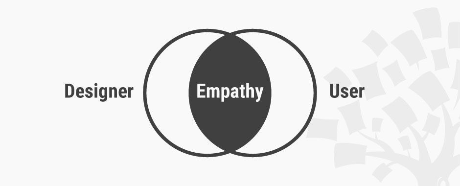
Model for an empathic approach in Design Thinking (Source: Interaction Design Foundation)
Building empathy into your design process requires embracing four key mindsets:
- Reserve judgment: Your goal is to listen and observe. Remove your own ideas and opinions from the equation.
- Question everything: Assume nothing. Your user is the expert on themselves.
- Seek patterns: As themes and motifs begin to surface, you’ll be able to ask even better, more focused questions.
- Stay curious: Empathy isn’t something that’s confined to a phase of the design process. Keep listening, and keep learning.
Design is fundamentally about problem-solving, which means that it must start by problem-finding. Assuming you have at least a rough idea of your website’s core audience, how might you immerse yourself in your potential users’ lives? The easiest way is to engage people in direct conversation: simply ask them about their needs. Be an active listener, tuning in to what their responses reveal about their values, attitudes, hopes, and fears. Dig deeper. Keep asking “Why?” Get people to show you the objects and artifacts that are meaningful to them, and let them tell you their stories.
Of course, we know there’s often a gap between what people say and what they do, and that gap is full of opportunities for finding juicy design problems to solve. Head out “into the wild” and pay attention to how people behave and interact in a given environment. How do they present themselves? Are there changes to tone and composure? Or, try “A Day in the Life” of a user. Watch them as they go about performing tasks. What’s their process? How do they respond to friction? What workarounds and shortcuts have they invented for themselves? Observing users in the real world can lead to powerful and unexpected insights about how we navigate the increasingly blurry line between our online and offline lives.
2. Design for diversity and inclusivity
Once we arrive at an understanding of users’ diverse needs, design necessarily becomes about prioritizing the solutions we create to meet them. This means not only being aware of all the ways people might use or access your website but also how your website — the content, the imagery, the voice — represents and portrays people. Considering that every decision has the potential to include or exclude certain users, designers must be accountable for the why behind every design element on the screen.
Inspired by surgeon and author Atul Gawande’s book, The Checklist Manifesto: How to Get Things Right, the designers and futurists at Project Inkblot created the Design for Diversity (D4D) framework as a way of bringing a more equitable approach to the design process.
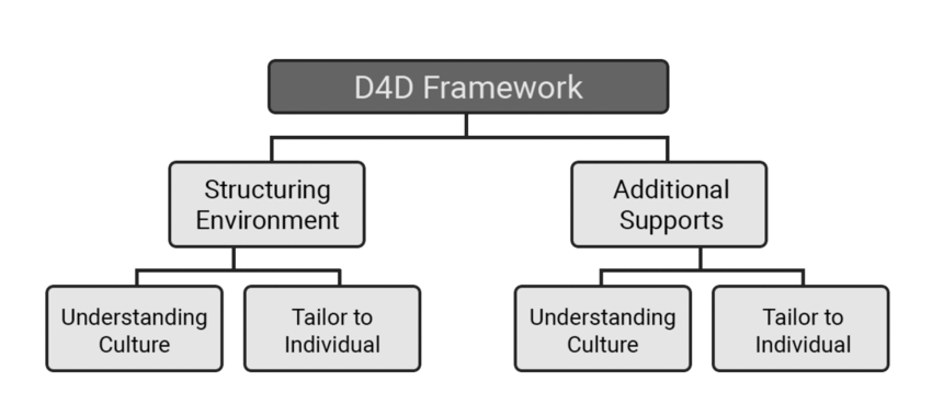
As part of their guide for The Creative Independent, they clarify the meaning of key terms this way: “Diversity is quantitative. It’s the composition of different people represented in what you make, and the decision makers on your team. Inclusion speaks to the quality of the experience you’ve designed for these diverse folks, so they experience themselves as leaders and decision makers.”
The first step toward designing for diversity and inclusivity is to confront your team’s own unconscious biases. This means taking a look at your own identities and interrogating how they might inform and influence your design decisions. Design is a collaborative process that thrives on bringing multiple perspectives to the table. What perspectives or lived experiences might be missing from your team? How might you invite others into your design process — especially those who have had less decision-making power in the past — and actively engage in representing their best interests?
The D4D framework offers several questions that can help expand your team’s thinking:
-
As part of your ideation, try the brainstorming question: “What’s the worst case scenario, and on whom?”
-
As you’re homing in on your target audience and messaging, try the “All People” statement to see who you might be excluding and why.
- The D4D designers offer this example as a starting point: “All People have access to the resources needed to get their writing published.” Your next step is to drill down to where the statement proved false, identifying all the users who don’t have access to the resources needed to get their writing published. What missed opportunities might this reveal?
-
As you’re developing user personas, try separating your audience into two (or more) groups:
- The Target Source are your intended audience — i.e. your “target” demographic or ideal customer.
- The Excluded Source are communities outside of your intended reach, but who may interact and/or be impacted (negatively or positively) by your product, service, or content.
While doctors like Atul Gawande may be governed by the Hippocratic Oath, designers are not sworn to any explicit code of ethics. But that doesn’t mean they shouldn’t be. As design leader Mike Monteiro puts it in his own take on a designer’s code of ethics, “For years, we referred to people who weren’t crucial to our products’ success as edge cases. We were marginalizing people. And we were making a decision that there were people in the world whose problems weren’t worth solving.“ At every stage of the design process, designers must be responsible for proactively seeking feedback and analyzing the potential impact of their work among the range of audiences it reaches, intentionally or not.
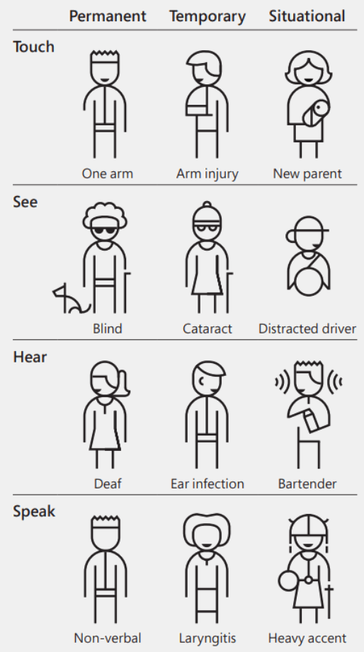
(Source: Microsoft’s Inclusive Design Toolkit)
3. Design for accessibility
According to the W3C Web Accessibility Initiative (WAI), the intent of accessibility is to ensure that “people with disabilities can equally perceive, understand, navigate, and interact with websites and tools. It also means that they can contribute equally without barriers.”
As part of the World Wide Web Consortium (W3C), the WAI is the international standard-bearer responsible for developing and maintaining the guidelines for web accessibility. These guidelines are designed to uphold four principles:
-
Perceivable information and user interface, including guidelines for the presentation of text and non-text content, for example:
- The use of alt-text on buttons and graphics, which is used by screen readers to describe web page design elements to the blind, visually impaired, and others
- Providing captions, subtitles, and transcripts for multimedia elements, such as audio or video
- Recommending screen contrast ratios, avoiding the use of color to convey information, and using typography (e.g., H1, H2) to indicate content hierarchy
-
Operable user interface and navigation, including guidelines for key functionality, for example:
- Users can navigate with multiple input modalities, including a mouse, keyboards, mouth sticks, gestures, and voice recognition.
- Users have mechanisms to control (stop/play/pause) auto-play media and animations, manage scrolling behaviors, or suppress interruptions (close popups).
- Links, buttons, and form fields use focus indicators to highlight active navigation.
-
Understandable information and user interface, meaning that content is readable and understandable to the widest audience possible, for example:
- By identifying the primary language of a website to make it easier for browser translation or providing localization or language switching when possible
- By considering a website visitor's education level and using clear and simple language that avoids presenting idiom, jargon, and abbreviations without definition
-
Robust content and reliable interpretation that meets current markup standards for browser compatibility and use with assistive technologies.
- Not only has the WAI published its comprehensive guidelines, but the organization also offers courses, certifications, and tools specifically built for website designers and developers to apply accessibility standards to their work.
4. Design for usability
Usability is a measure of the quality of a user experience that includes its utility — whether a website or an app does what it needs to do — and how easy and pleasant it is to use. Way back in 1994, Don Norman and Jakob Nielsen, founders of the Nielsen Norman Group (NN/g) and pioneers in the field of user experience design, established what’s still considered the quintessential set of 10 usability heuristics (more rules of thumb than specific guidelines).
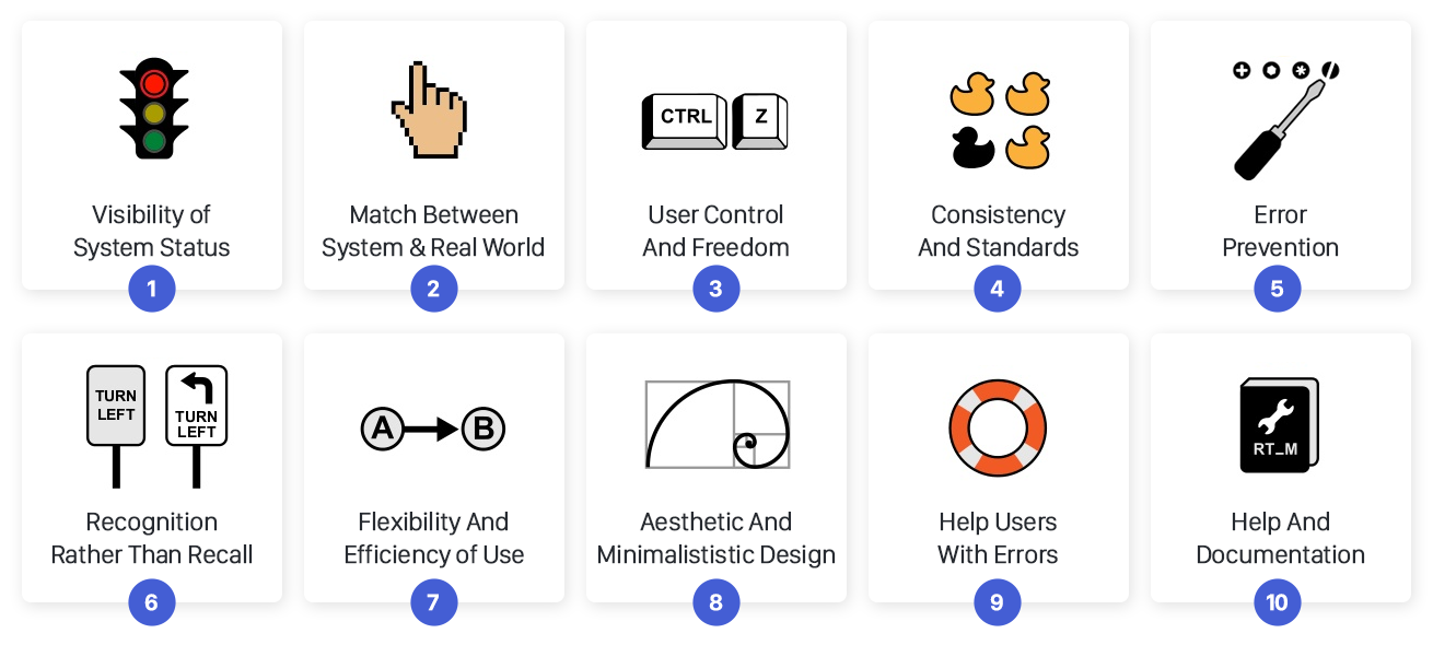
10 usability heuristics (Source: Jonathan Ibrahim)
Among them, some key considerations for website design best practices are:
- Keeping users informed about what’s going on and providing them with feedback that validates the expected outcome and helps them know what to do next
- Giving users a clearly marked "emergency exit" to easily abandon a process or undo a mistake without getting stuck
- Establishing guardrails to help users recover from “slips” of unconscious errors and preventing mistakes with adequate warnings
Usability testing is an important aspect of evaluating whether your design meets the needs and expectations of users. NN/g suggests five essential measures that can help identify gaps in your experience and opportunities for improvement:
- Learning curve: How intuitive is the experience for a first-time user? Can they easily accomplish tasks without elaborate tutorials or guidance?
- Efficiency: How quickly can users perform key tasks?
- Memorability: Does the experience use recognizable design patterns, e.g., standard iconography or F-Z visual hierarchy for scanning?
- Recoverability: How easy is it to recover from errors?
- Satisfaction: Was the experience pleasant?
It’s worth noting that usability metrics correlate with a number of key performance indicators (KPIs), like average time spent on a task, task completion rate, or number of errors. Usability testing offers an ideal opportunity for gathering both qualitative and quantitative feedback that can help move your designs forward.
5. Design for transparency
If you’ve ever removed “suggested” products that had been automatically added to your cart at checkout or been charged for a subscription you didn’t sign up for at the end of a free trial, you’ve experienced dark patterns in website design. Dark patterns are features intentionally designed to heavily influence or even trick users into making certain choices, like granting tracking consent or clicking navigation that turns out to be an ad.
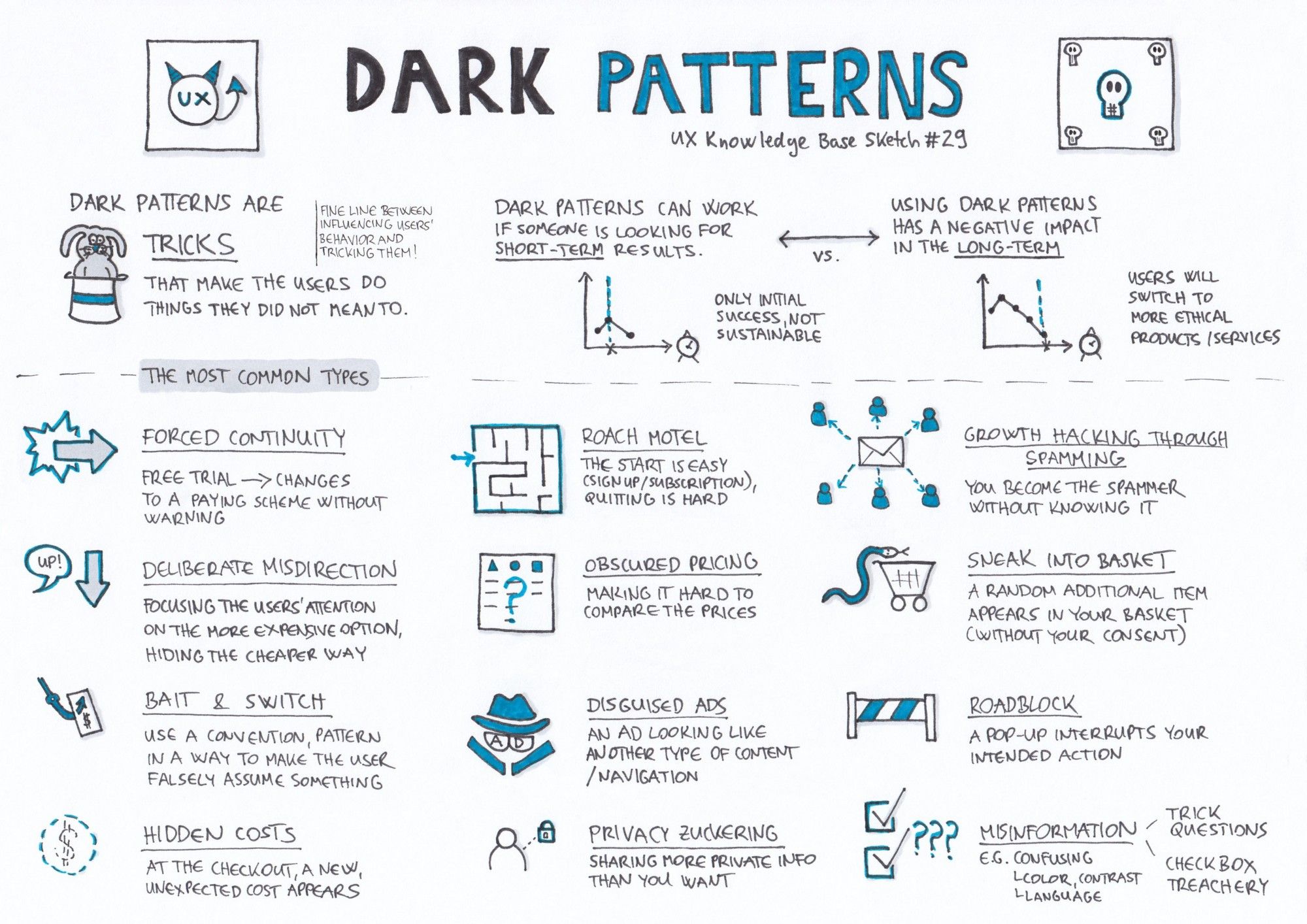
Dark patterns (Source: UX Knowledge Base)
Though the term was coined by UX designer Harry Brignull in 2010, dark patterns designed to drive particular behaviors certainly pre-date the web; who remembers ordering 10 CDs for a penny, only to be roped into an impossible-to-cancel Columbia House subscription? (Don't remember? Okay, I feel old now.)
But with the amount of online content we consume mostly by skimming, some companies and digital marketers are keen to take advantage of our inattentiveness and decision fatigue. Brignull lists a number of recognizable dark patterns, including:
- “Confirmshaming”: Some websites will use guilt or shaming tactics to convince you to hand over your personal information (e.g., “I don’t want 20% off my next purchase” as the opt-out button text).
- “Misdirection”: Manipulatively timed popups and notifications that interrupt user flow and make it difficult to find how to close the window or dismiss the notification.
- “Privacy Zuckering”: Perhaps the most familiar, where obtuse privacy settings (e.g., Facebook) or brightly colored “agree and continue” buttons encourage users not to read or contemplate a service’s terms and conditions and therefore not to understand what they’re agreeing to.
The good news is that efforts by designers like Brignull and users who have taken a stand for greater control over their privacy and personal data sharing have led to an increase in regulatory legislation, such as California Consumer Privacy Act of 2018. Dominant tech companies like Apple and Google have also recently taken measures to implement policies that give users more agency over their data protection.
With the introduction of GDPR (General Data Protection Regulation) in 2018, the EU has some of the most stringent standards of online consent in the world, with guidelines that stand as useful examples for designers to follow, such as:
- Requiring a positive opt-in instead of pre-ticked boxes or any “default consent”
- Avoiding making consent a precondition of a service
- Specifying the purpose and intent for any data collection and what we’re going to do with it
- Giving distinct options to consent separately to different features
- Making it clear and easy for users to withdraw their consent
It’s important to call out that there are positive defaults that support ease of use and help users make good choices and that collecting certain data can actually create a better user experience. But for designers, being transparent about our motives and intentional about our requests is the least we can do to respect our users.
Website design best practice with Uizard
According to the Peter Parker principle, “with great power comes great responsibility”. Design is a superpower (albeit involving a different kind of web), and the practices and principles that underpin each design decision shouldn’t be taken lightly. What makes websites successful isn’t just slick interface design, smart functionality, and content optimized to rank at the top of a search engine results page. Successful websites and digital products are designed to solve real problems, meet real needs, and make real lives better.
As a design tool for non-designers, all the features and the functionality of the platform Uizard are designed with best design practices in mind. Especially ones that take into serious consideration the surprisingly profound impact they have on the humans on the other side of the screen. Our platform has been built for easy-of-use and accessibly whether you are designing for yourself or using one of our UI design templates to design products for others, so why not give it a try!
With tools like Uizard, everyone can now easily design digital products and bring their ideas to life. Use Uizard today for free today.