Founders: How to design a website for your startup

For a lot of startups, your website might be your first introduction to the market. It might even be a simple landing page that announces your new product or service offering.
A website is key to a business's success, but startup founders aren't always well-versed in UI design. In this article, we'll provide an overview that will help you get started and give you a few tips on what startups actually need on their website to make a great first impression.
Write a design brief
A design brief is a document that outlines the scope and requirements of your startup website design project. It lays out your vision and direction, and helps you focus on your project’s goals and priorities. A design brief brings together information from your product/user experience strategy and typically includes the following sections:
- Project purpose: In one or two sentences, describe why your startup needs a website and what you are trying to achieve by creating it. For example: “Our website will be a prospective customer’s first point of contact with our brand and needs to present clear pathways so that we can effectively onboard them to the appropriate position in our funnel.”
- Business goal(s): Think in terms of SMART (Specific, Measurable, Attainable, Relevant, and Time-based) goals as you describe what results or outcomes you hope to achieve with your website. For example: “We want to attract 500 new user sign-ups to our product waiting list within the first month after launch.”
- Target audience personas: Assuming you’ve already created personas, describe why and how each of your target customers will interact with your website. List the top two or three things they are each looking to accomplish when they visit.
- Competitive landscape: Include a simple audit for your top three competitors’ websites that describes a few pros and cons about how they are organizing information, their user experience, and their site’s look and feel.
- Brand values: Articulate what your business stands for in service to your mission. A simple format for this could be a comparison: Our brand is This and Not That. If you haven’t done any brand work yet, try a three-hour Google Brand Sprint as an efficient way of getting the basics in order.
- Tone of voice: Establish a point of view on how you want to “sound” in your messaging. Are you a trusted adviser? The cool and savvy friend? An academic expert? Your voice will need to align with your visuals and be consistent across all your customer channels, from your website to social media to your email newsletter.
- USPs: List your top three Unique Selling Points and itemize which of your offering’s key features and benefits specifically delivers on each of them. Take it a step further by connecting each USP to the customer persona’s needs it most directly addresses.
- Project scope: Finally, specify the amount of time, effort, and budget you’re willing to invest in your website design project. Even if you’re doing the work in-house, outlining a project scope will help you and your team get on the same page about what it will take to get it done.
Overall, a design brief is best when it contains just enough detail to inspire exploration rather than itemize specific solutions.
Make a moodboard
A moodboard is a collection of visual inspiration that acts as a reference point for your website’s creative direction. Whether you’re working with designers or taking a DIY approach, a moodboard will help you develop a vision for a polished and cohesive website look and feel. Your moodboard should include ideas for your site’s typography, photography, illustration, and color schemes, but you can also add imagery that inspires a more general vibe that you want your website to exude.

Pinterest is made for creating moodboards. It’s also helpful to browse sites like Dribbble, where designers post examples of their work, and Typewolf, which curates a “site of the day,” to get a sense of current design trends and inspire ideas for layouts and navigation styles.
You can work on your moodboard in parallel to developing your design brief and continue iterating on it until you’re ready to layer on visual details, as your wireframes evolve into mockups. It’s an ongoing process of adding and subtracting elements as you refine your vision. Later on, you can even use this moodboard to automatically create themes.
Create a sitemap
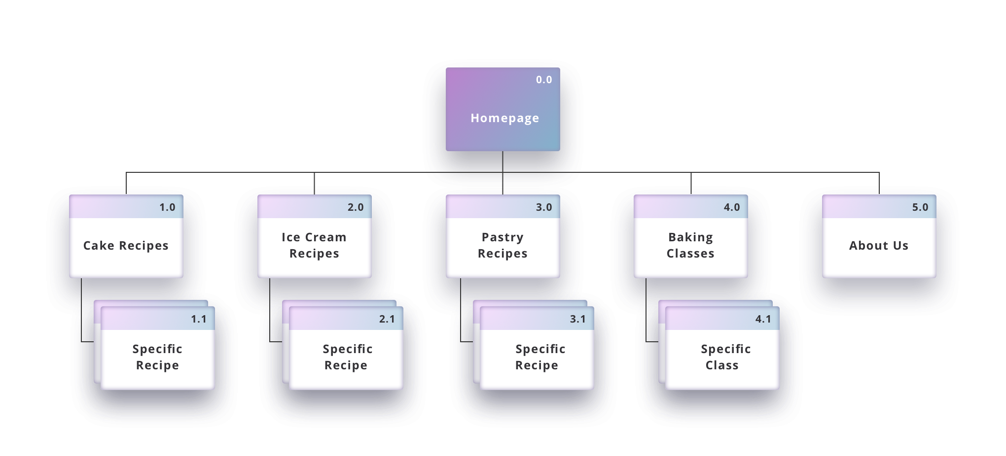
A sitemap is a blueprint of your website’s pages and the system of navigation that connects them. It provides a structure for how your website is organized. Your initial sitemap should be relatively simple but can increase in complexity as you develop more detailed pages and functionalities throughout your design process.
To start, sketch a basic diagram of the relationships between all of your intended key pages and subpages. Your sitemap diagrams all of the pathways a user can take to locate information or complete a task. Your goal is to create a bird’s-eye view of how your website works so that you can know pages you’ll need to wireframe.
Sketch key user flows
A user flow outlines the steps a user takes to complete a specific action, like signing up or making a purchase. Sketch your key user flows to identify where there might be gaps or obstacles between your user and them completing a task efficiently and successfully.
First, you’ll want to sketch the flows for your website’s highest priority actions, meaning those that will convert users into customers. It can help to write these flows as “user stories,” a term commonly used in Agile product development. This just means describing the process in natural language. This can help uncover details that diagramming alone might otherwise overlook.
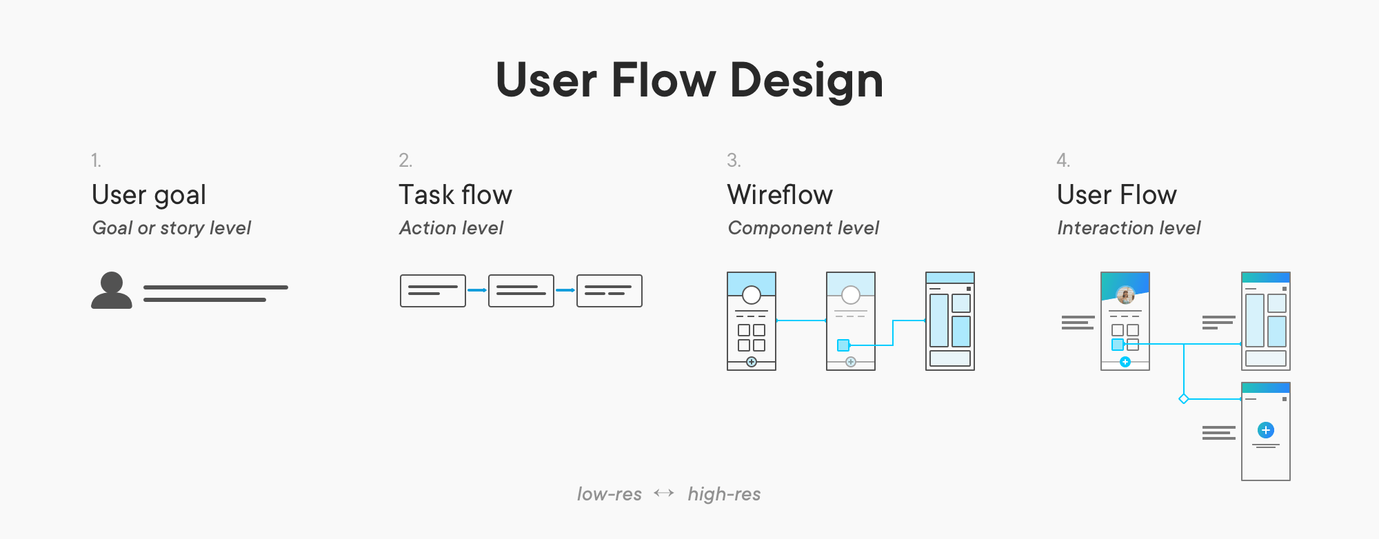
User flows are instrumental to defining the minimum viable product (MVP) version of your website. An MVP should include just enough of your core features and functionalities to be usable and to garner feedback from early customers.
Wireframe key pages
A wireframe shows the hierarchy of all basic design elements on a screen: text, imagery, navigation, and calls-to-action.
Wireframes help you organize your thinking so you can share a more detailed version of the concept with your team and stakeholders.
A wireframe typically starts as a low-fidelity representation of a page’s basic blocks of text, imagery, and functionality rendered simply in grayscale. As you iterate and refine your work based on feedback, your level of design fidelity increases, layering on more detail with content, color, and typography.
At a minimum, you want to create wireframes for your key pages: a Homepage/Landing page, an About page, and a Contact page. Each of Uizard’s web or mobile templates includes layouts for these pages, which are fully editable and customizable, and you can add any other pages that you need. You can then easily connect your pages together into a clickable prototype.
Create a prototype
A prototype is a preliminary version of your website that lets you test how users will interact with it. Similar to wireframes, prototypes can evolve from low fidelity to high fidelity. You should create simple prototypes to test with users as early on as possible in the design process.
A prototype gives you a sense of how your user experience feels, and in testing with users, it will help you resolve usability issues and reveal opportunities for improvement. Uizard is an ideal UI design tool for creating prototypes that help you test and iterate before investing in detailed design and development. For example, take a look at this mobile e-shop prototype created in Uizard:
Get real-world feedback
For founders, your startup’s first website is essentially a test of your business idea. The real-world feedback you get from putting your designs in front of users will help you clarify what’s essential to delivering a good user experience. These insights save time and money and reduce the risk of going too far down a path without validating your ideas.
As you develop your wireframes into an interactive prototype, think about what you need to learn first so that you can either proceed as planned or pivot in a new direction. You and your team will need to come up with hypotheses about why your specific solutions will achieve your specific desired outcomes and orient your tests directly to validate these hypotheses.
When you’re ready to launch your MVP, there are lots of powerful no-code page builders like Wix that require a minimum of development effort for a high-quality and professional-looking experience. In addition, these platforms offer a variety of built-in features that let you conduct regular A/B testing and track performance metrics so you can back up your decisions with data and behavioral insight.
Make a great first impression
A great startup website focuses on a single, clear goal, whether it’s capturing leads for a future release or generating revenue from a new product launch. Keep messaging and CTAs sharply aligned with that goal, and avoid jargon or technical language. Reinforce the emotional connection with your brand by including social proof from testimonials (don’t forget to solicit feedback from your customers whenever you can!). Remember to show instead of tell, making use of screenshots and tutorials to highlight any complex features.
Startup founders need to be clear and intentional with each design decision. Every element of your startup’s website is variable in testing your proposition with potential customers. You may never get a second chance to make a first impression, but you can make every impression count!
Make every impression count with the easiest UX design tool for non-designers. Create a Uizard account for free now.