Landing pages for startups: What is a landing page?
Whether you’re launching a brand new business or testing the waters with a new product, a landing page is the perfect way to demonstrate your value proposition and let your potential customers know exactly what it is you do and how you do it better than anyone else.
The best part about startup landing pages? They are a relatively low-effort, but they are also a high-impact tool for testing out ideas, collecting valuable insights from prospective customers, and for converting those customers once you finally get to launch.
In this article, we answer all your landing page questions and give you lots of useful reasons why you should use landing pages for your own business. Oh, and there will also be some great startup landing page examples along the way to help you understand what to include in your own design to achieve your goals.
Skip to section:
5 essential landing page building blocks
Design your own startup landing page with Uizard
What is a landing page?
A landing page is a web page created as a destination for visitors who click on a marketing campaign link. Visitors to landing pages may come through paid ads, email campaigns, or organically through search engine results page listings. Landing pages are designed to convey a USP or the value proposition of a product or service with the core aim being to turn users into converting customers.
Typically included on landing page is core messaging, visual content (such as product demos), and a core CTA encouraging users to sign up, register, or purchase.
Landing page vs home page
Before we dive any further into the detail, let’s clear up one question that's likely on the tip of your tongue: What is the difference between a landing page and a home page? It’s actually very simple. While both landing pages and home pages are about making great first impressions, a landing page is focused on a single, specific, and typically short-term goal and ideally targeted to reach a particular audience.
Home pages provide a more general overview of your offering. They encourage exploration and browsing along multiple user journeys that appeal to different use cases and present a range of calls-to-action (CTA) aligned to a number of user goals. Everything on a landing page, by contrast, should be singularly oriented towards one call-to-action.
Basically, landing pages are about driving user behavior. We like how Stanford professor and founder of the school’s Persuasive Technology Lab, BJ Fogg, frames this as ‘putting hot triggers in front of motivated people.’ Visitors have already made their way to your landing page via a marketing campaign; now the landing page has only one job: to convert them into customers.
A landing page (or pages, more on that in a bit!) can be used to serve a few common goals:
- Introducing a new product or service
- Testing market reception to a concept
- Finding new customers and nudging them towards a purchase
Next, let’s take a look at the two primary types of landing pages and how to design one that fits your business objectives.
Types of landing pages
Two main types of landing pages can be immeasurably valuable in validating your idea’s desirability and viability in the market before you invest in developing it further.
Lead generation landing pages
Lead generation landing pages are designed to capture user data in order to build a list of contacts to whom you might sell your product or service in the future. In marketing-speak, this is known as the top of the funnel, or the early stages of a customer’s engagement with a brand.
These types of pages tend to use a form as their CTA; users are nudged toward entering their name and email address as the key conversion goal. People can be fiercely protective of their inbox, and gaining access to this privileged attention is the holy grail of marketing strategy.
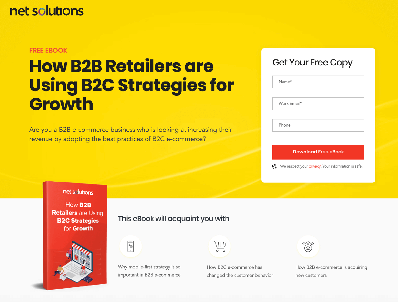
A lead magnet offers something of low monetary value to you, but of high utility to the visitor. (Source: ConvertFlow)
The goal of collecting customer email addresses can be positioned in a number of different ways, like building a list of subscribers, offering early access to your offering, or inviting users to join a private beta.
Lead generation pages are popular with B2C marketers who frequently encourage sign-ups by offering a “lead magnet”: offering something for free, like access to a webinar, an email course, or downloadable to sweeten the deal. These top-of-the-funnel landing pages are all about building your brand’s trustworthiness and credibility with prospective customers.
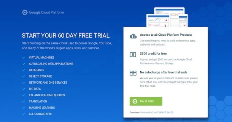
Clickthrough landing pages
Clickthrough pages, on the other hand, function at the bottom of the funnel, helping to close the deal with prospects with whom you’ve already established a relationship.
They’re often seen as an intermediary step between “Add to Cart” and “Checkout,” warming a prospect up with useful and persuasive information about the product’s features and benefits. It’s another opportunity to pitch, but without coming off as too pushy, like a smarmy cars salesperson.
Note the clear terms of engagement to show users exactly what they’re signing up for. (Source: Deskera)
Clickthrough landing pages are popular with SaaS companies, and two familiar approaches are the “trial offer” or the “get started” CTAs. Both of these engage the user directly in the purchase process, drive them through checkout, and thus fully convert them into customers.
Users are offered an accessible introductory price and the opportunity to test drive the product for a limited time. Then, they’re allowed to “cancel anytime” after their trial expires (by which time they've already fallen in love with your product!).
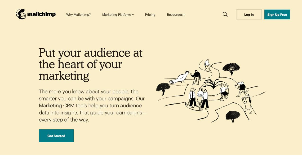
A ‘Get Started’ CTA pulls the user right into the action. (Source: HubSpot)
You can think of lead generation pages and clickthrough pages as two points along a continuous user journey, which means they actually work best as part of a cohesive strategy. For example, suppose you’re planning to launch an online course. In order to attract and grow an audience, you might put up a lead-generating landing page, offering people who sign up access to an exclusive (free!) webinar that shows off your unique and authoritative expertise.
How to get the most out of your landing page
Treat your landing page as an experiment — that’s really what they’re made for. Most landing page-building platforms have built-in A/B testing, so you can play with different variables, e.g., audience segments, CTAs, imagery, etc., to see what’s the most effective for conversion. Be relentless in your pursuit of learning what works. Test, learn, and always be optimizing!
Here’s how to get your head in the landing page game:
- Think about what you need to learn in order to validate your idea and keep moving forward. What questions about your product or service or offering is this landing page helping you to answer? Make sure every element on your landing page is essential to answering those questions and remove anything that isn’t.
- Think about where you need to focus in the customer lifecycle. Are you trying to build awareness? Provide information that will aid visitors’ decision-making? Nudge prospects into customers? Ideally, your landing page(s) will touch on the full-funnel, but your call-to-action should point to just one clear goal.
- Think about how you will measure success. What metrics and KPIs matter to you at this phase? Is it about building a particular number of leads in order to hit an ideal conversion rate? Is it a bottom-line sales target? Put down some hard numbers. Consider that the average conversion rate is just over 2%. That means you need at least 1,000 leads in order to convert 20 paying customers.
Now that you’ve got your strategy in order, it’s time to move on to the landing page design.
Five essential landing page building blocks
Designing effective landing pages is a little bit of art and a little bit of science. Like Lego bricks, you only need a few types of pieces to build just about anything you can imagine. There are five essential elements that define landing page UX and UI.
- Unique selling point
- Hero image
- Features & benefits
- Social proof
- A core CTA
1. Your USP
Your USP defines what sets your offering apart from your competitors. Your landing page headline should be a bold and concise expression of your USP, and all content and messaging on the page should serve to reinforce it. A strong USP will clearly convey the what, how, why, and for whom of your offering.
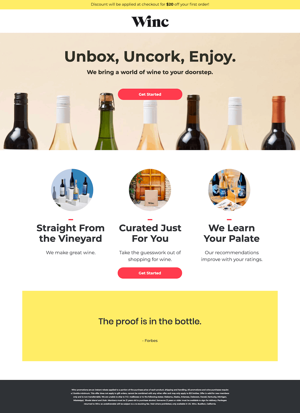
Winc pairs a more playful headline with a clear 3-point breakdown of the service’s core USPs. (Source: Unbounce)
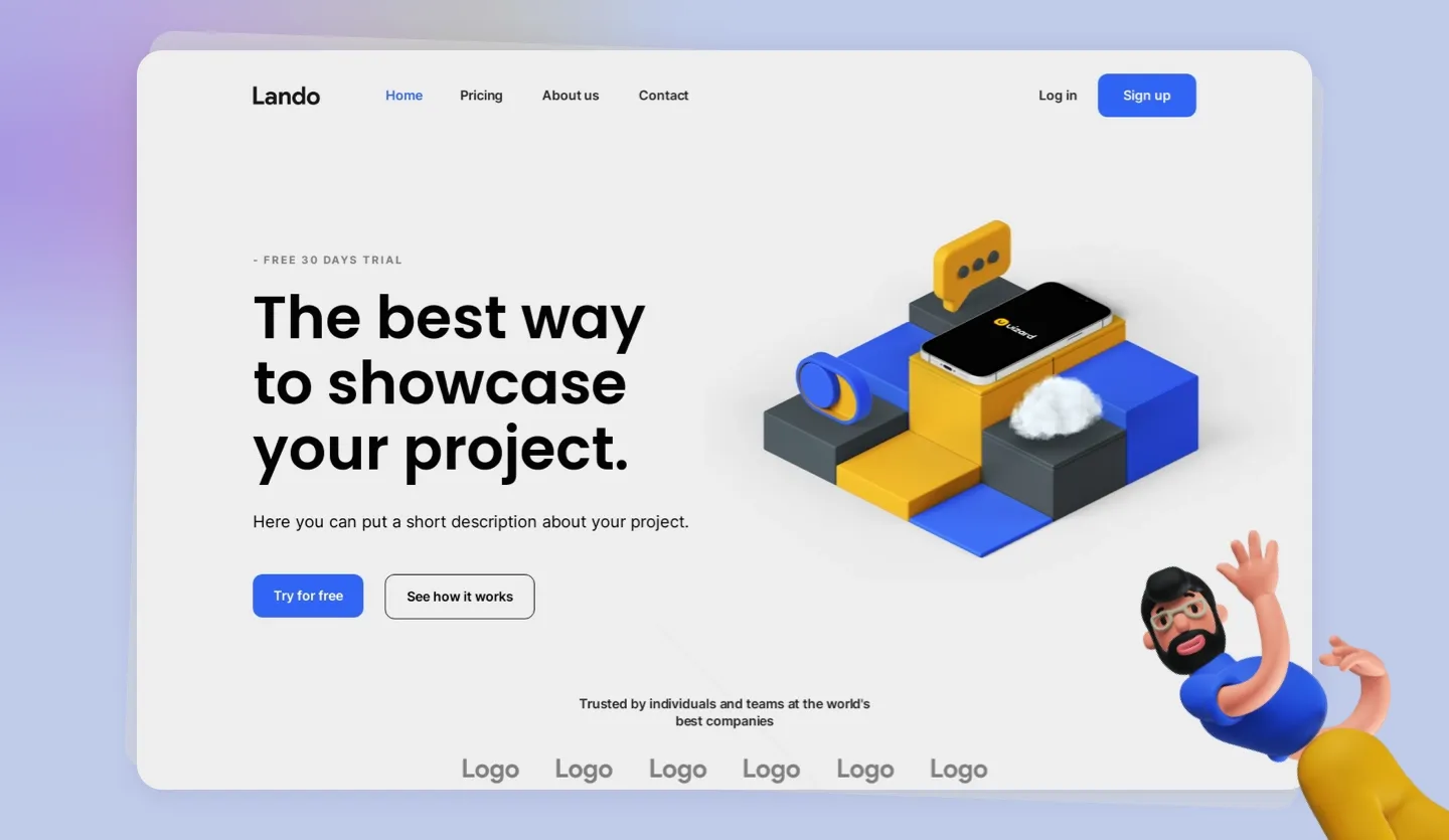
2. A hero image
The hero image usually refers to the main banner area at the top of the page, but eye-catching visuals are a great way to anchor the user’s attention to your most important content anywhere on the page.
A hero image should be, well, heroic, meaning it should evoke a powerful emotional response. It needs to be simultaneously relatable and aspirational. It should be the picture that’s worth a thousand words of your value proposition. No pressure, right?! A few good options for hero imagery are:
- Product Mockups: Offer a sneak peek of how your product looks (or will look when you actually design it!). Think app screenshots and flat lays. Mockups show your product in situ, that is, in a real-life context that helps users imagine a world where your product already exists.
- GIFs or Video: Landing pages with video are unquestionably among the highest-converting landing pages out there. Use animated GIFs to highlight key functionalities of your product. Try a short video explainer to introduce your concept or even yourself.
- Tutorials: Especially effective on bottom-of-the-funnel landing pages to anticipate users’ questions about how your product works. Consider this approach when you’re introducing a new tool or technology.
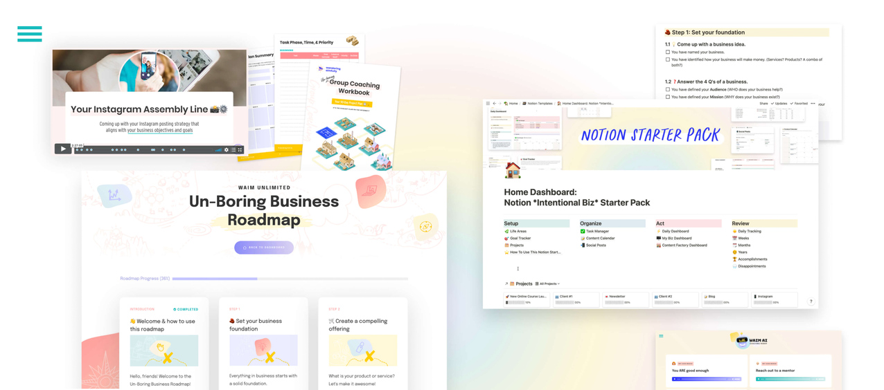
Immerse your visitors in your world — show them what life with your product can look like. (Source: Wandering Aimfully)
3. Features and benefits
After your USP, itemizing your product’s features and benefits will be the most important content on the page. This is your opportunity to expound on your USP in more precise detail. Format counts here: keep it punchy with bullet points or pair with imagery wherever possible. Lead-generating landing pages should aim for concision; on clickthrough pages, users will be hungry for more expansive details.
4. Social proof
Endorsements from real human beings go a long way in building the trust and credibility that help users make confident purchase decisions. In addition to customer testimonials, there are other compelling forms of social proof: case studies; a counter of new sign-ups or a total number of customers; star ratings and reviews; and, of course, the now-ubiquitous logo wall.
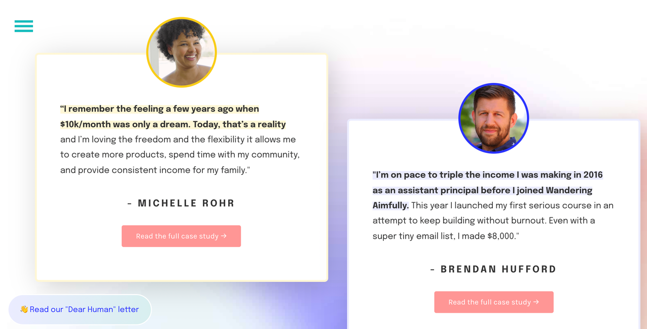
Triple-whammy social proof: profile image + testimonial + case study! (Source: Wandering Aimfully)
5. A core CTA
A landing page has one goal and one goal alone: converting customers. We encourage you to experiment with multiple landing pages customized with messaging for different target audiences or to A/B test different variations of language or imagery. But each page must be anchored to one clear and focused call-to-action that aligns with where the customer is in the conversion funnel.
Landing page best practices
We’ll leave you with a few parting thoughts to keep in mind as you’re crafting your landing page.
- Remove all distractions. Err on the side of minimalist design principles that emphasize striking imagery and lots of white space. Make it crystal clear to the visitor what you want them to do, and give them a straightforward path to doing it.
- Write in plain language. Keep your message simple and accessible. Don't try to explain every part of your product; only include the things that directly speak to your target's pain point. Be human.
- Do the work to find or create eye-catching, evocative imagery that shows context and includes as much detail as possible. Immerse your audience in a moment that shows how your offering fits into their life, whether practically or ideally.
- Put yourself in the shoes of your visitors and anticipate what they need to know before they sign up. Make sure this critical info is before your first CTA.
- Maintain a mobile-first mentality. Since most visitors will arrive via digital marketing campaigns through email or social media, they will likely be accessing your landing page on their mobile devices.
- Add an exit intent survey on your landing page. Ask why they're leaving, and then address those reasons through continuous page optimization.
Design your own startup landing page with Uizard
Ready to put some of our advice into practice? Uizard is here to make startup landing page design and iteration easier and faster than ever before. You can design your own page from scratch or you can take advantage of our pre-made landing page design template.
To get started, simply sign up to Uizard for free, invite team members to join your project, and bring your landing page vision to life collaboratively in real time.
Got more questions when it comes to the world of design and UX? Want to find out how to design a home page or how to master the basics of design? We answer all in the Uizard blog.