10 usability heuristics for UI design

There are lots of factors to consider when working on UI designs, but in the end, it all comes down to one thing — perfecting your user experience. Creating a seamless user experience is something that all UI designers dream of, and utilizing usability heuristics can make it a reality.
We'll dive into a detailed overview of what usability heuristics are a little later on, but essentially they are a set of rules that can be used to create a user-focused UI design. So, whether you’ve come across the term before, or this is your first encounter, you’re about to get up close and personal with them.
In this blog article, we’re going to discuss Nielsen’s ten usability heuristics, and how they can be put into practice. So, let’s get started.

Skip to section:
What are usability heuristics?
10 usability heuristics for UI design (with examples)
- Visibility of system status
- Match between system and the real world
- User control and freedom
- Consistency and standards
- Error prevention
- Recognition rather than recall
- Flexibility and efficiency of use
- Aesthetic and minimalist design
- Help users recognize, diagnose, and recover from errors
- Help and documentation
What are usability heuristics?
Usability heuristics are used to support the creation of user-centric UI designs. Whether you’re designing an app or a website, it’s essential that what you're creating is straightforward and easy-to-use. That’s where these principles come into play. Utilizing usability heuristics will help to streamline your project and make it simple for users to navigate and use. Ultimately, these guidelines will help your users to reach their end goal faster and more intuitively.
10 usability heuristics for UI design (with examples)
Now that you know what a usability heuristic is, we should probably give you some context. Originally devised in 1990, Jakob Nielsen put together a list of ten usability heuristics that he deemed crucial to UI design.
These ten principles provide a robust set of guidelines for UI designers to follow. You may even be following a few of them already. So, whether you’re struggling to make your current UI design user-friendly, or you just want to learn more about UI — these ten usability heuristics are here to offer support on your journey.
Without further ado, we present Nielsen’s ten usability heuristics:
- Visibility of system status
- Match between system and the real world
- User control and freedom
- Consistency and standards
- Error prevention
- Recognition rather than recall
- Flexibility and efficiency of use
- Aesthetic and minimalist design
- Help users recognize, diagnose, and recover from errors
- Help and documentation
Visibility of system status
Let’s dive into our first usability heuristic, namely visibility of system status.
Visibility of system status refers to how well the state of the system is conveyed to users through visual cues. This usability heuristic is all about developing trust with your users, which is essential for great user experience.
The websites and apps we interact with inform us of small actions constantly, and most of the time we aren’t even aware of them. For instance, in an e-commerce store, the number that appears next to your basket when an item is added signals that the ‘add to basket’ button has worked.
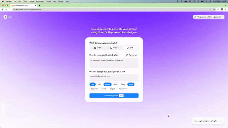
Another great example of visibility of system status is the use of breadcrumbs on web pages or the use of loading/progress bars. Check out the Uizard Autodesigner example below, where the user is provided with visual cues that their request is being processed:
Match between system and the real world
Second on our list is the usability heuristic match between system and the real world. This is all about relatable and readable content, as well as simple designs.
Sometimes it’s easy to slip technical terminology into your web or app content. Although it may sound great, do your users actually understand the lingo? Remember that most users landing on your page won’t have any prior industry-related knowledge, so it’s important to keep your copy simple. Complicated terms and niche phrases may cause users to go elsewhere, and you don’t want that.
If you’re struggling with snappy content for your headings and buttons, Uizard’s AI-powered design tool is here to lend a helping hand. Satisfy your users with easy-to-understand terms generated by our AI Text Assistant.
User control and freedom
We’re all guilty of using the browser back button to retrace our steps, and this is where the third usability heuristic comes into play. User control and freedom, in simple terms, is the ability for users to back out of unwanted actions.
No user wants to feel stuck, so make sure that each and every action in your UI design is easily reversible. How can you do this? Well, a back or close button is a common example here, and you’d be surprised how many sites and apps miss these from their UIs.
It’s easy to demonstrate your user flows and click journeys using Uizard’s UI navigation components and built-in clickable interactions. Designing this way enables you to hand over your design prototype to a developer with clear examples of how you want to empower user control and freedom.
Consistency and standards
Next up, consistency and standards. This usability heuristic explores the benefits of consistency, and how users have become accustomed to a certain style of web and app design.
There’s a reason that most apps and websites follow similar formats; it’s because they know what their users want. Without realizing it, we have all become accustomed to certain formats, even down to the most basic placement of components. For instance, we would expect a brand logo to be in the left-hand corner, clickable text to be underlined or highlighted, and the navigation bar to have a drop-down menu.
It’s great to be unique, we would even encourage it, but in terms of design usability — there’s no need to reinvent the wheel. With Screenshot Scanner you can take a design from another web or app and shape it to suit your needs.
Error prevention
Preventing problems before they happen is a task that UI designers have gotten used to over the years. Error prevention includes preempting how users will interact with a design, and ironing out any issues before the website or app is live.
If users realize that they can’t complete an action on your platform, they will most likely leave and try again elsewhere. A great way to avoid errors such as this is to make use of user testing and iteration of your UI design.
Recognition rather than recall
Without delving into the world of psychology too deeply, this usability heuristic focuses on a user’s ability to remember information. Recognition rather than recall focuses on how recognition is the preferable option. Confused? Let us explain.
When a user enters a site or an app, their immediate response is recognition. They see aspects of the page that they’re familiar with, and it encourages them to click. Recall is the secondary response, and it requires users to delve into their memory. For example, if a user was asked to log into a site, they would have to recall their username and password. The less a user has to recall, the better. Make it as easy as possible for users to reach their end goal.
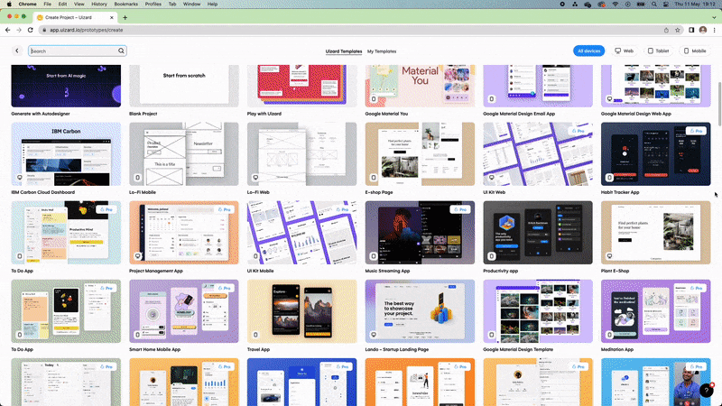
Get started on your UI design quickly and easily with one of our templates. Suitable for web and app design, our templates are created by professionals with users in mind.
Flexibility and efficiency of use
The next usability heuristic is flexibility and efficiency of use. This might not be essential for every web or app design, but we will run through how adding shortcuts can benefit experienced users.
Enabling shortcuts such as ctrl+c or ctrl+v can speed up a user’s end goal. This is exactly the same when adding shortcuts to your UI design. Inexperienced users will find it helpful to go through processes in full, but for experienced veterans — adding shortcuts will speed up their actions on your platform.
Satisfying all levels of experience means doing both. Try to avoid making your app or website too difficult for a novice user — and this goes for every aspect of your design.
Create a design that can be comfortably used by anyone and one that provides various options for fulfilling specific actions.
Aesthetic and minimalist design
Maximalist design enthusiasts cover your eyes because UI design is all about minimalism. Our next usability heuristic, aesthetic and minimalist design, preaches that less is more. Now, don’t get us wrong, your design shouldn’t be boring, it just needs to include the essentials, look sharp and sleek, and aim to not visually overwhelm the eyes.
When a UI design has too many plates spinning at once — those plates being components, colors and features — it can become distracting. Overwhelming users from the get-go is not very user-friendly, and it may even cause them to bounce. Keep your design clean, easy to navigate, and avoid overcrowding with irrelevant components or content.
Looking for some design inspiration when it comes to minimalism? Our dating app template could be just the ticket.
Help users recognize, diagnose, and recover from errors
We’re nearly to the end, so hang on in there. This next usability heuristic is pretty self-explanatory, and it is to help users recognize, diagnose, and recover from errors.
Great UI design is all about the user, so when a problem occurs there needs to be a mechanism in place to provide a solution for that user. Error messages are an easy way to offer help. But it's important to explain plainly what error has occurred, and what the user can do about it.
UI design doesn’t stop at error messages. Using icons like red flags is great for highlighting an error, but don’t forget to personalize the content too. You can easily reflect your brand’s tone of voice, and put users at ease by personalizing these messages.
Help and documentation
Last but not least, our final usability heuristic is help and documentation. Luckily, this is exactly what it sounds like — supporting your users whilst they are navigating your product.
Help center articles or some form of blog, is the easiest way to solve issues experienced by your users. Just make sure that your help center is easily accessible, and that means directing users straight to the page if they come across a problem.
Don’t leave your users in the dark, include both proactive and reactive help in your help center or on your blog. What do we mean by these two terms? Well, proactive help consists of familiarizing users with your platform such as beginner guides, and reactive is responding to issues if and when they’re flagged.
If you’re struggling to formulate your own help center, why not take a look at ours? Design a safe place for your users to get the advice and assistance they need.
Uizard is an AI-powered design tool, perfect for both designers and non-designers. From wireframe support to our AI design functionality, we really do have it all. Sign up for free and get started on your next UI design project today.