Web design themes: A DIY guide for non-designers
People have expectations of what a contemporary website should look like, even if they can’t articulate the precise characteristics. First impressions are everything; visitors decide within milliseconds whether or not a website appears credible, and their decision is almost entirely based on visuals. A Google Study even found that “prototypicality” — meaning that a design style is representative of a particular category of websites — was a defining factor in a website’s perceived attractiveness and trustworthiness.
The power of clean layouts, cohesive color palettes, and consistent font treatments should not be underestimated. For better or worse, a website’s look and feel speaks more loudly than its content. Developing a well-thought-out UI theme is an ideal first step toward creating a coherent website or app that people will respond to. And there’s no need for non-designers to feel intimidated. In this brief guide, we’ll show you the basics of how to do it yourself (and how Uizard can give you a head start).
Skip to section:
How to create your own design theme
Taking it to the next level: The design system
What is a web design theme?
A design theme is simply the overall look and feel of a website. The purpose of a design theme is to create unity across web pages through the consistent use of a color palette, fonts, and layout patterns. Taken together, these attributes establish a visual organization that helps users orient themselves, so they can easily take desired actions. It also helps to create a sense of familiarity, making your design identifiable and recognizable wherever it is presented. A coherent design theme works in tandem with your information architecture to support visitors with effective visual cues and signposts throughout their user experience.
Often, design themes are born out of branding guidelines, which tend to be produced by either external creative agencies or in-house teams. These guidelines systematically define how a brand’s key visual attributes should be applied in a wide range of scenarios, from marketing collateral and retail displays to digital platforms.
In this respect, design themes can be a branding shortcut, particularly for founders or small business owners for whom launching a website is effectively launching their whole business. There’s value in investing in a comprehensive brand strategy, but design themes offer a lower barrier to entry when you’re just getting started and access to design resources is limited.
This is why there’s such a vast marketplace of pre-fab design themes available, particularly with site builders like WordPress, Wix, Shopify, and Squarespace. These no-code platforms make it easy for anyone to create a high-quality website without any specialized coding or design skills. But the downside to using straight “out of the box” themes and templates is the potential for creating cookie-cutter websites that blend together without distinction in the user’s mind. With a little legwork (and the help of a tool like Uizard), non-designers can take a few easy steps to create a more customized look and feel.
How to create your own design theme
Whether you’re starting from scratch or looking to customize existing templates, creating your own design theme starts with gathering some visual inspiration. Odds are you’re already doing this, and you’ve already collected a few references to other websites whose style you admire. You may also already have a set of brand assets, like a logo and color palette, that are helpful jumping-off points. But if you’ve got a blank slate, there are tons of resources available to get your creative juices flowing.
A quick search on Pinterest will turn up an endlessly refreshing feed of web design inspiration, but Dribbble is also a great source for best-in-class brand, UX, and UI design. It’s an ideal place to get a feel for the different page layouts best suited to your site’s purpose. Even better, it’s a portfolio site for designers and creatives looking to showcase their work and drum up new clients, so if you’re considering how you might collaborate with a design pro, Dribbble is a one-stop-shop.
There’s no hard and fast rule about how many colors to include in a single palette, but five is a decent starting place. It allows for one or two dominant tones, one or two complementary tones, and one contrasting or accent tone. Adobe Color is a useful tool for generating and experimenting with different color combinations. A new feature of the tool includes an accessibility checker to make sure you’re working with the most recent Web Content Accessibility Guidelines (WCAG) 2.1 for contrast and type sizing.
Typewolf has a finger on the pulse of the most on-trend fonts out there and features numerous lists and round-ups of font styles by category: serif, sans-serif, slab, display fonts, etc. The site also offers font pairing recommendations as well as a super-popular “site of the day” feed highlighting the newest and coolest in web design.
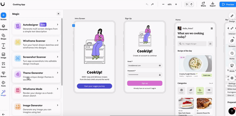
Once your selections are starting to feel like they’re coalescing into an overall creative direction, Uizard's AI-powered design assistant is a powerful next step in generating your own design theme. Uizard uses deep learning algorithms to extract style data from whatever visual input you use as a starting point: a moodboard you’ve created, a photo or illustration you love, or even directly from a URL. The Design Assistant is able to translate data about color, layout, and type styles and generate a customized design theme, a good compromise to using pre-fab templates. The Design Assistant helps non-designers start with a baseline of validated design best practices but with a bit more originality, so webpages don’t look totally generic.
Taking it to the next level: The design system
A design theme creates an overarching creative style for a website, but a design system establishes a library of interface elements and a set of guidelines on how they behave. Legos are a good analogy. The kit to build, say, a “Death Star” model is like a design theme — all of the individual bricks in different shapes are the components of the design system. You can put them all together and have a perfect “Death Star” replica, but you can also use the parts in different ways and in different combinations. Your construction will have the style of a “Death Star,” but you can invent your own intergalactic vehicle.
Cool analogy, but why — and when — should you care about design systems? As your site (and business offering) grows over time, it’s likely you’ll need to accommodate new and more diverse use cases. Suppose, for example, you started an online bookshop but then eventually began selling pet toys, and soon after, you added beauty products to the mix. All very different products with different requirements on how they might be presented, yet they all coexist on the same platform. A design system creates a toolkit of reusable components, e.g., menus, buttons, form fields, and text blocks that have many potential (and customizable) applications.
A design system is all about achieving scale and reducing redundancy. It helps to streamline some of the more tedious elements of a design workflow (such as adding and styling new pages) and avoids reinventing the wheel with new versions of the same components. Not only does this increase consistency across products and channels, but with potentially different business units managing them, a design system also creates a shared vocabulary across teams. Finally, a design system keeps design resources focused on solving more complex user experience challenges and simultaneously empowers non-designers to make confident and informed design decisions that align with a clear vision.
However, it should be noted that the implementation and management of an effective design system requires dedicated resources to oversee new use cases, roll out new components, and update existing standards. Companies like Google, Airbnb, and GE have sizable teams entirely focused on their rigorous and constantly evolving design systems. It’s worth taking a look at each of these examples to get an idea of how design themes and systems look under the hood.
A few key takeaways
Design themes and design systems are purpose-built to make good design accessible and scalable while eliminating the overwhelm of keeping your website’s style fresh and relevant in pace with design trends. But remember to take things step-by-step. Start simple by building a consistent look and feel with a few decisive design elements. Less is more. Make things feel familiar, as if it’s just how it’s supposed to be. Save the outside-the-box thinking for designing and delivering the best possible user experience.
Consider also that underneath the best design systems is a strong core design philosophy that governs the “why“ behind all the what and how of an interface. With some upfront investment in time and effort, both design themes and systems can make a measurable difference in how your site is perceived by customers.
Ready to put your design skills to work? Sign up to Uizard for free to get started. Looking for more information when it comes to the world of design? Discover the Uizard blog now.